
Week 1


Week 2


Week 3


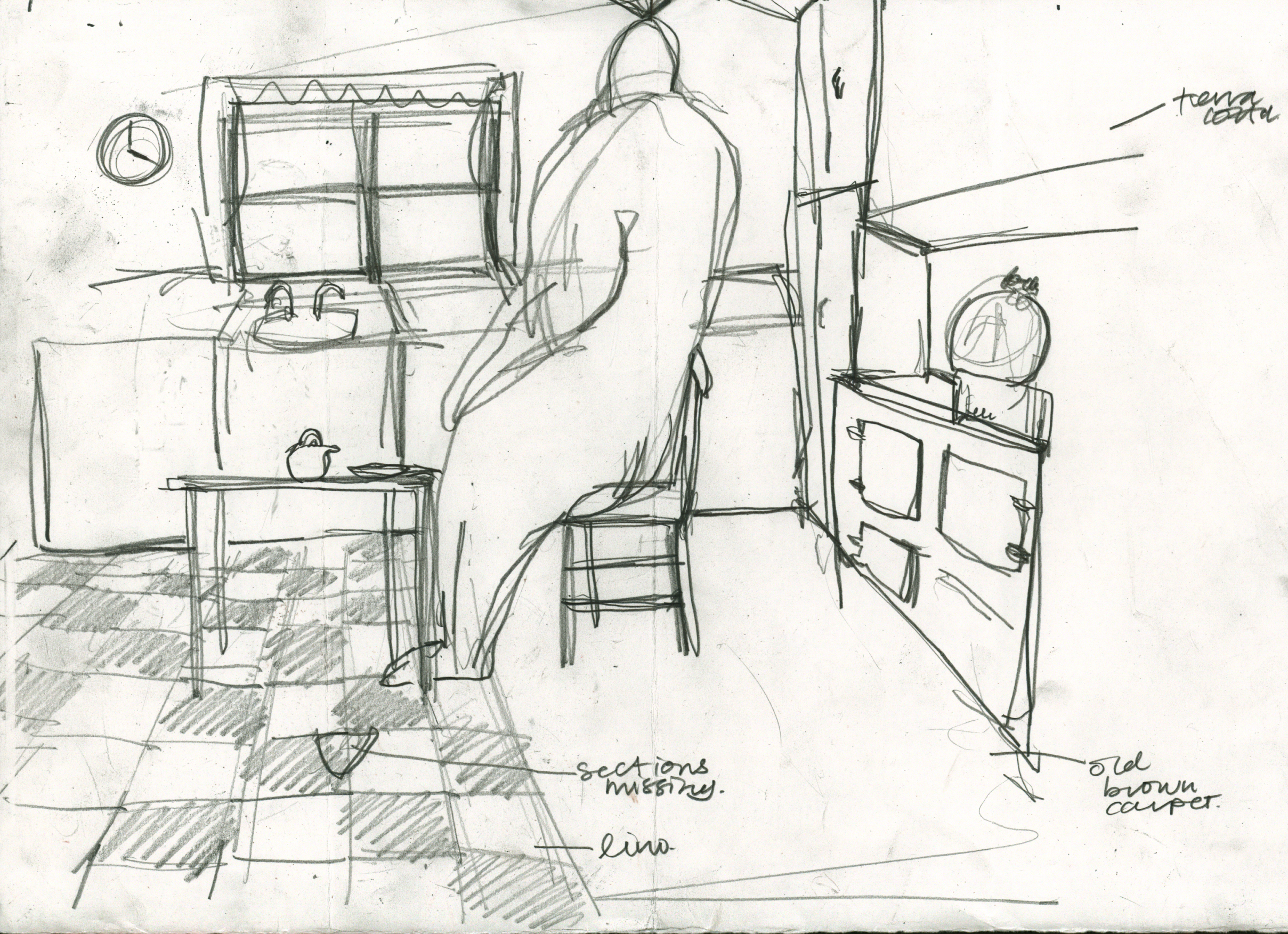


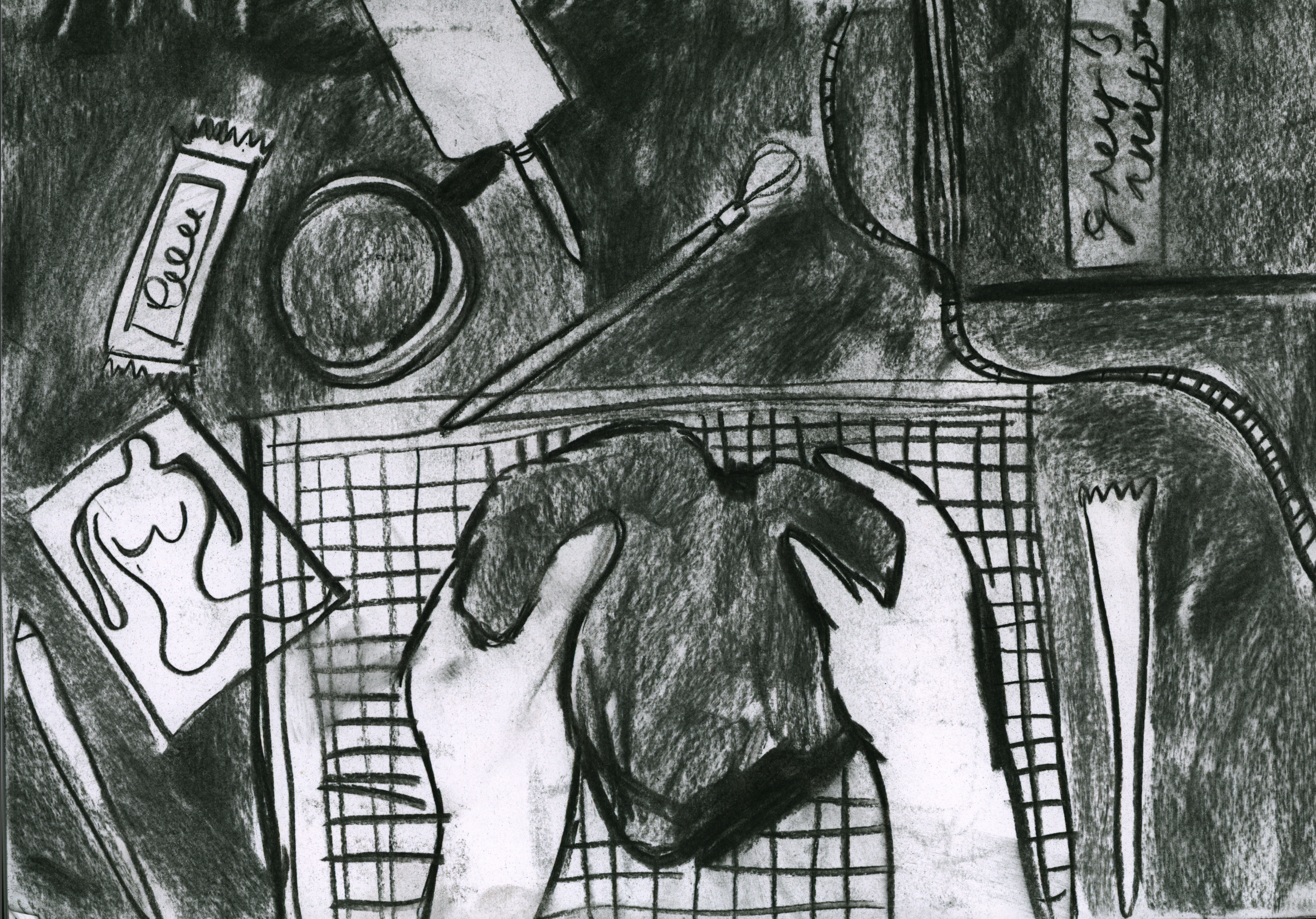
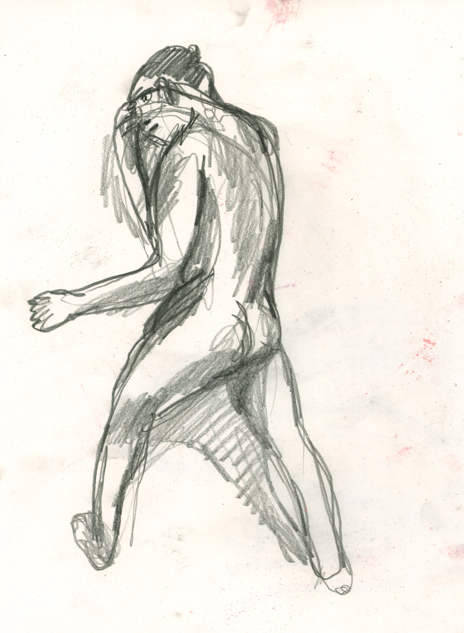
Saturday Life Drawing - 30th January
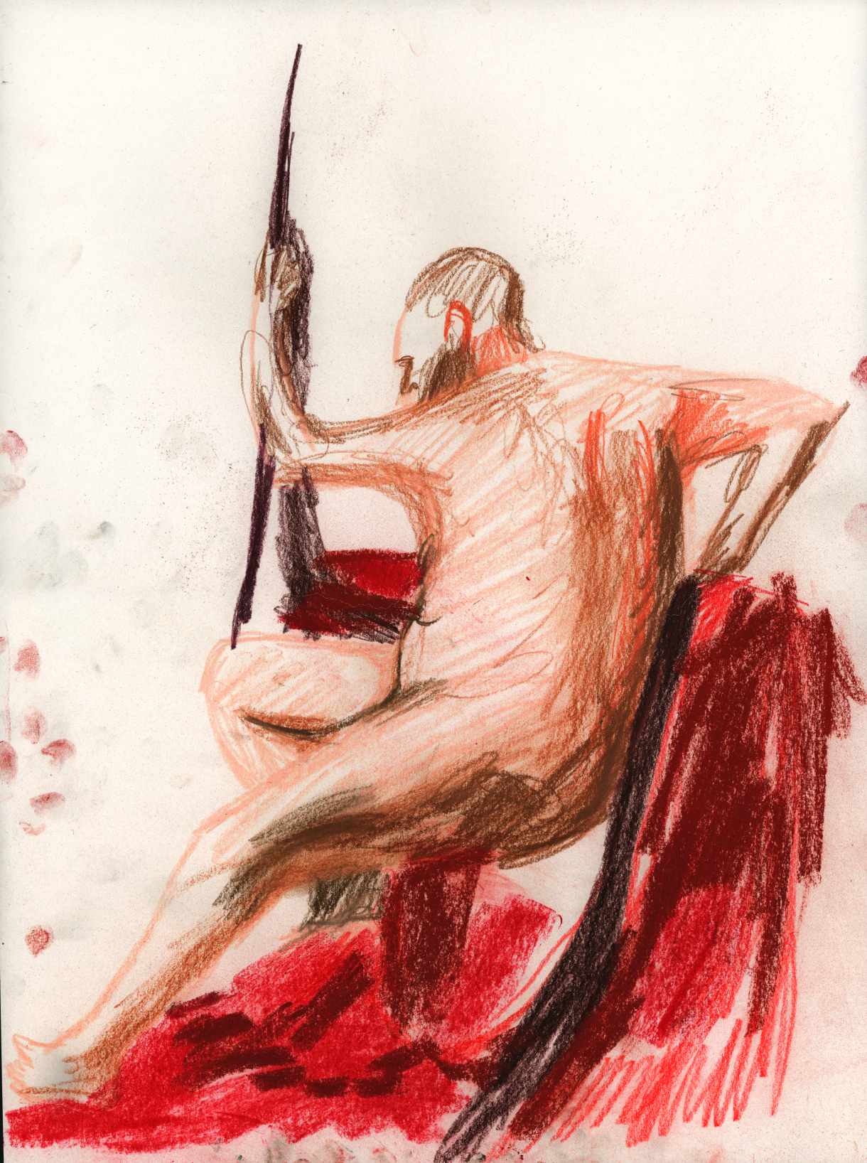
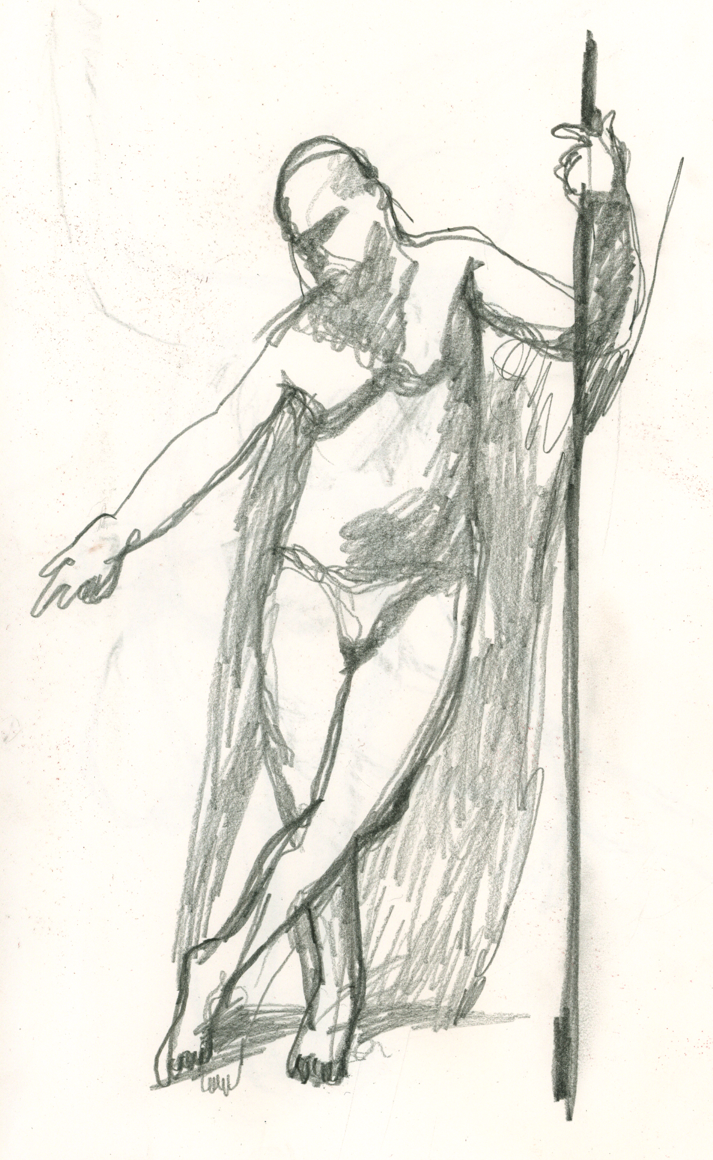
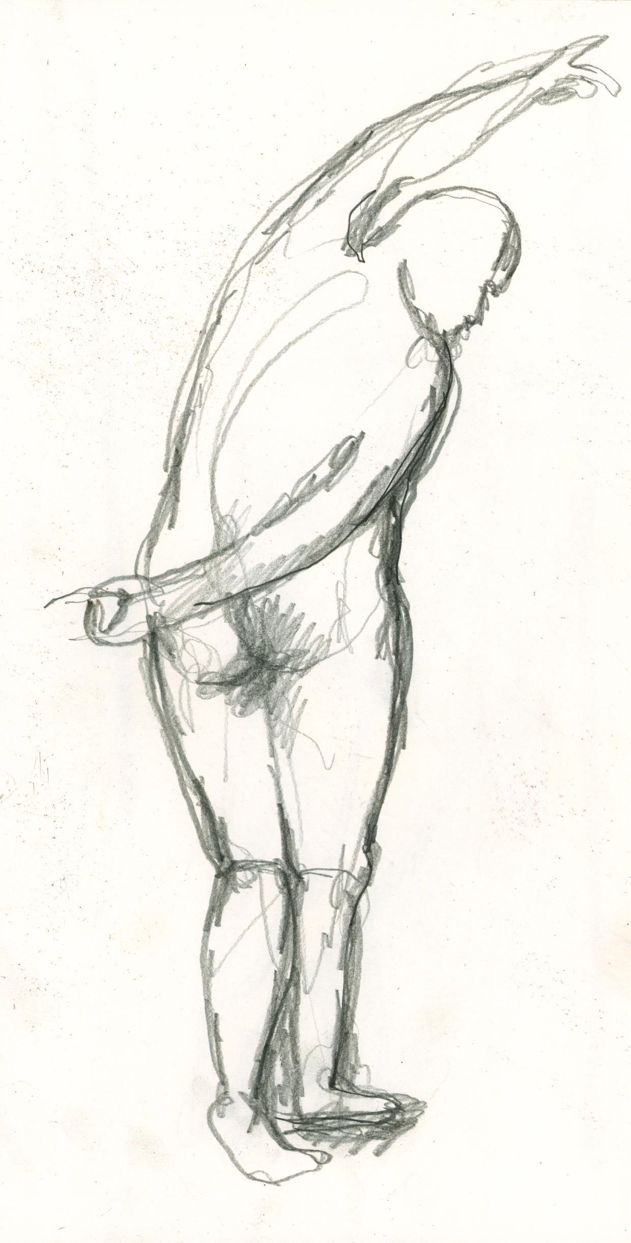

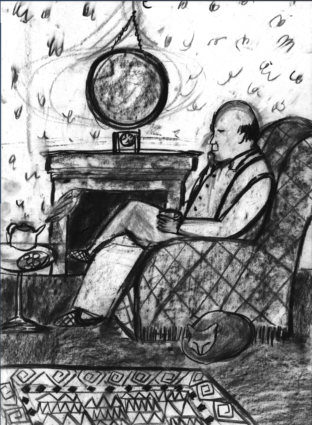
1st February Saturday
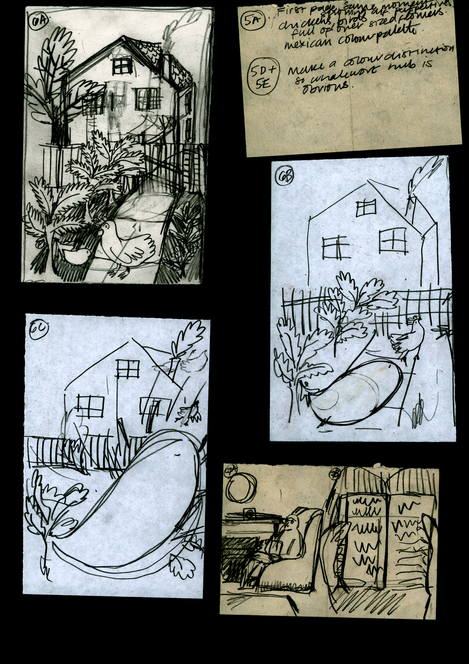
2nd February - Word and Image workshop
4th February - Mid module review.
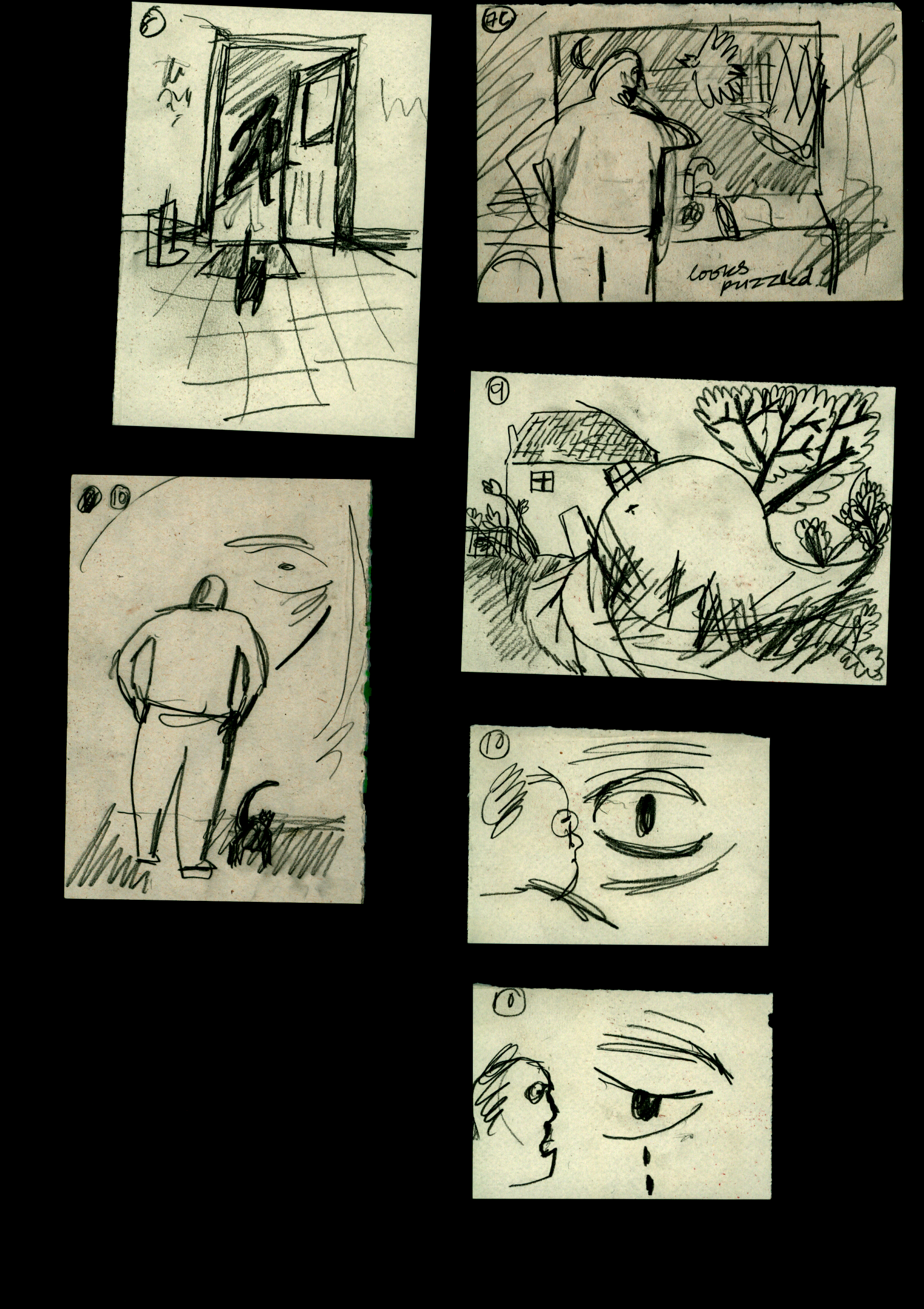


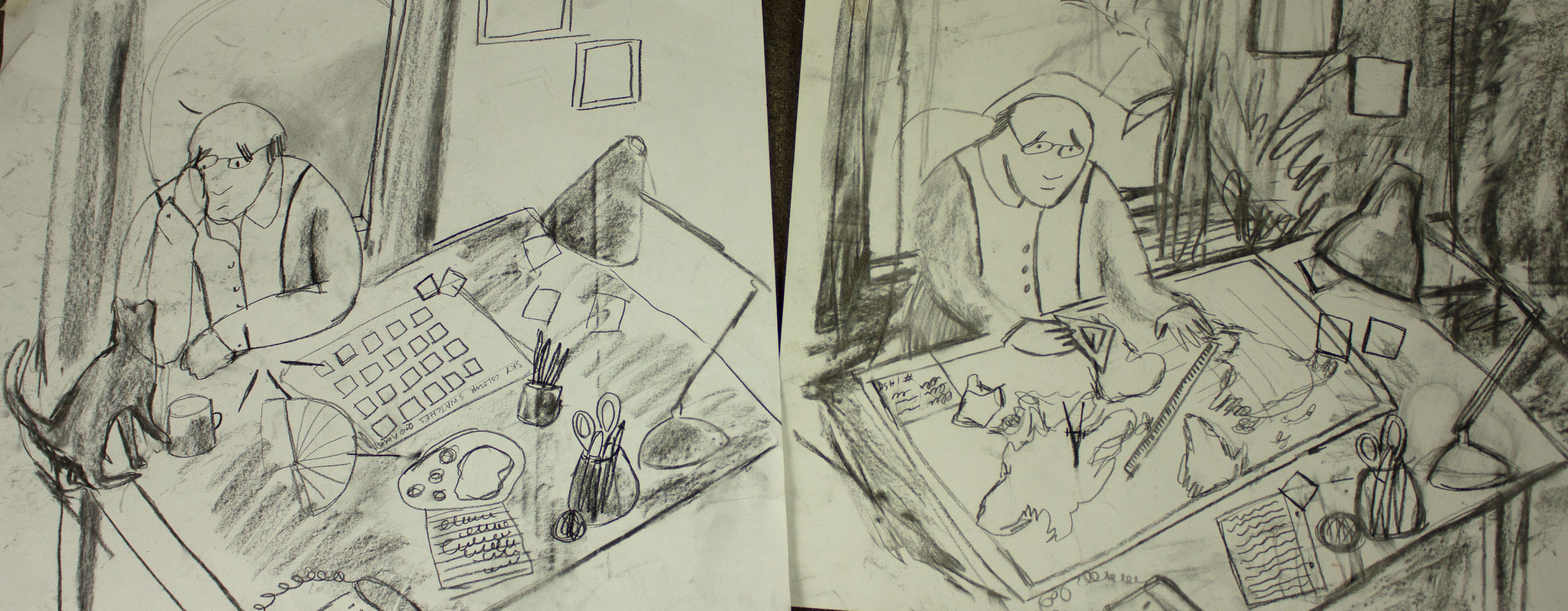
6th February
8th February
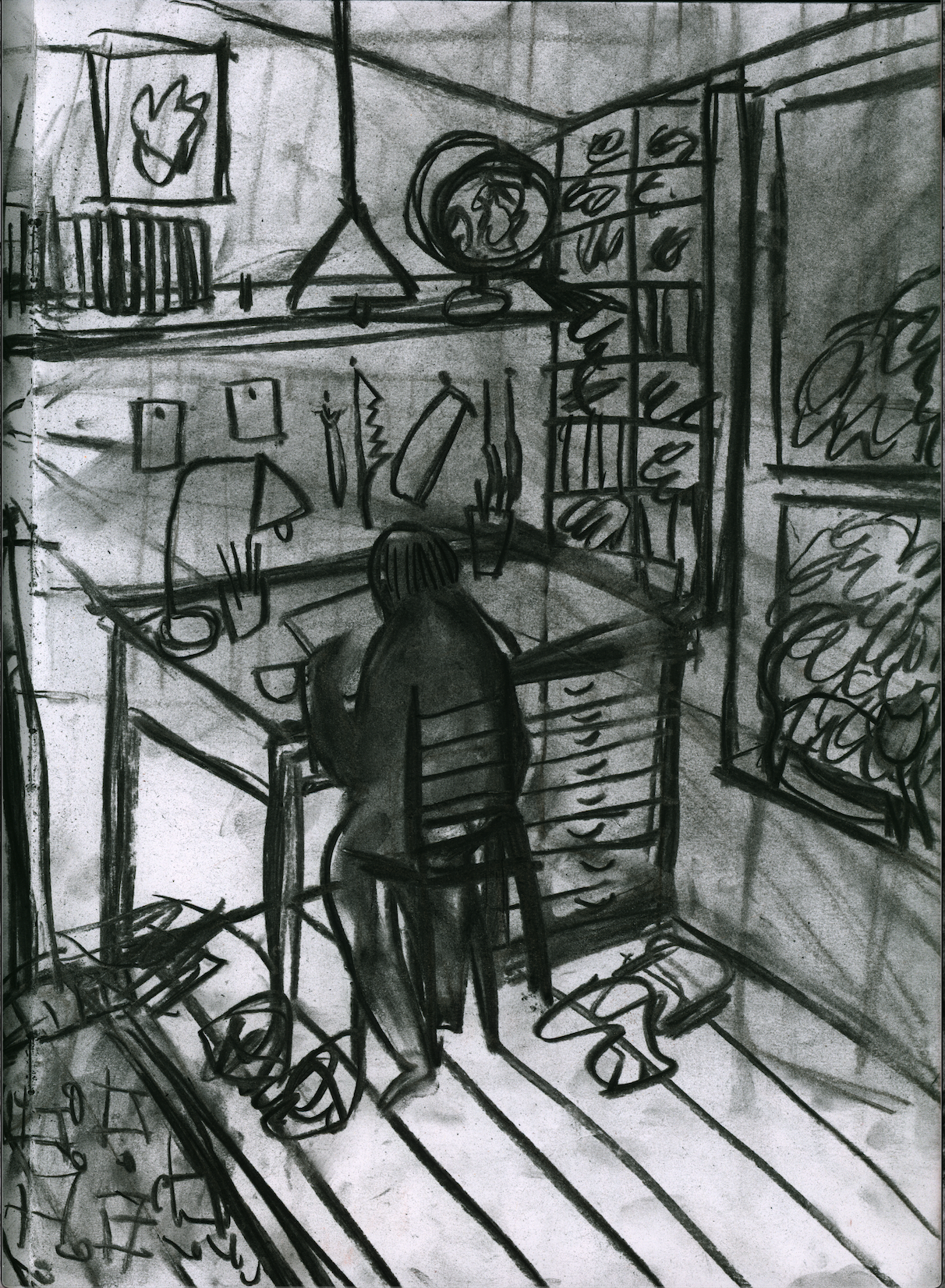
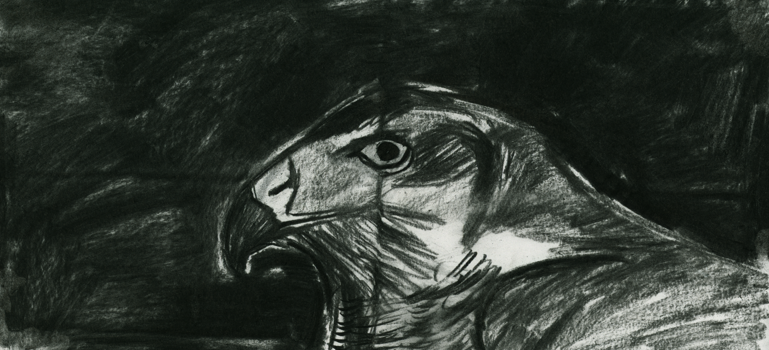
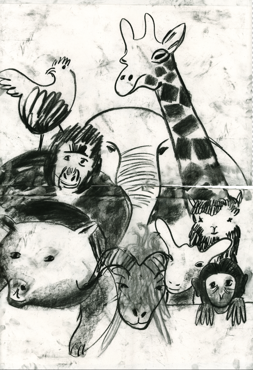
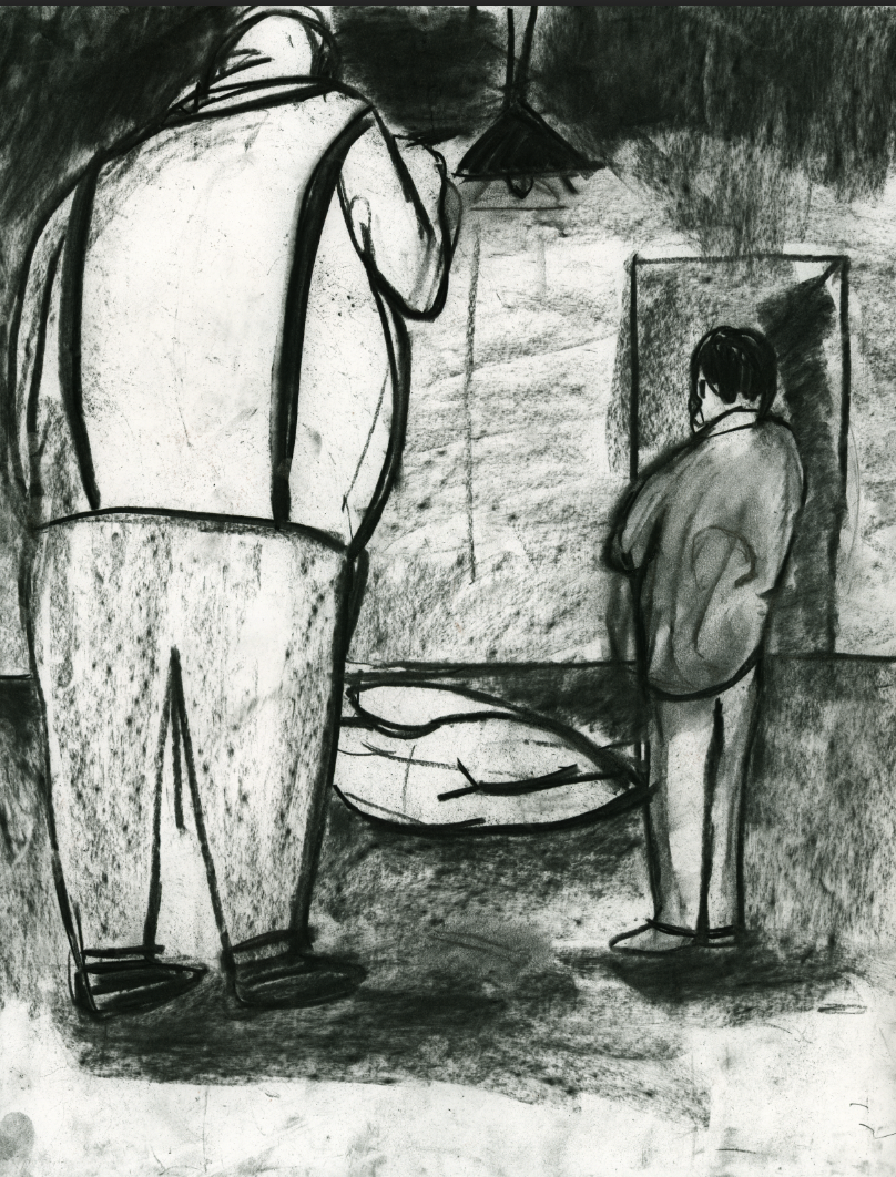
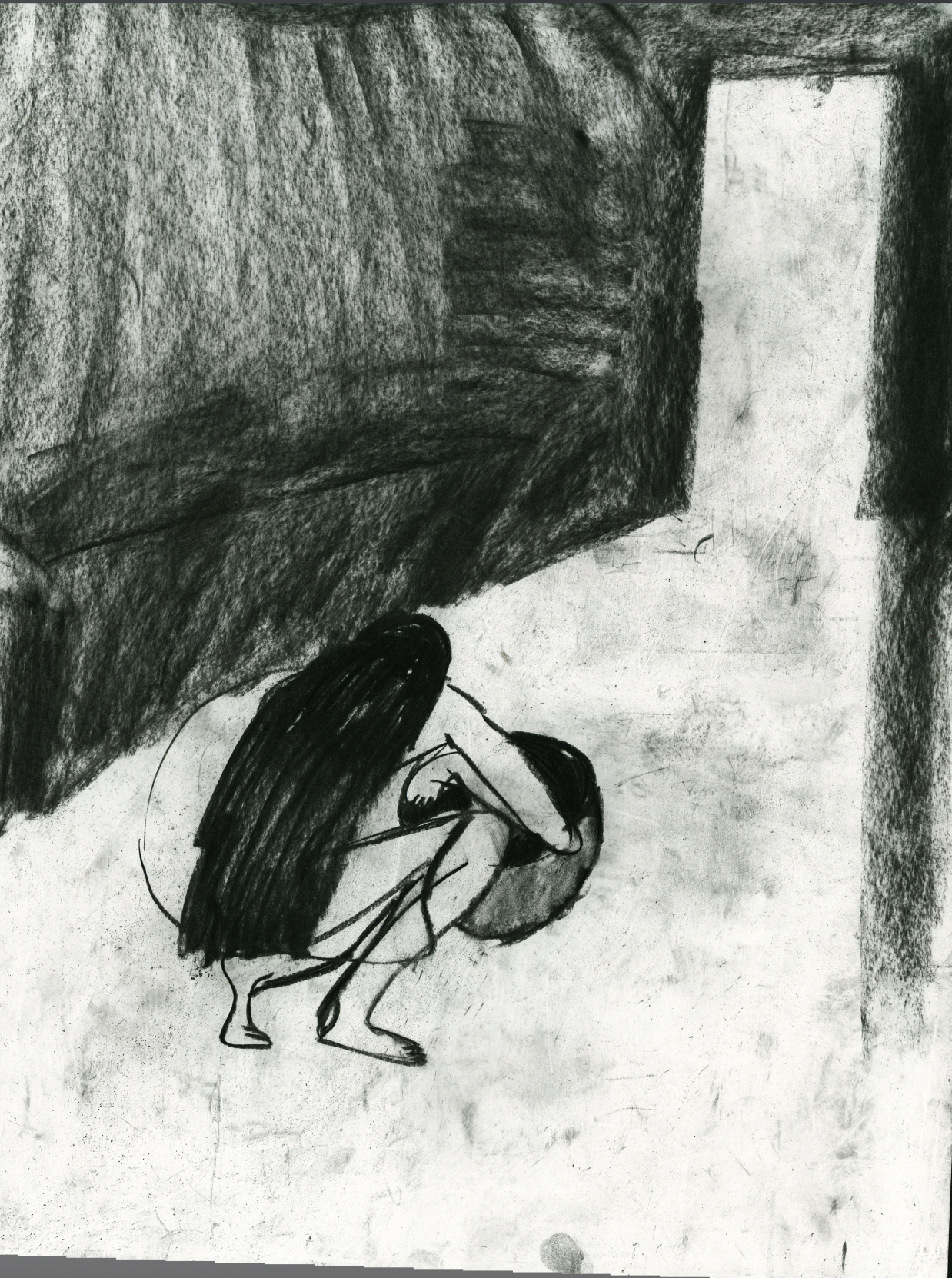
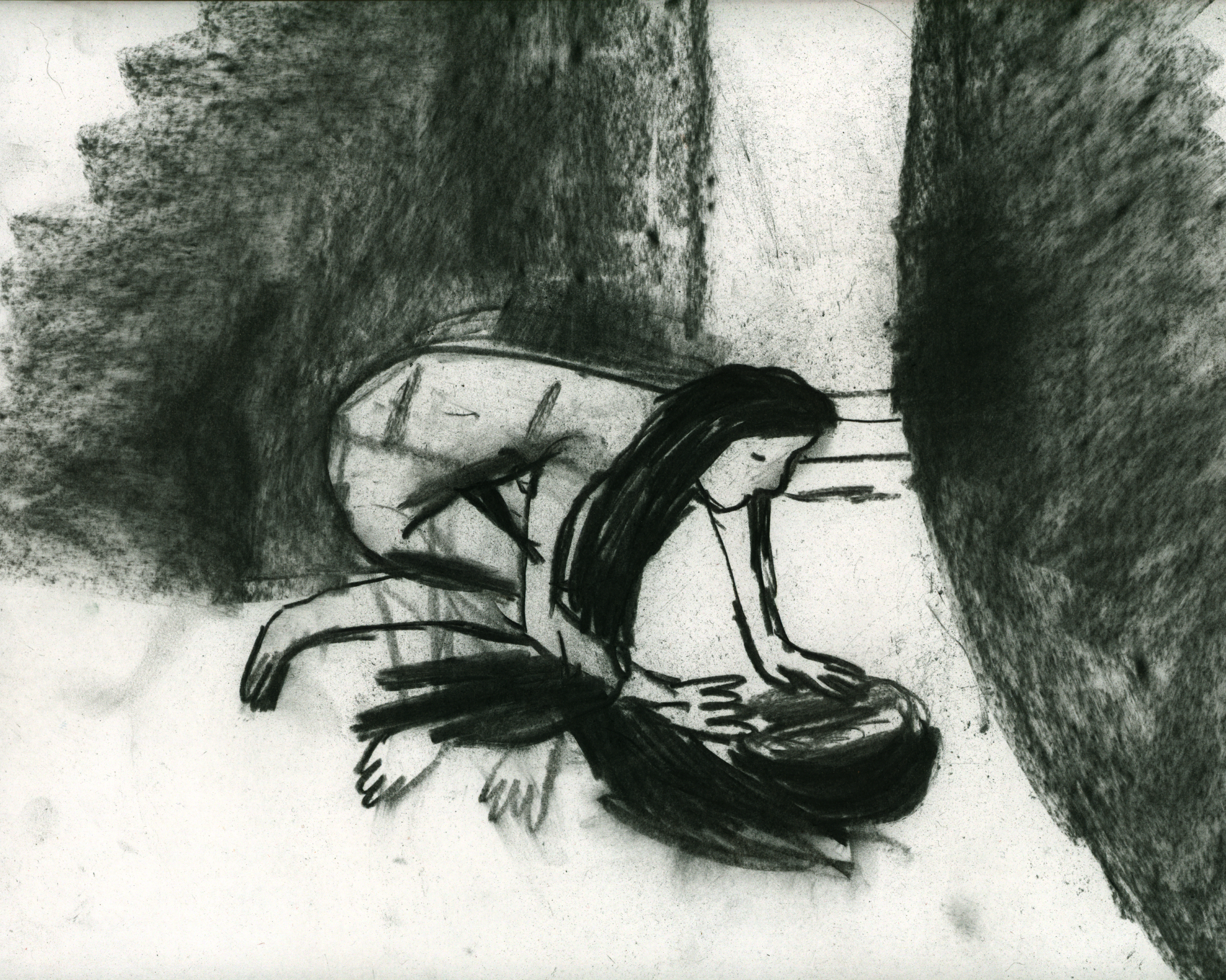
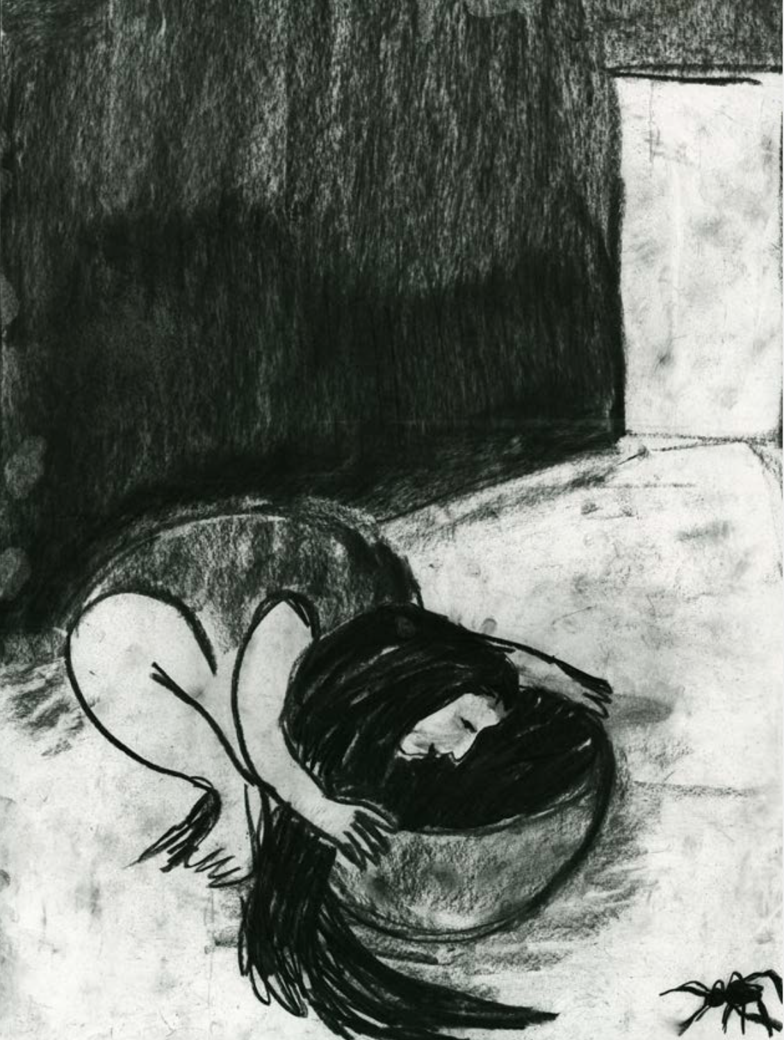
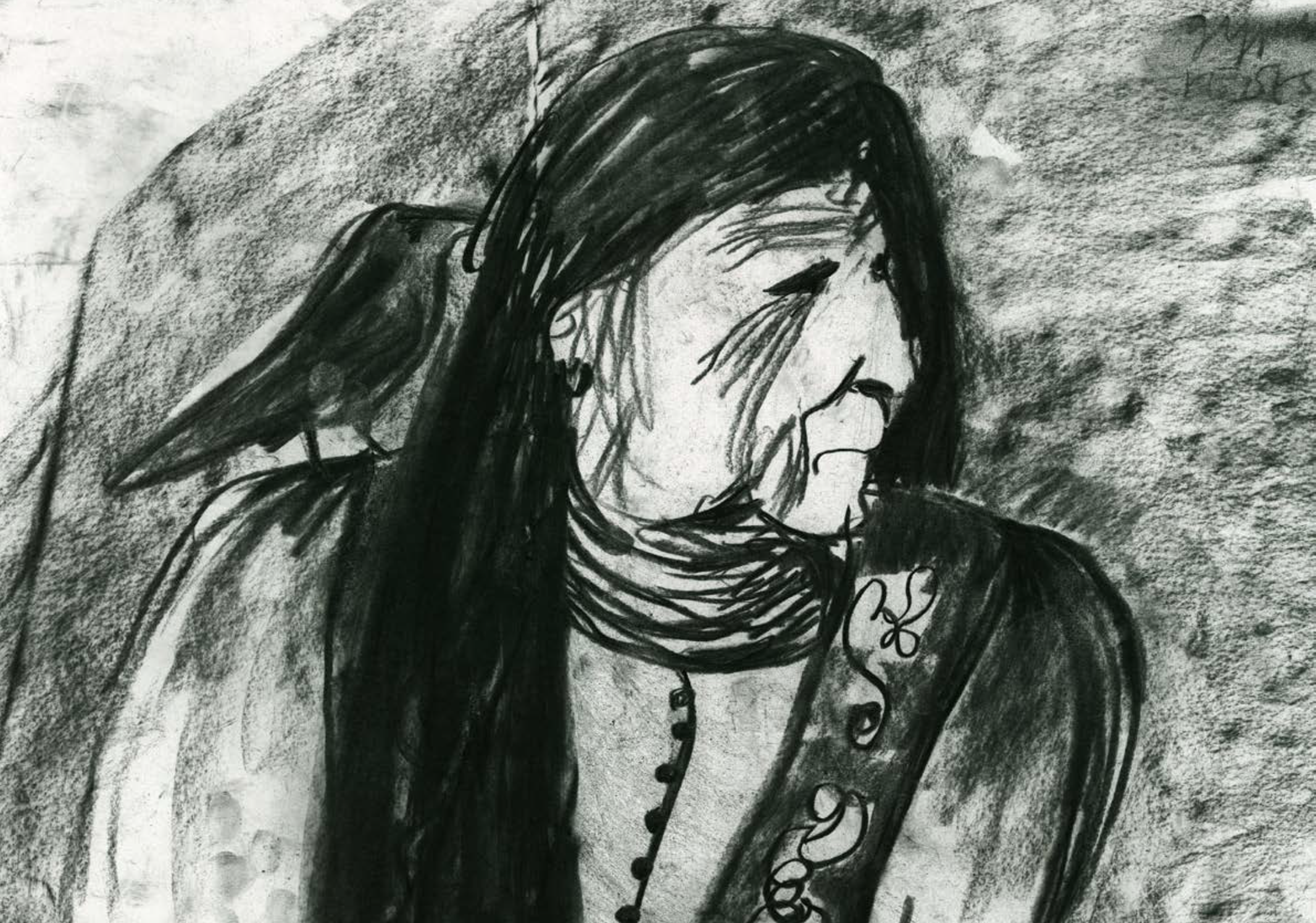
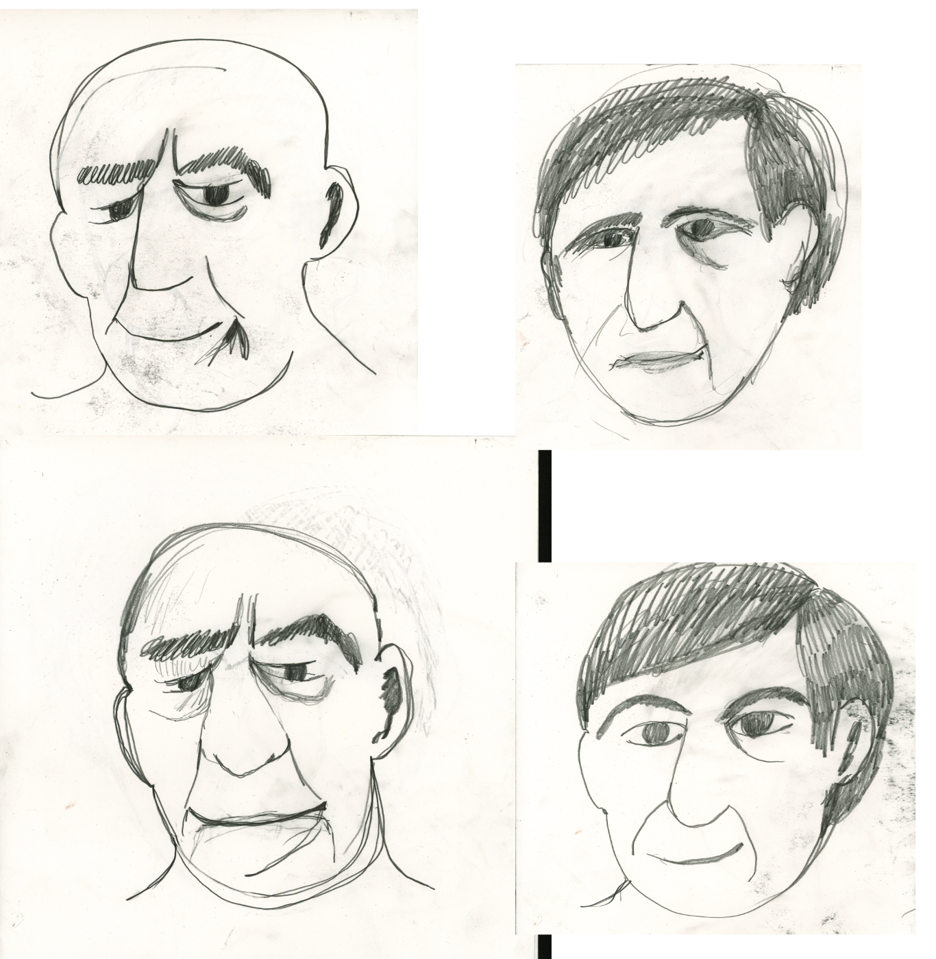
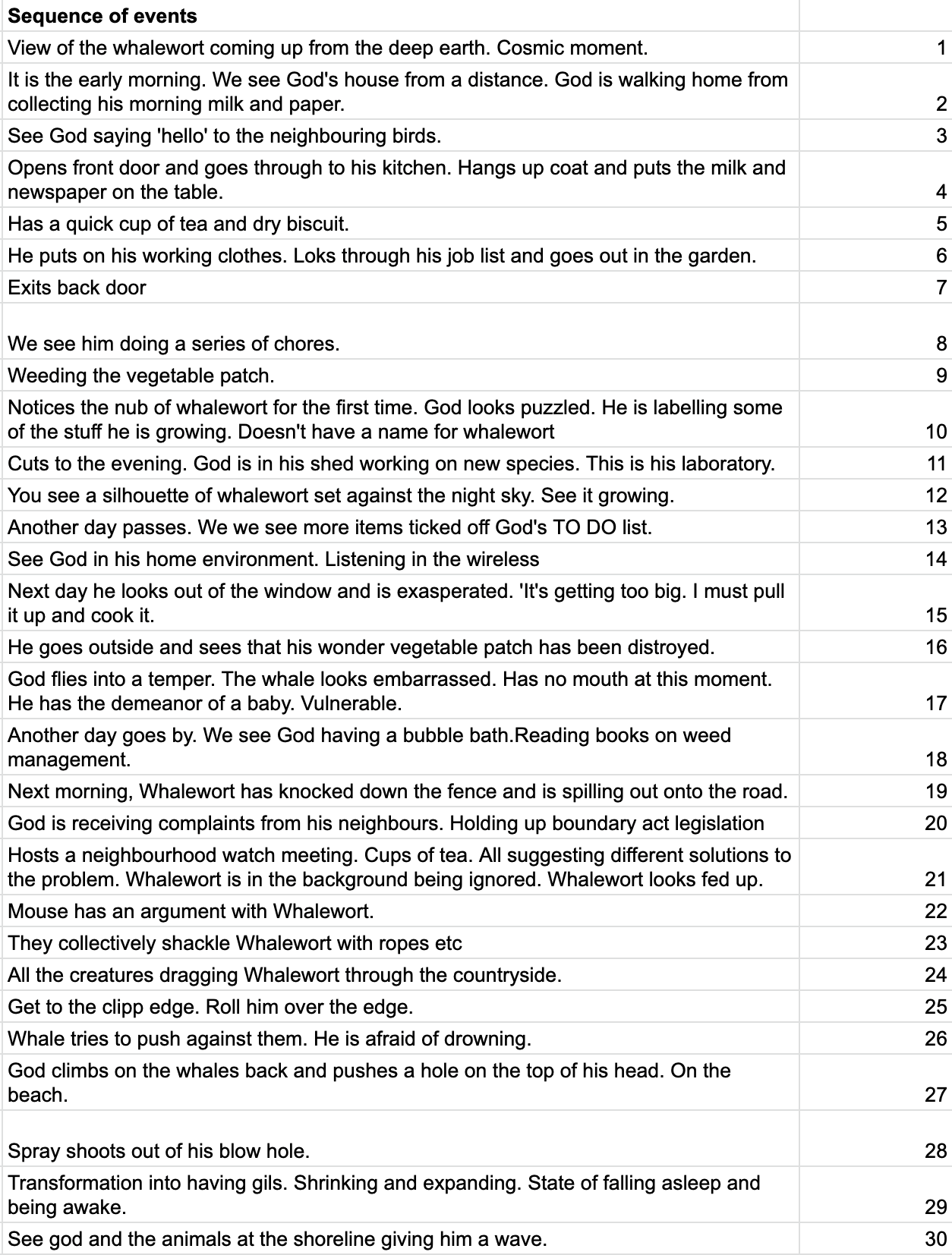
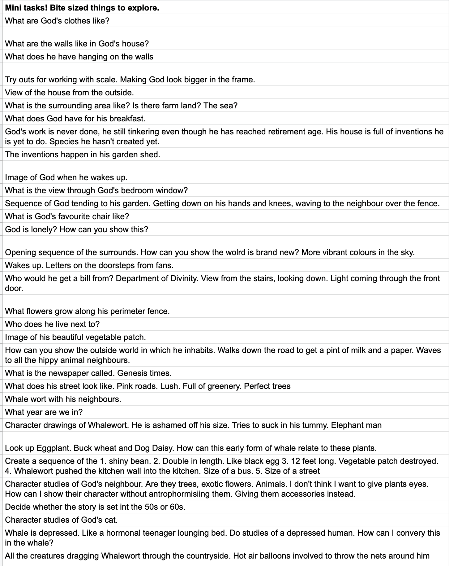
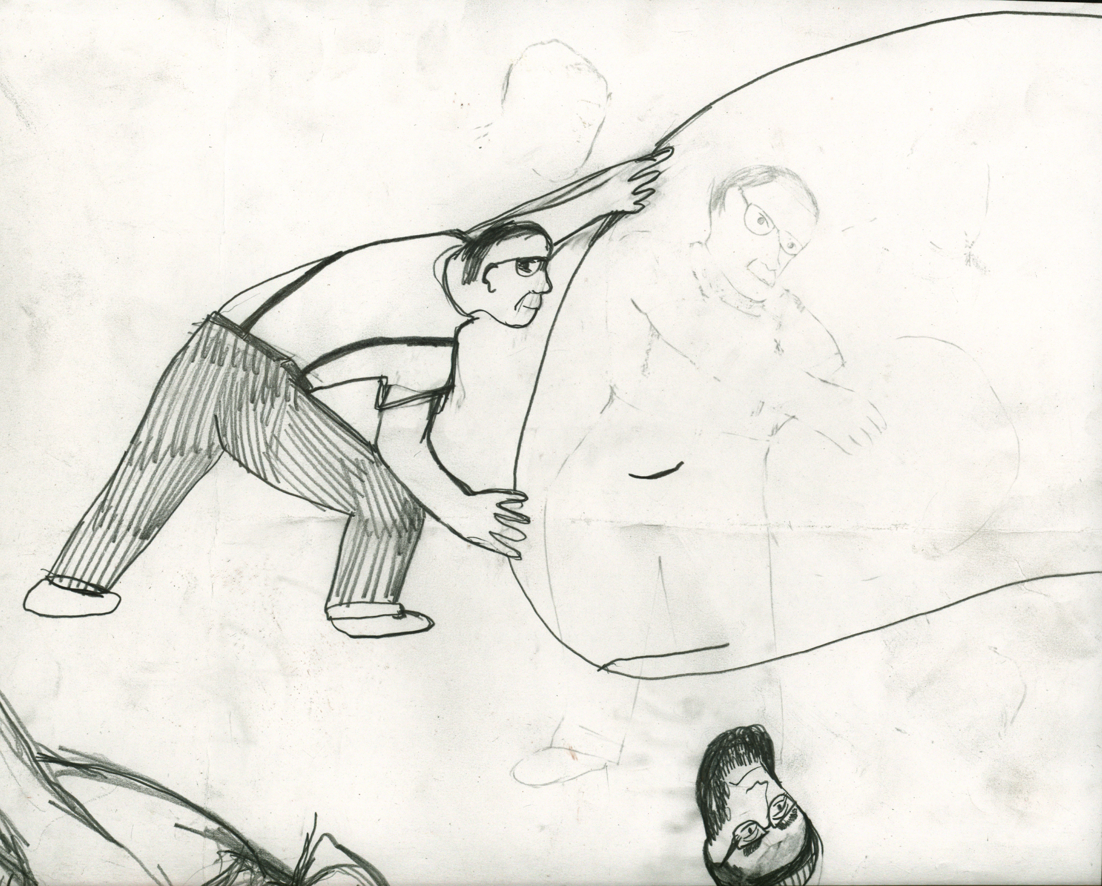
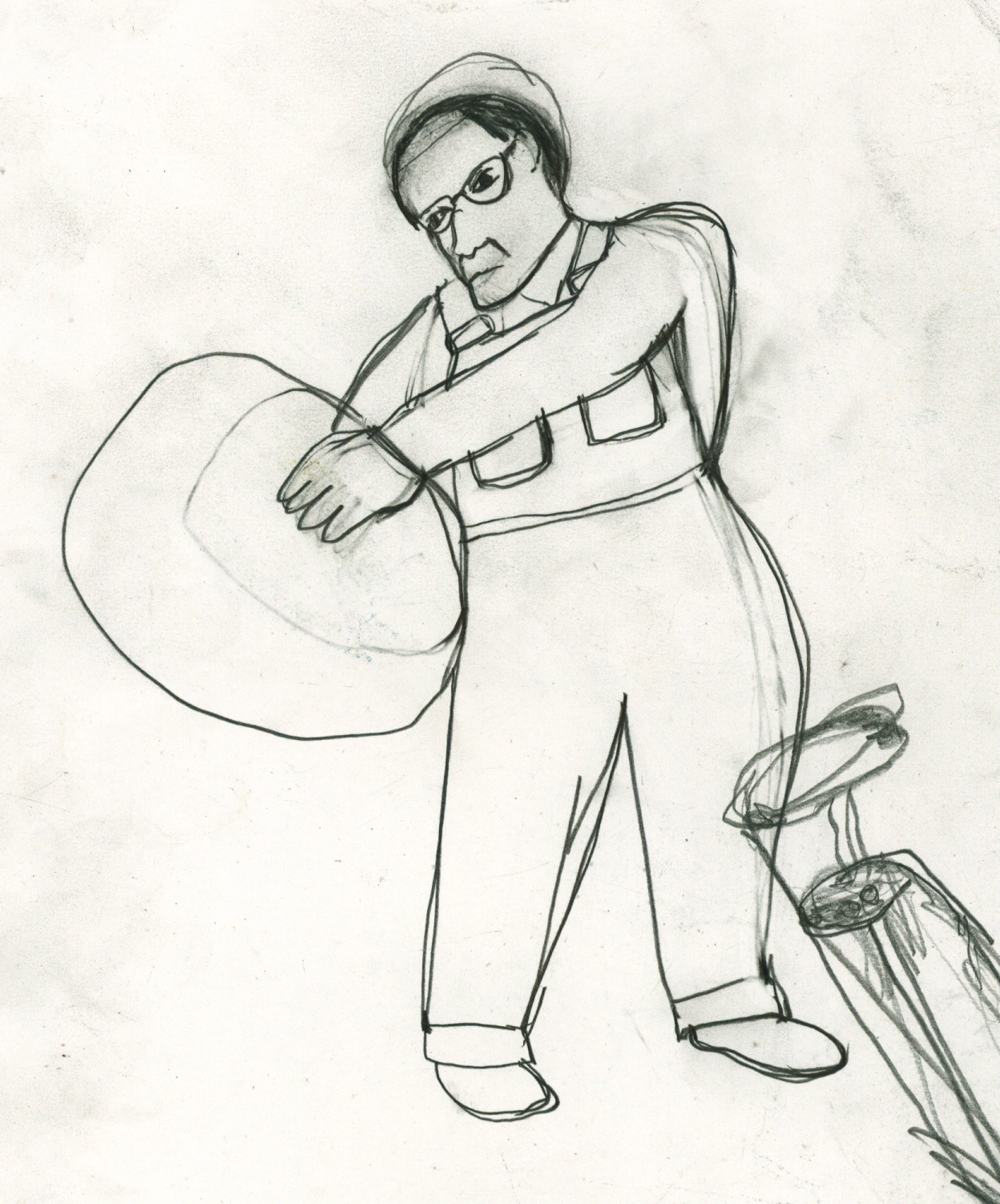
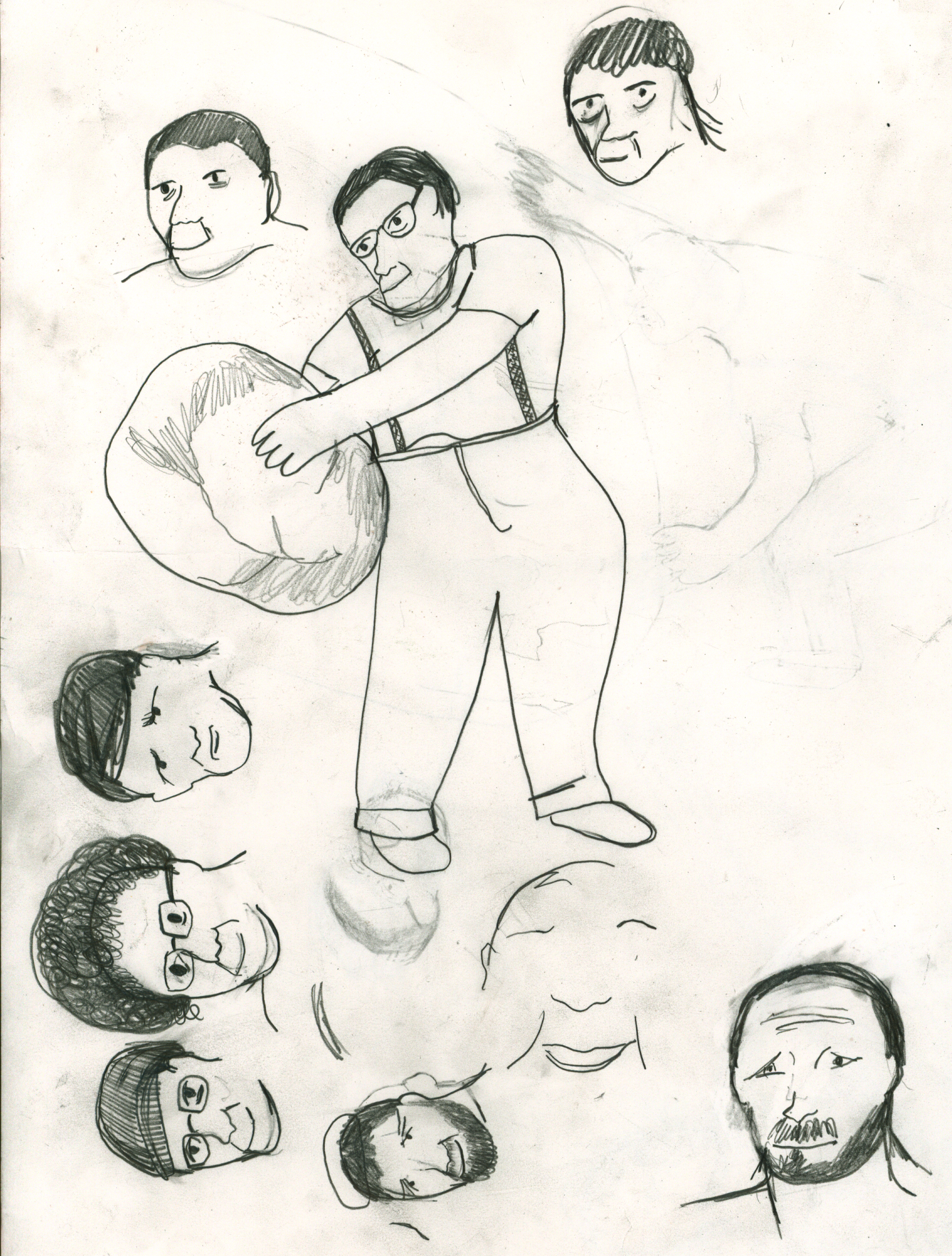
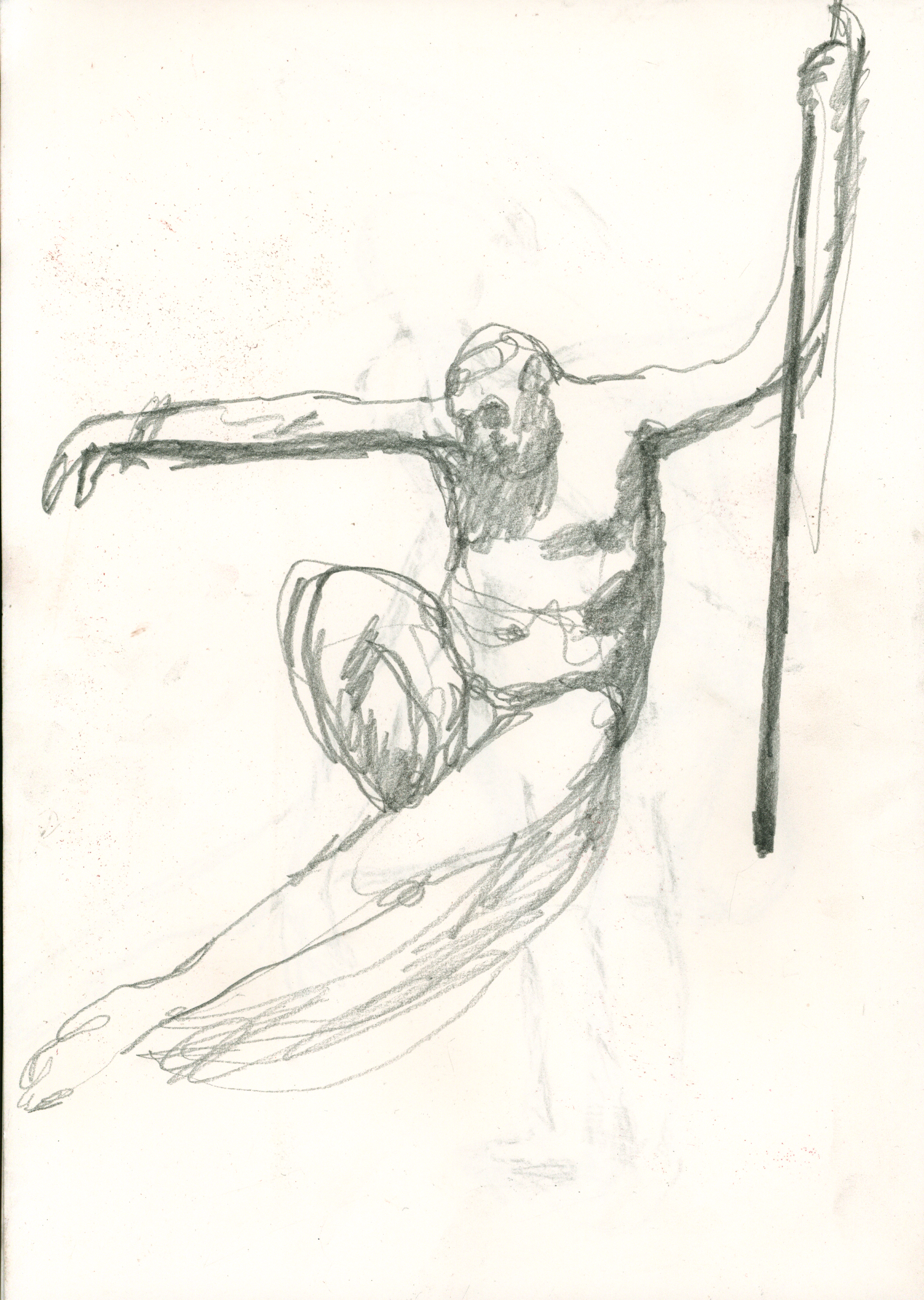
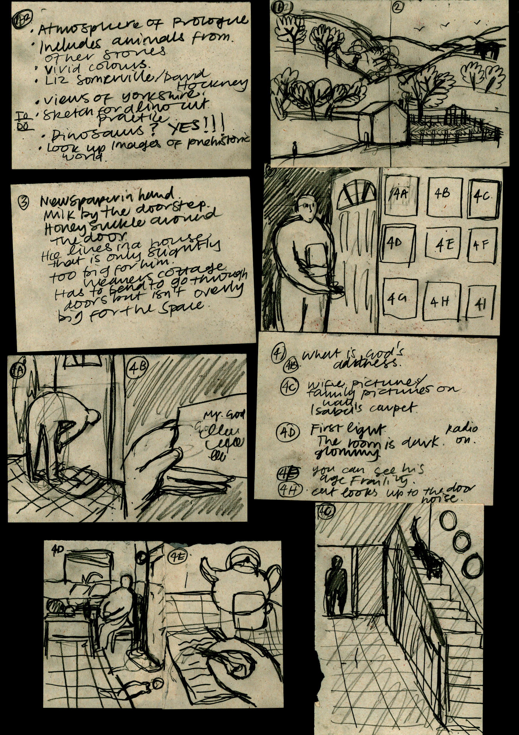
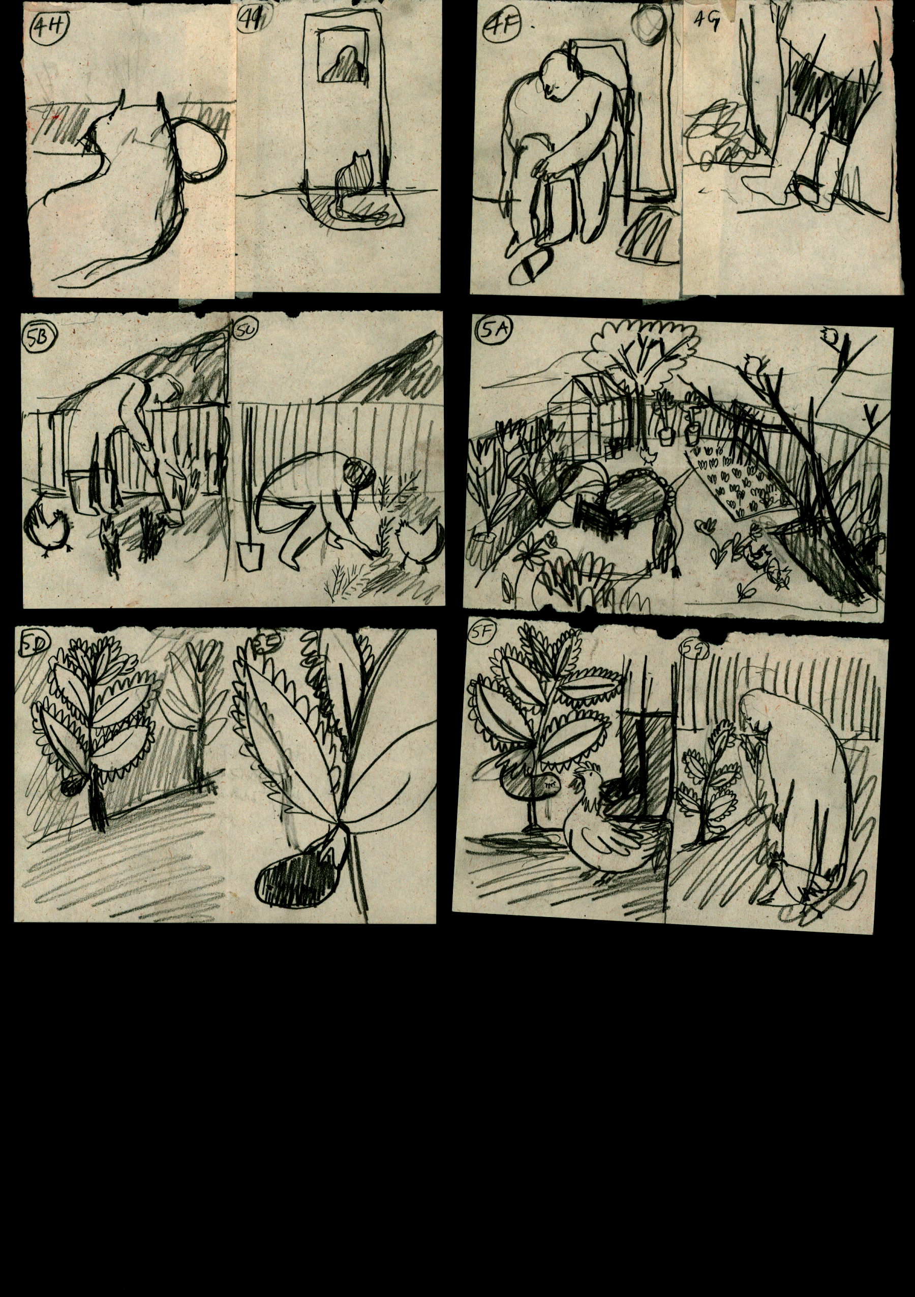
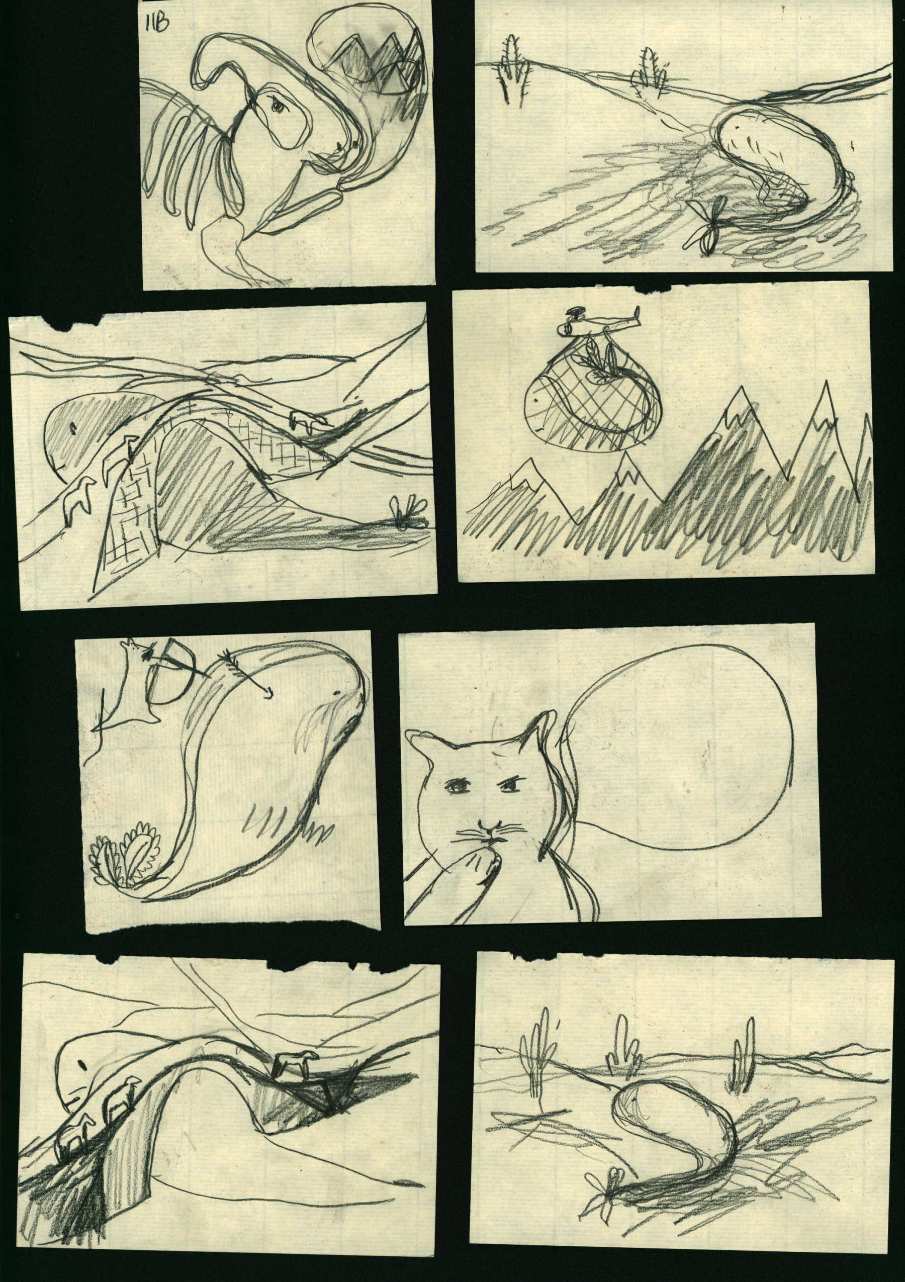
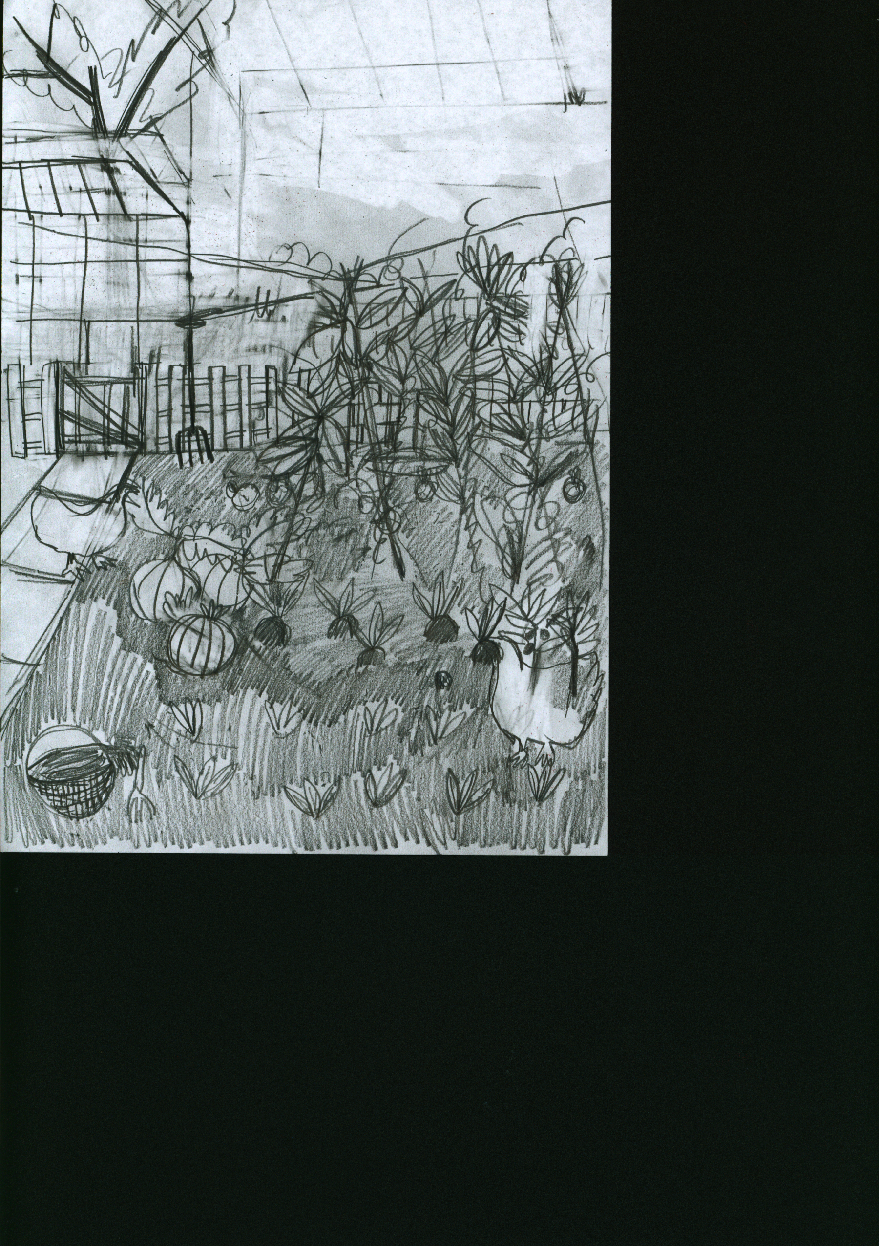
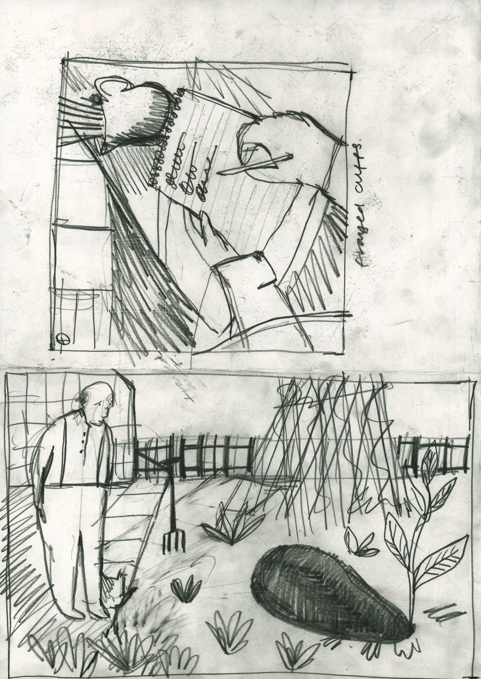
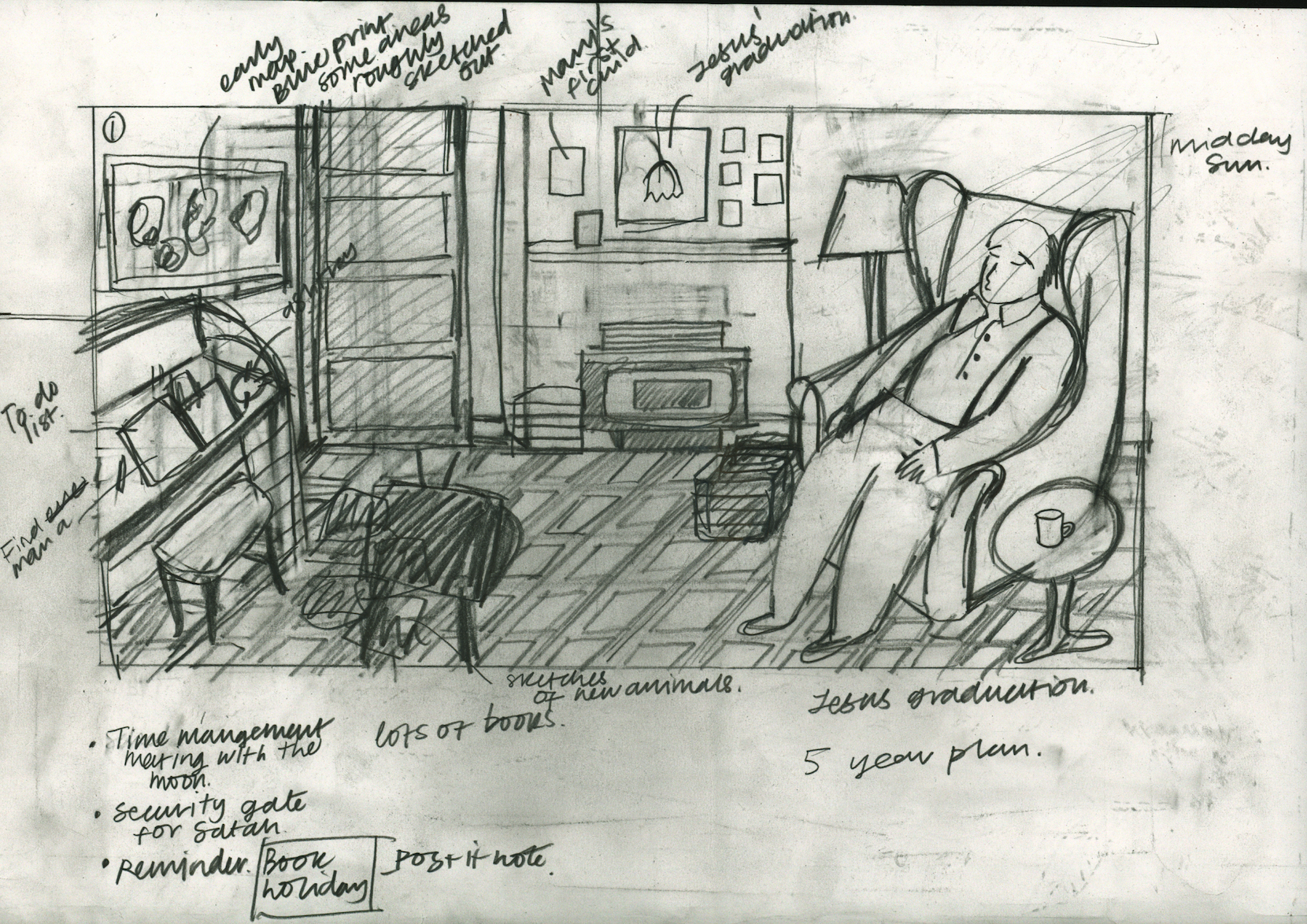
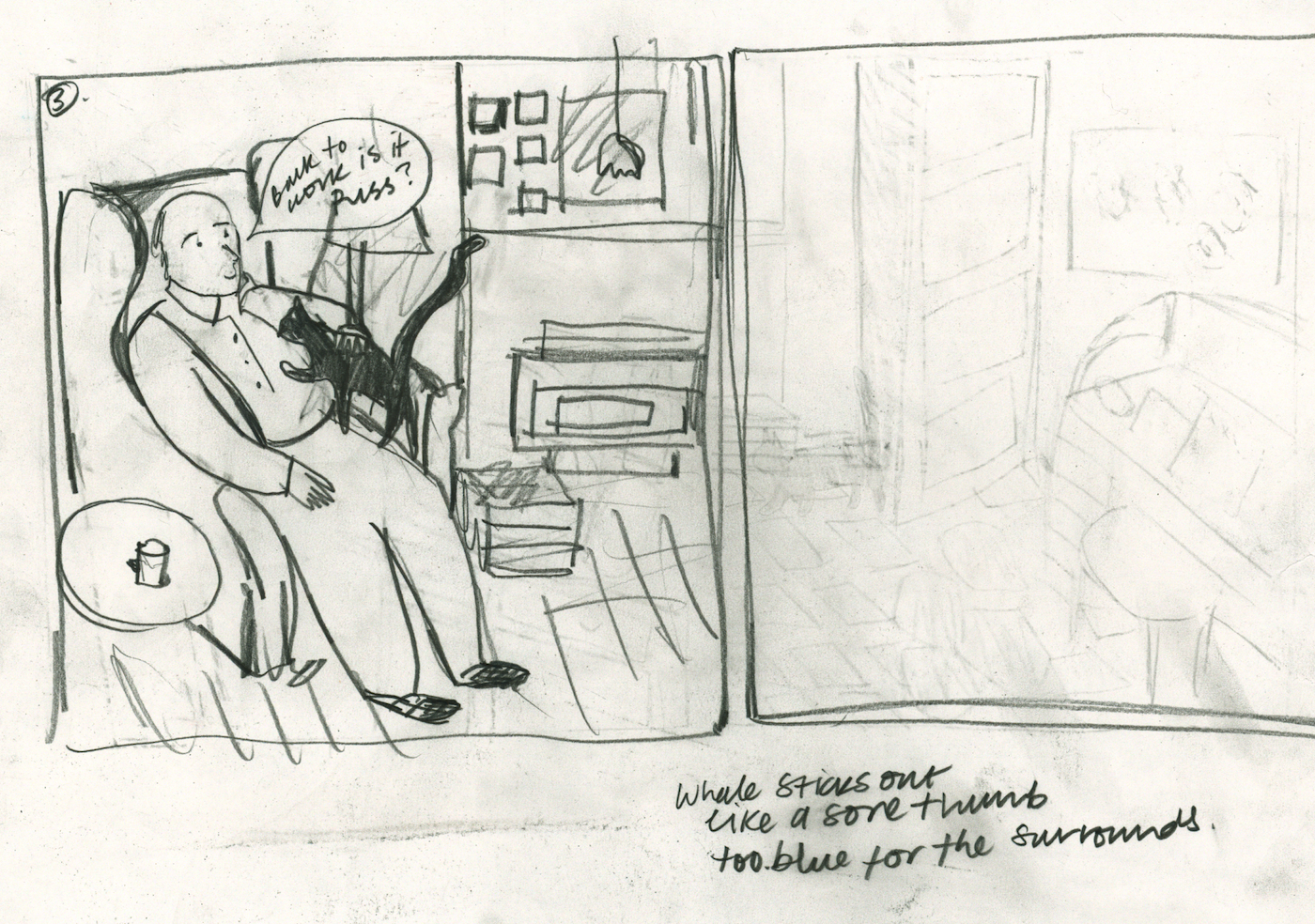
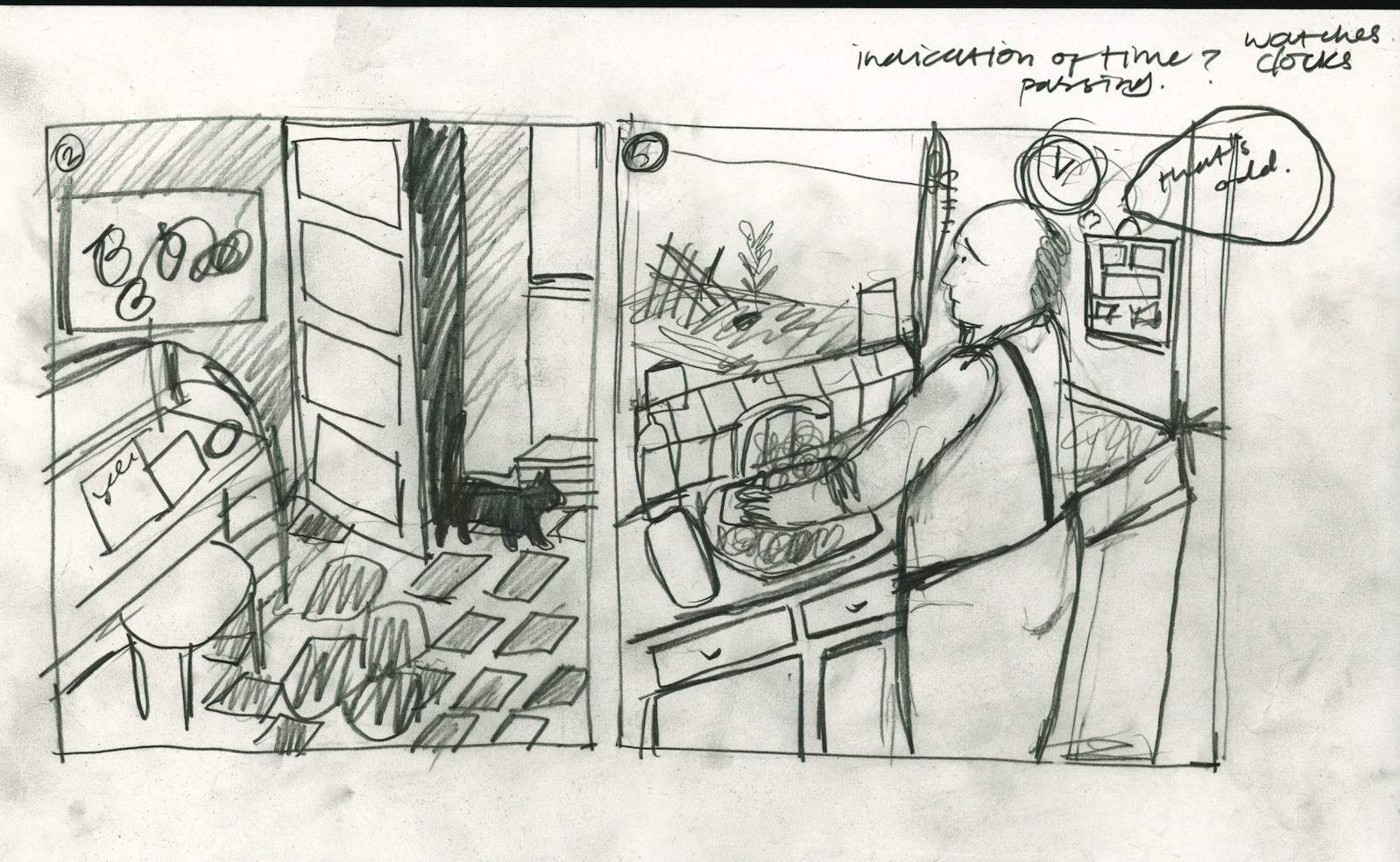
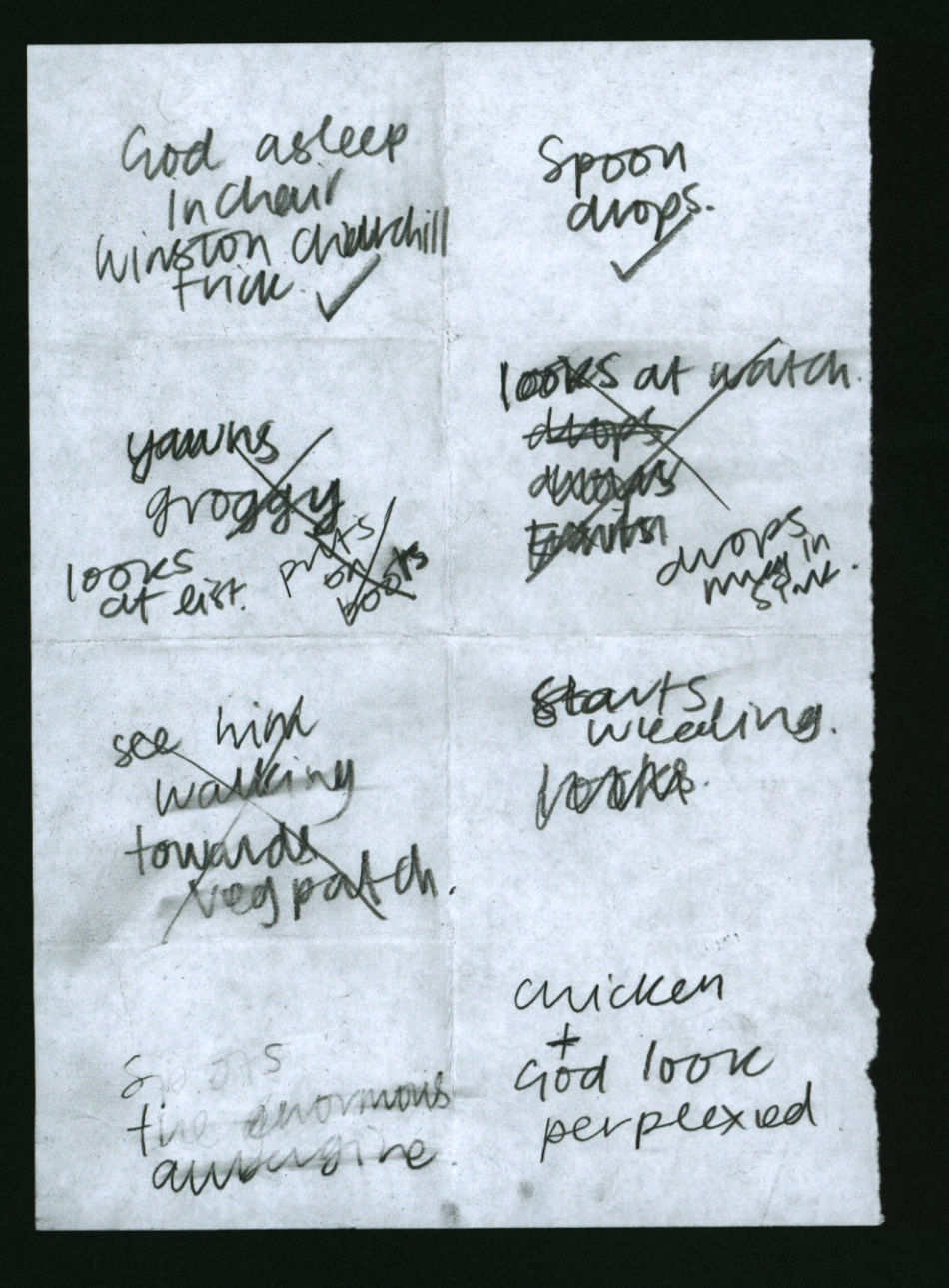
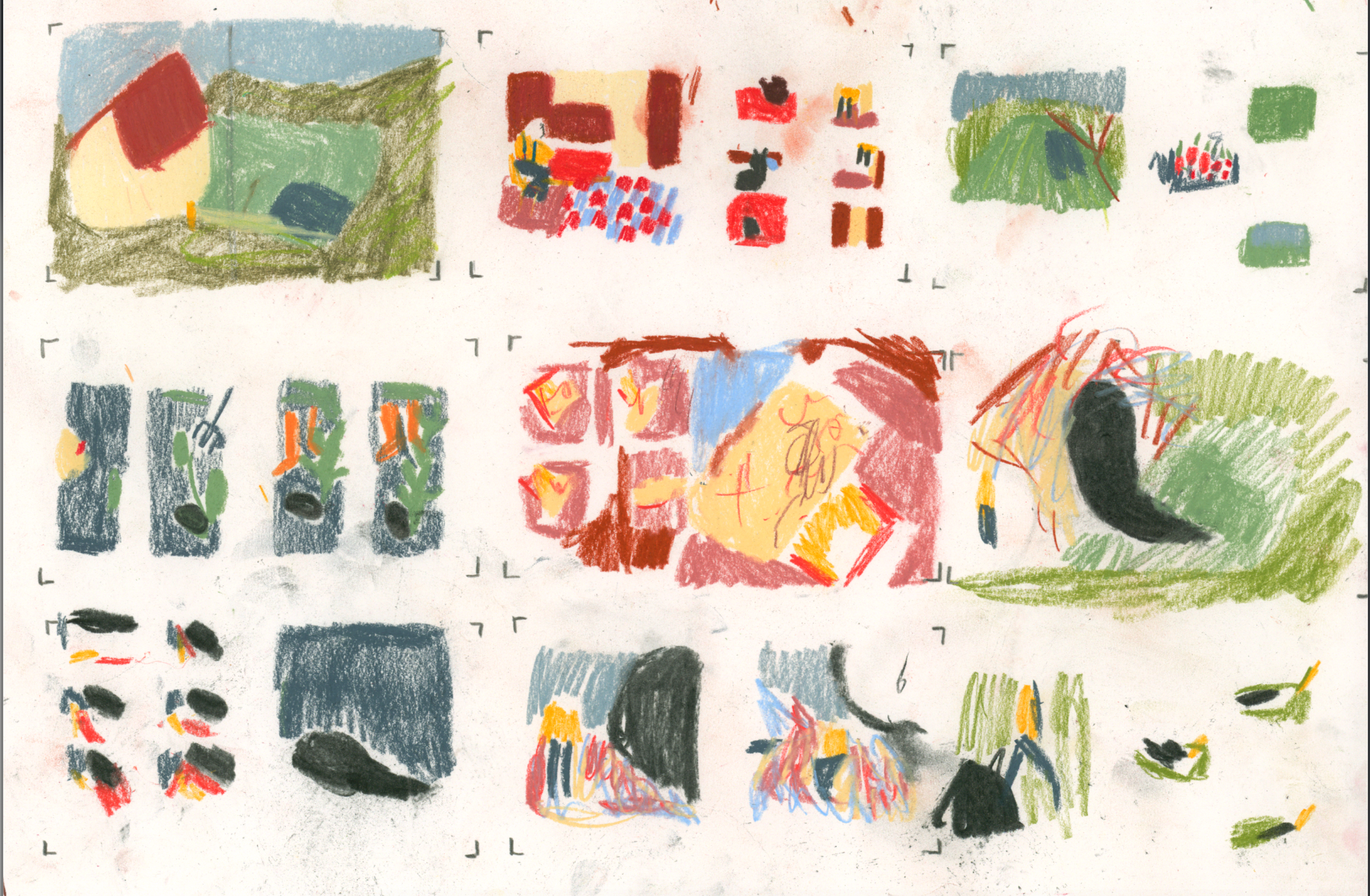
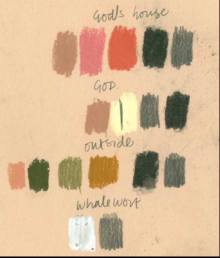
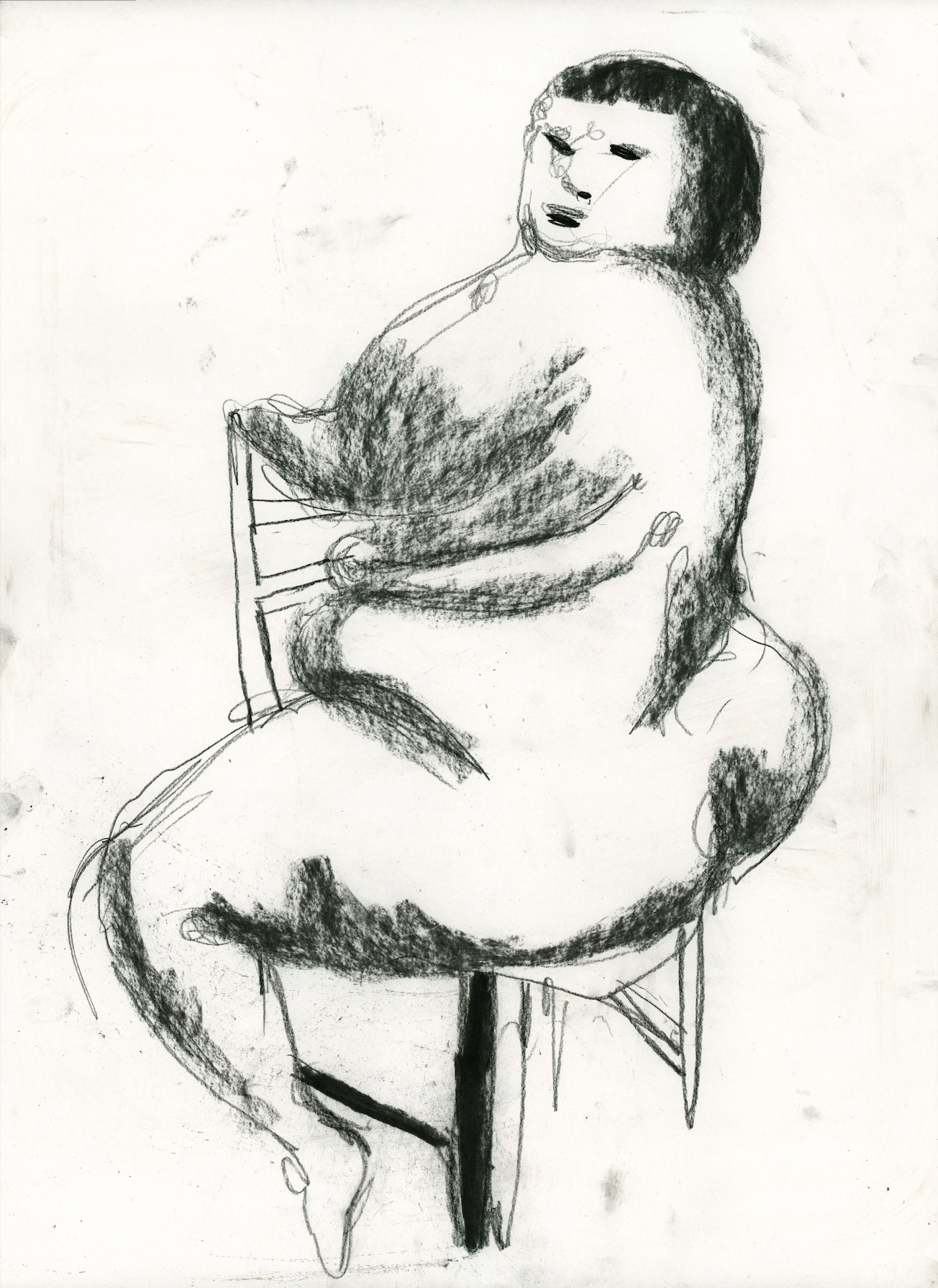
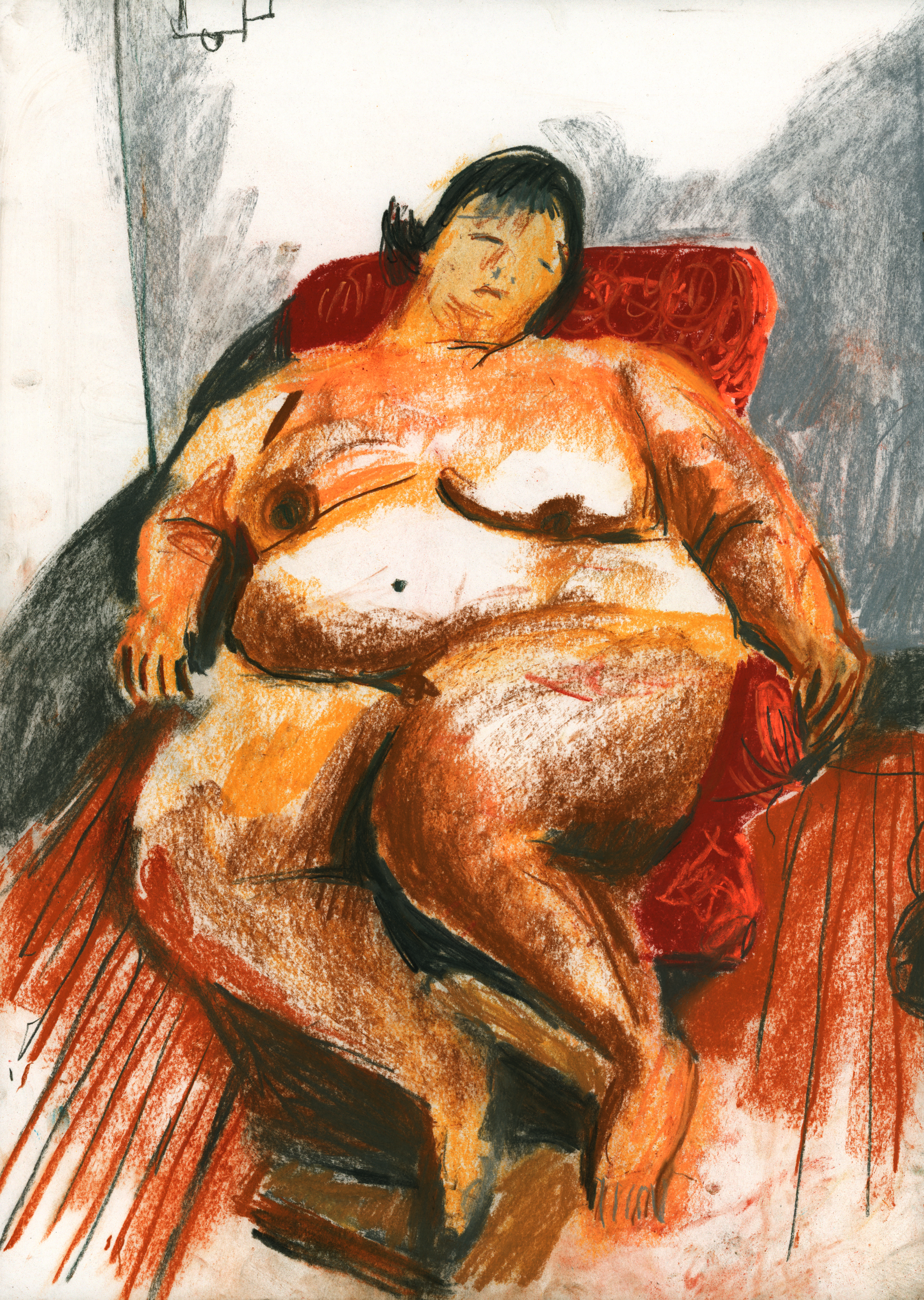
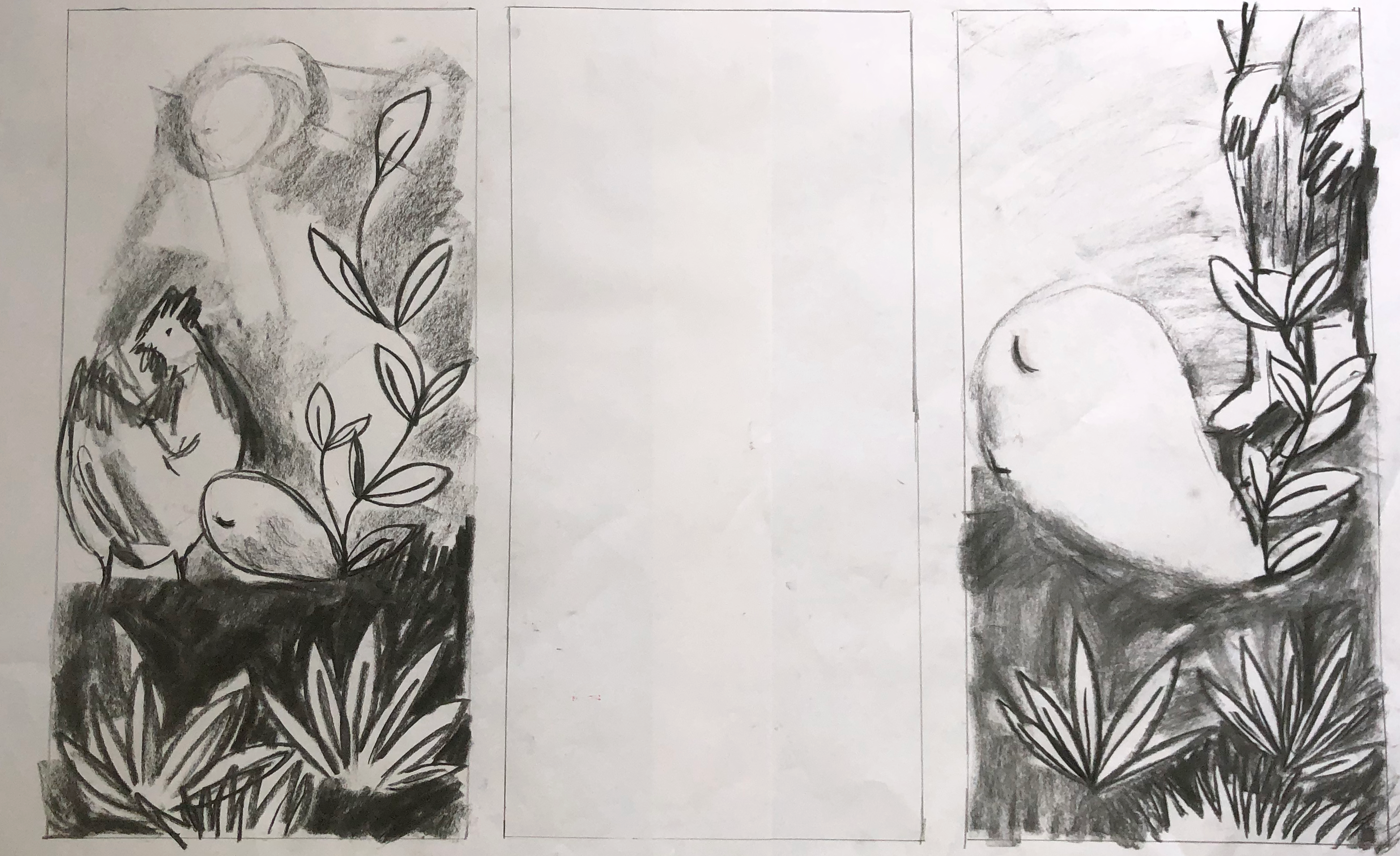
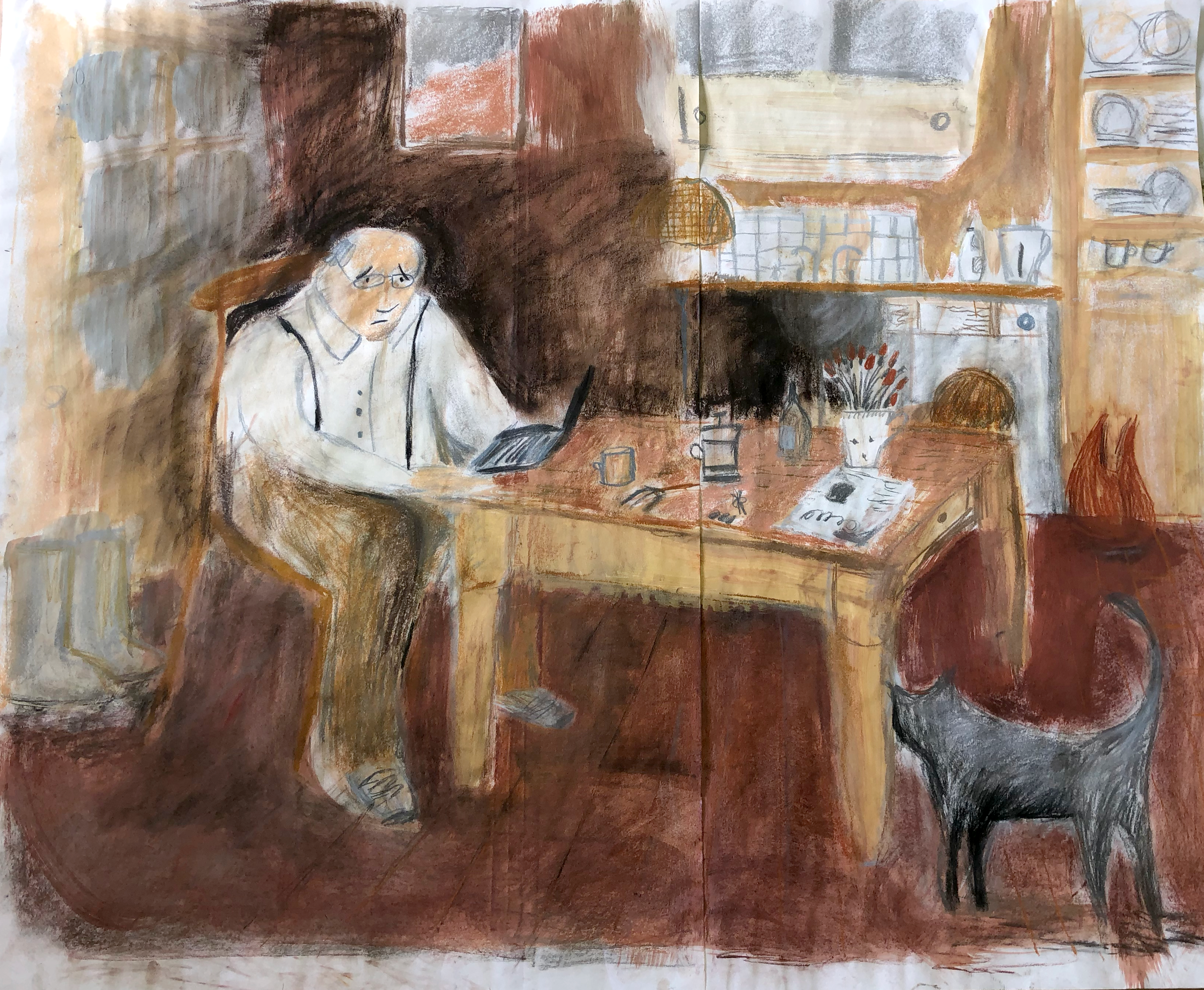
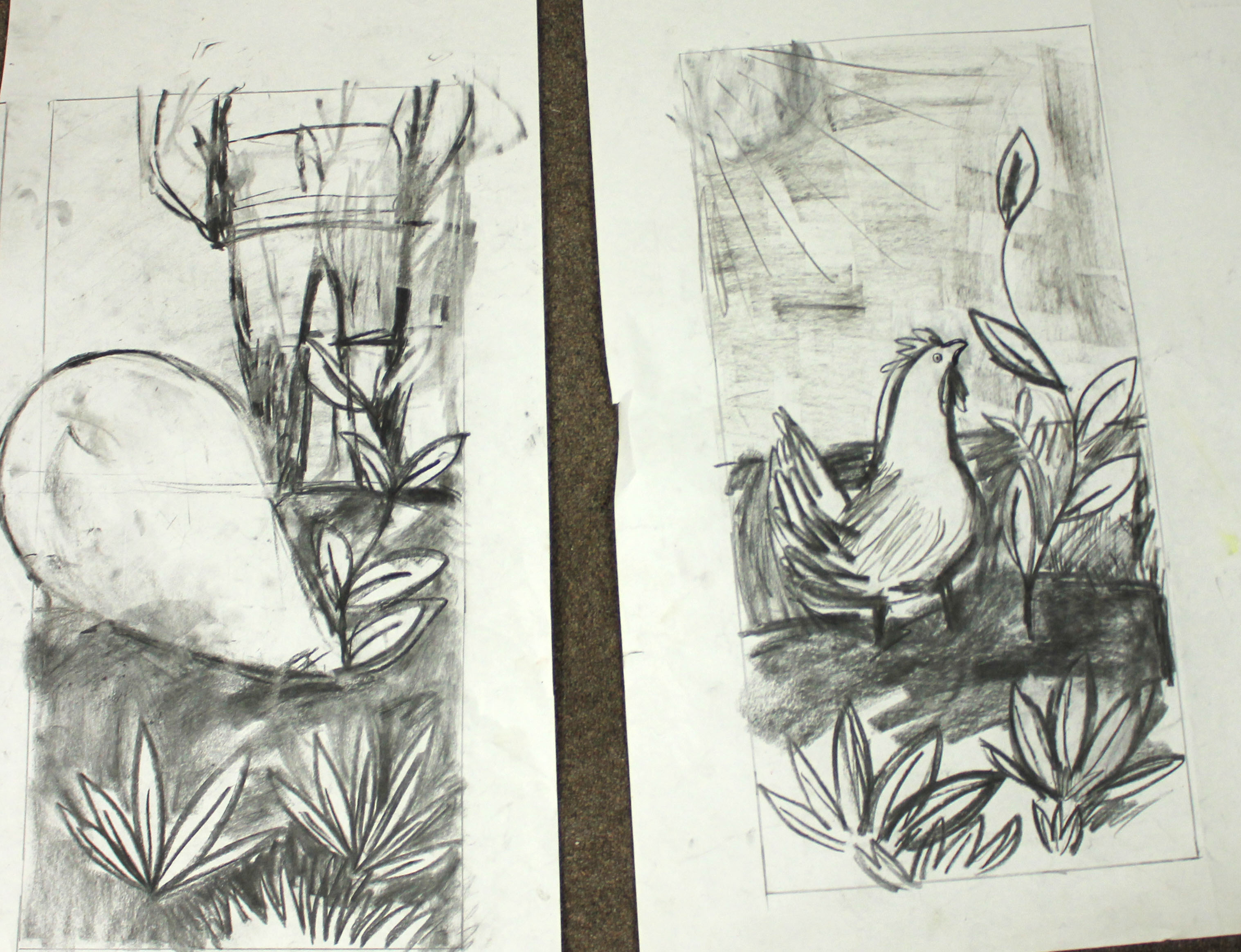
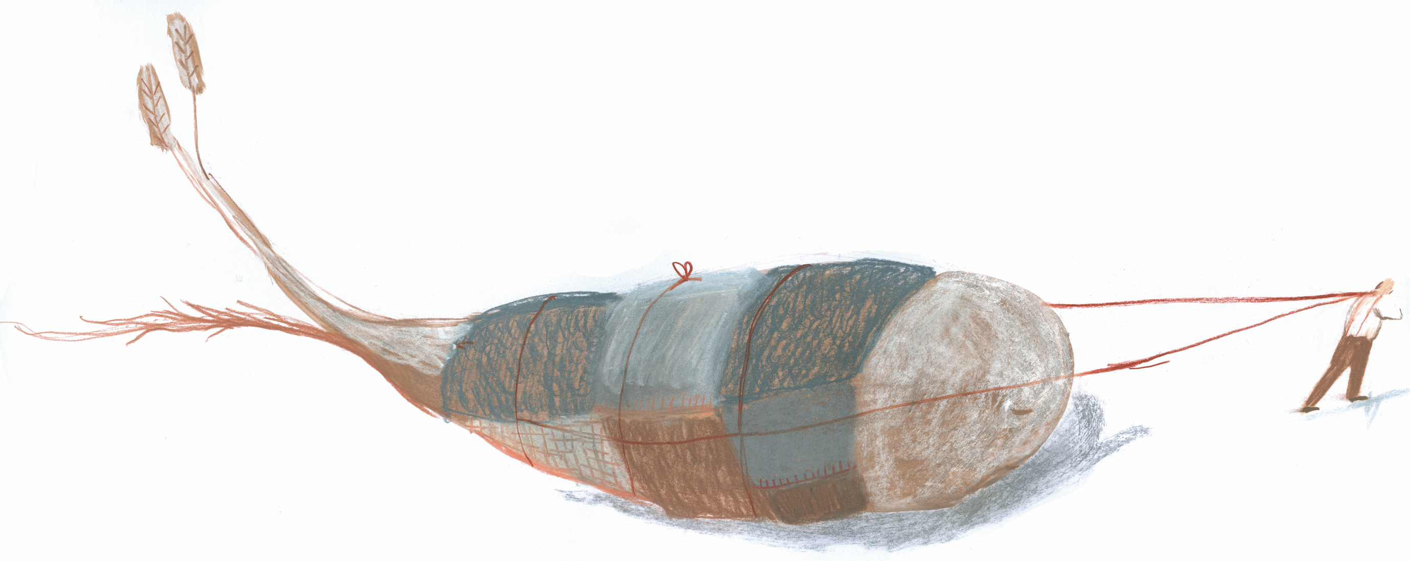
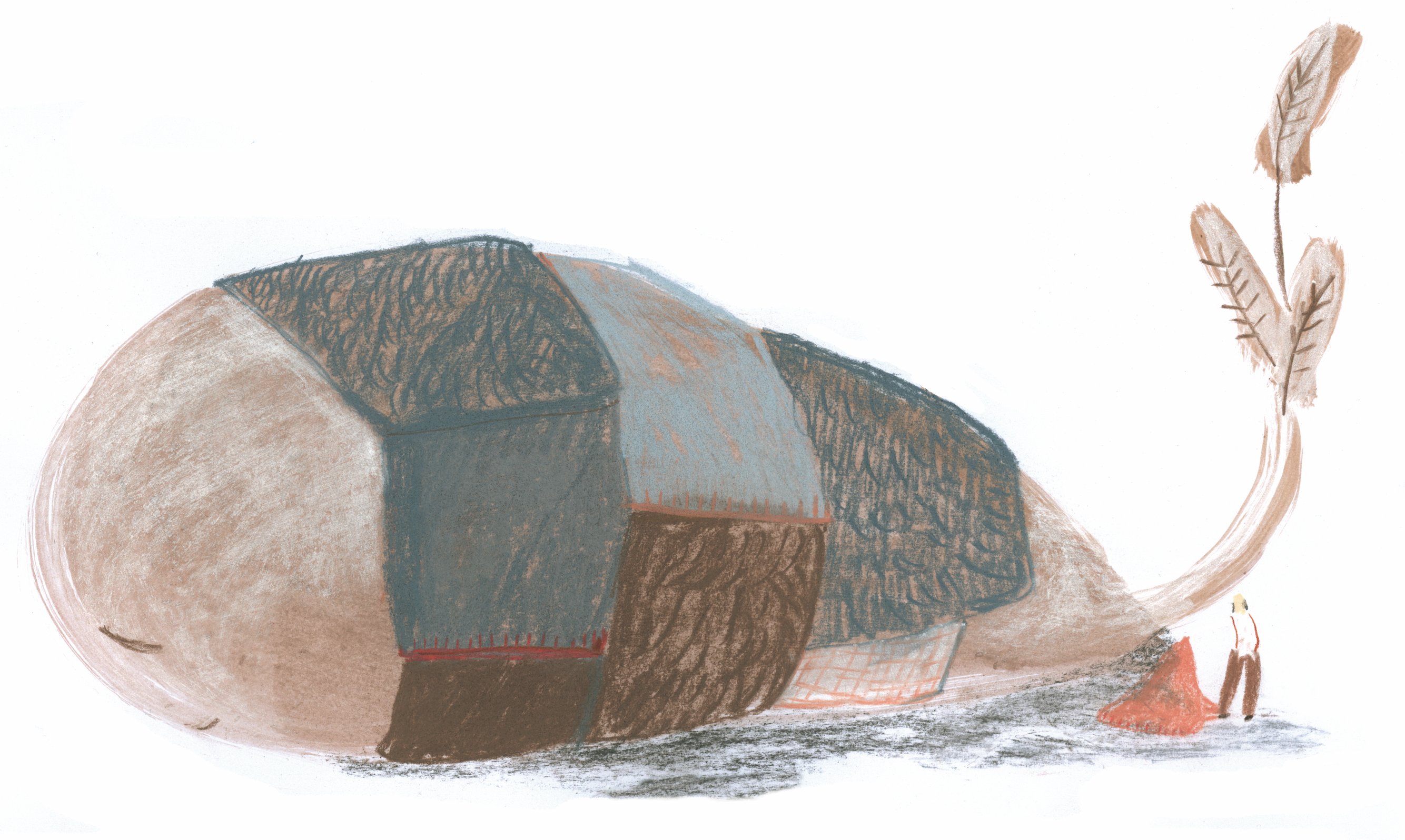
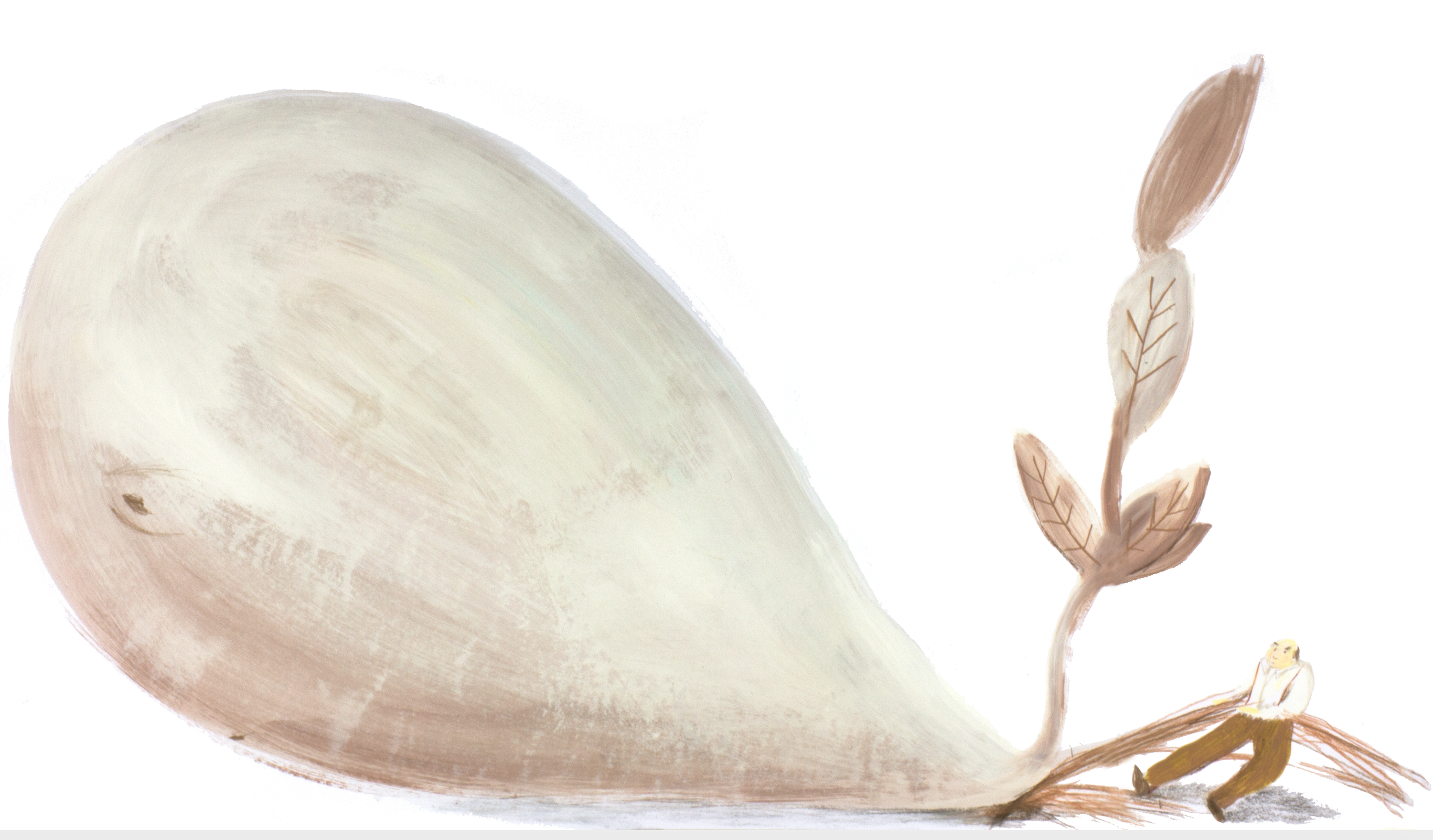
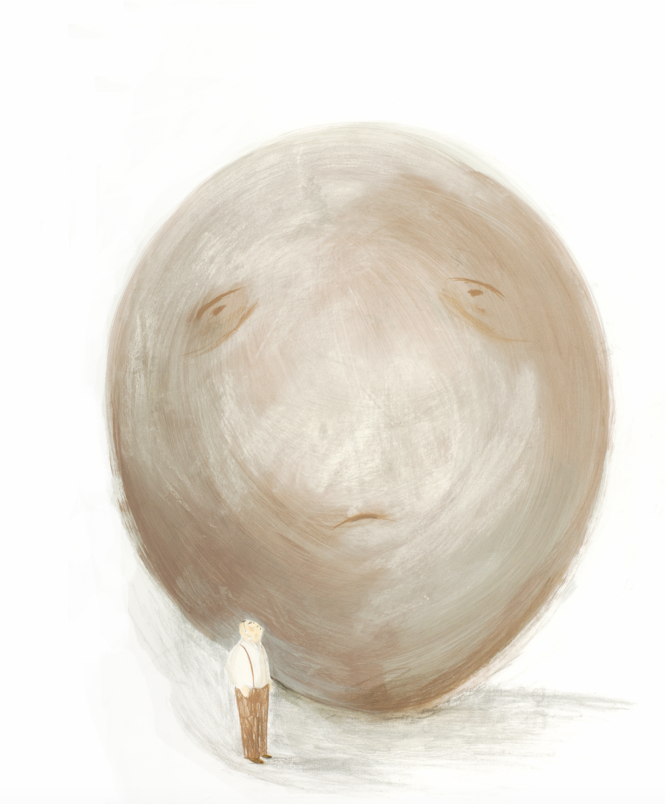
Character studies of Whalewort


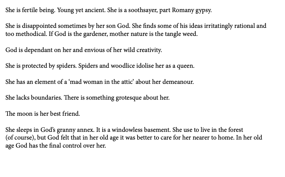
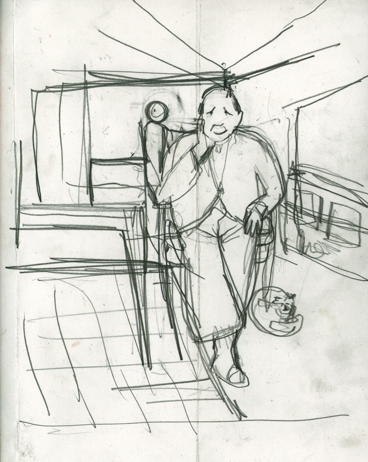
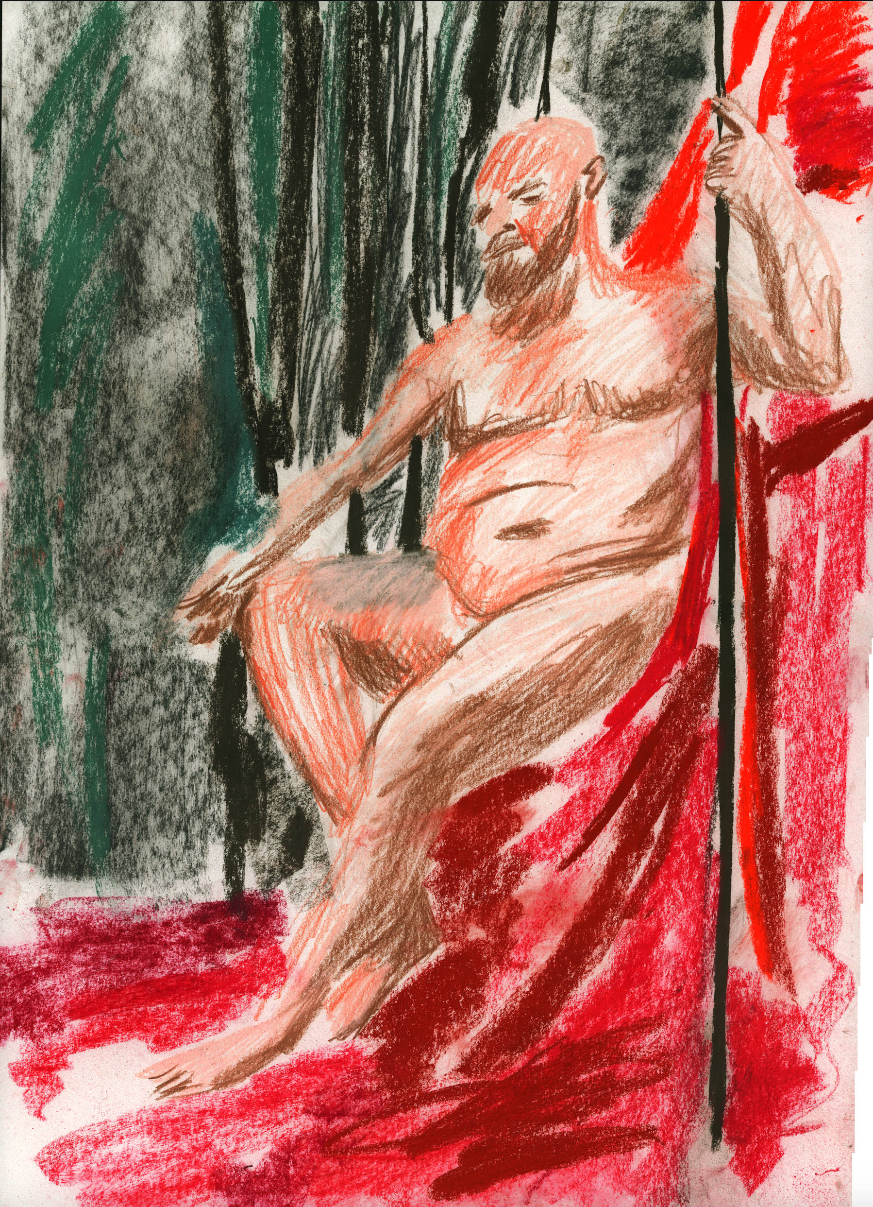
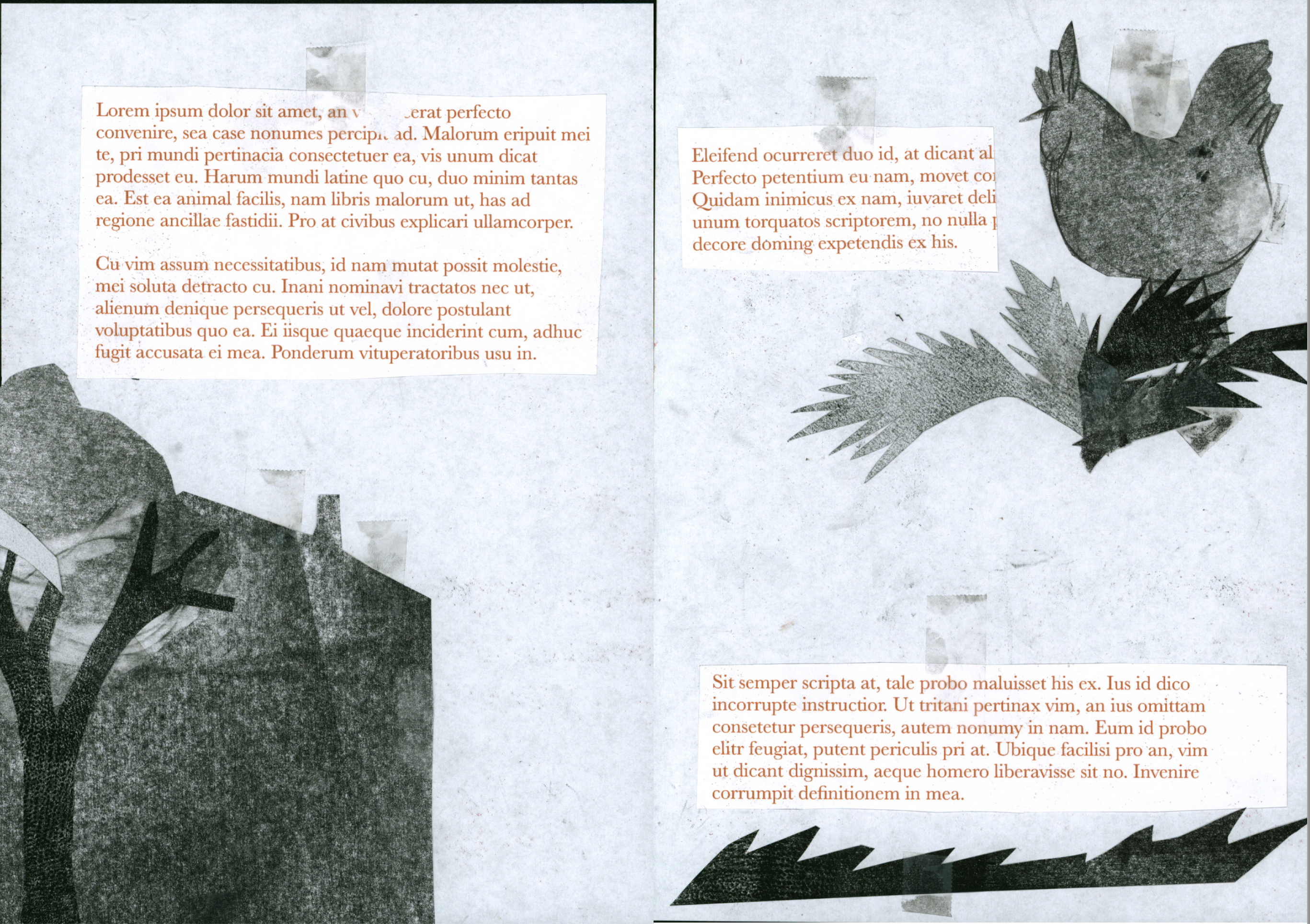
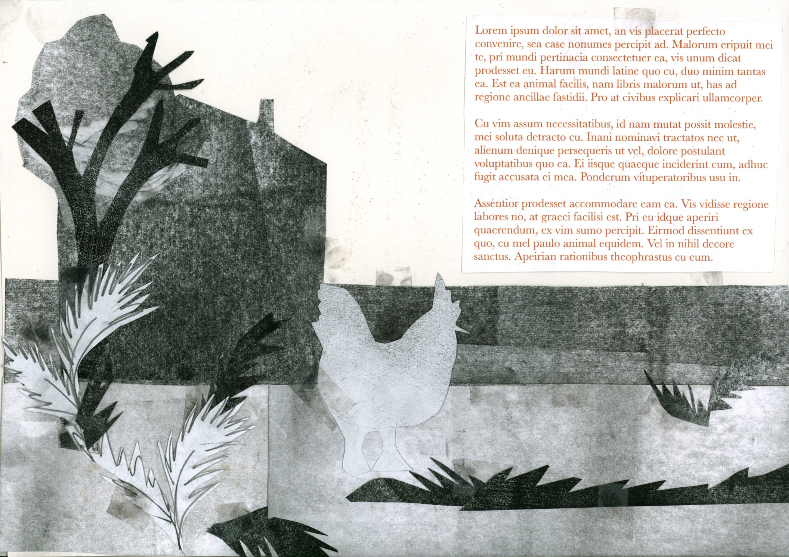
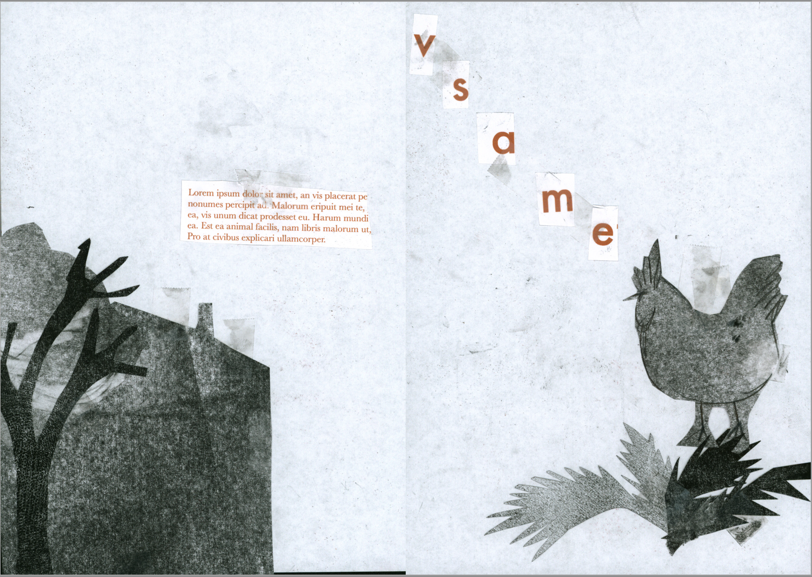
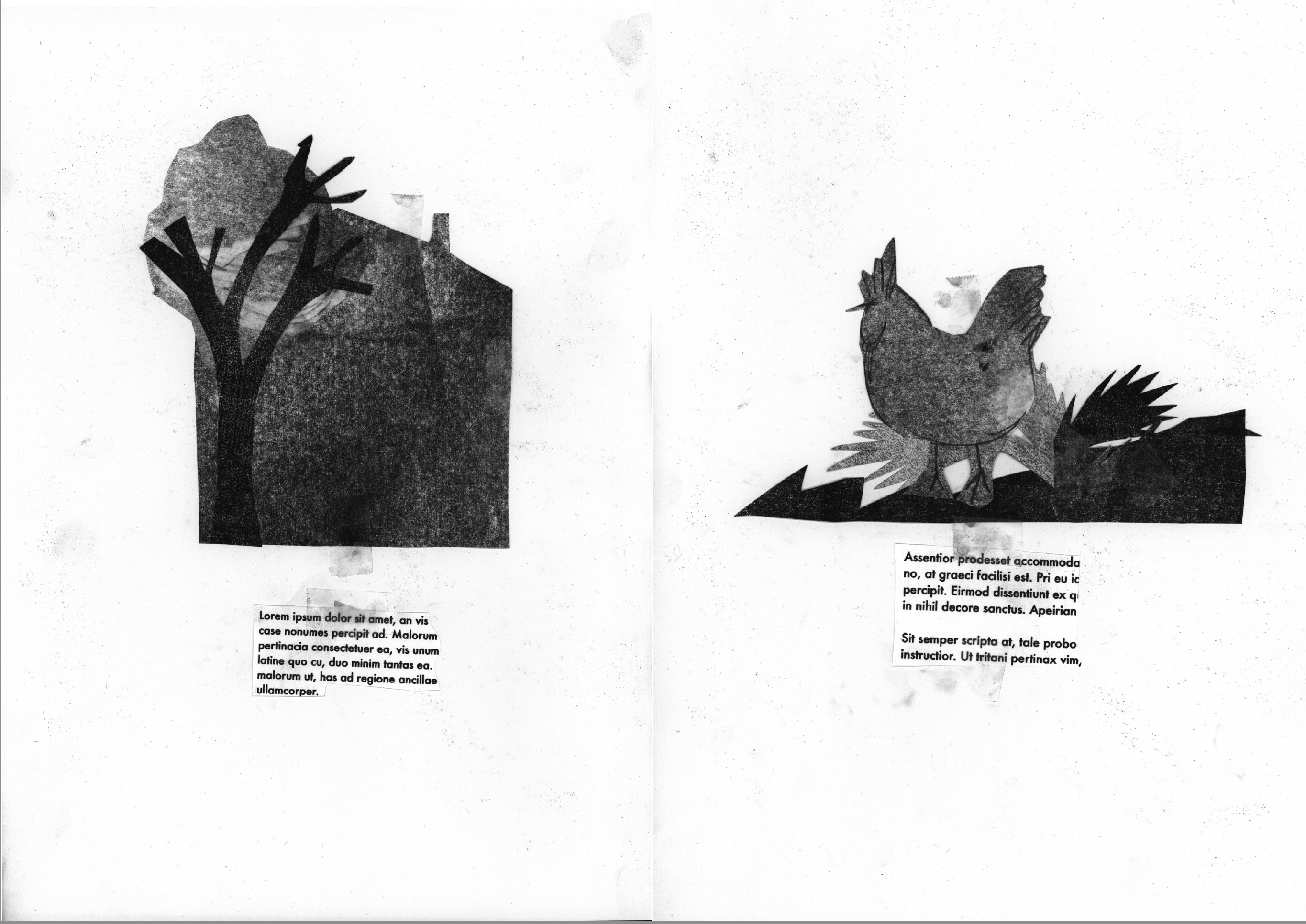
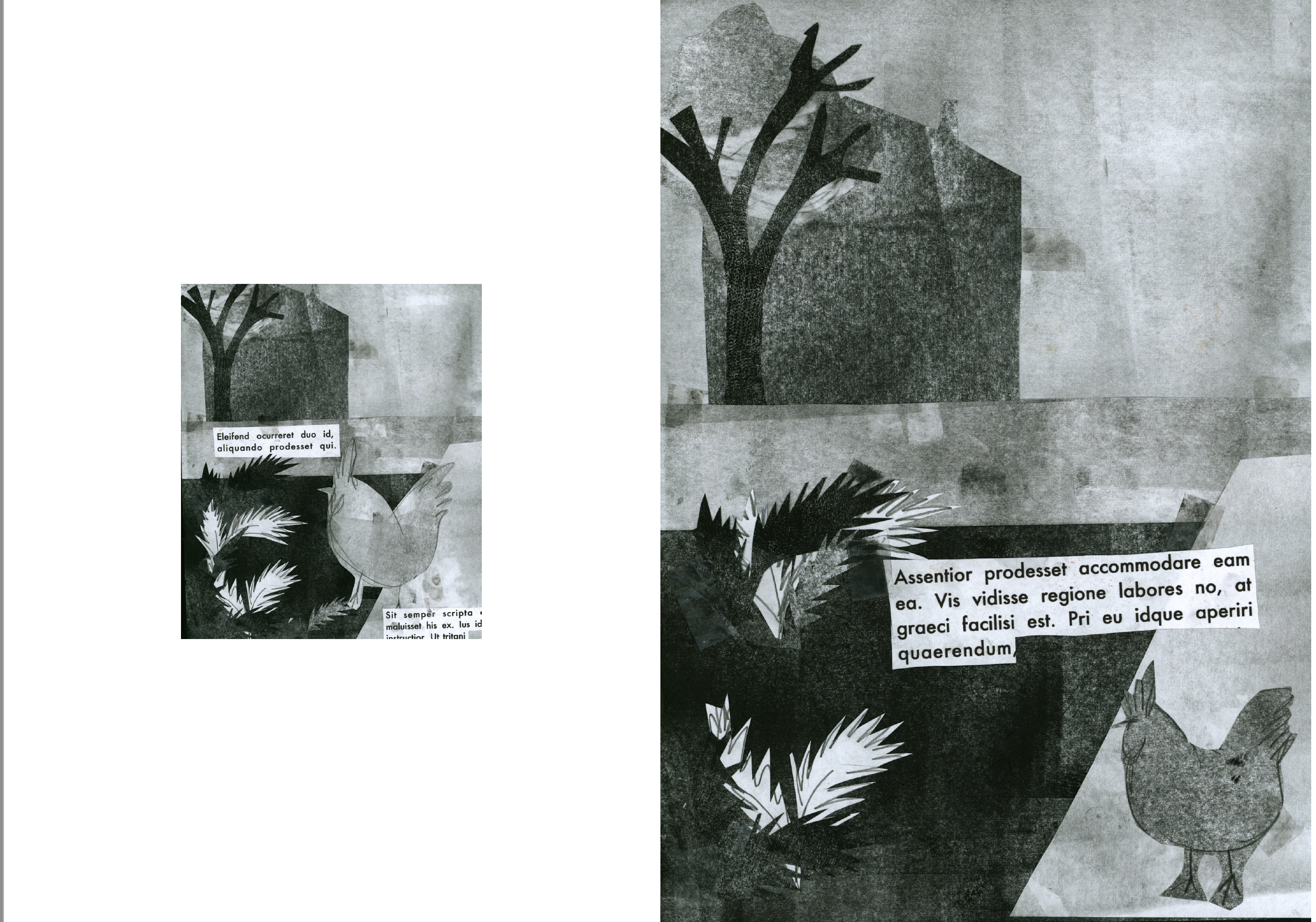
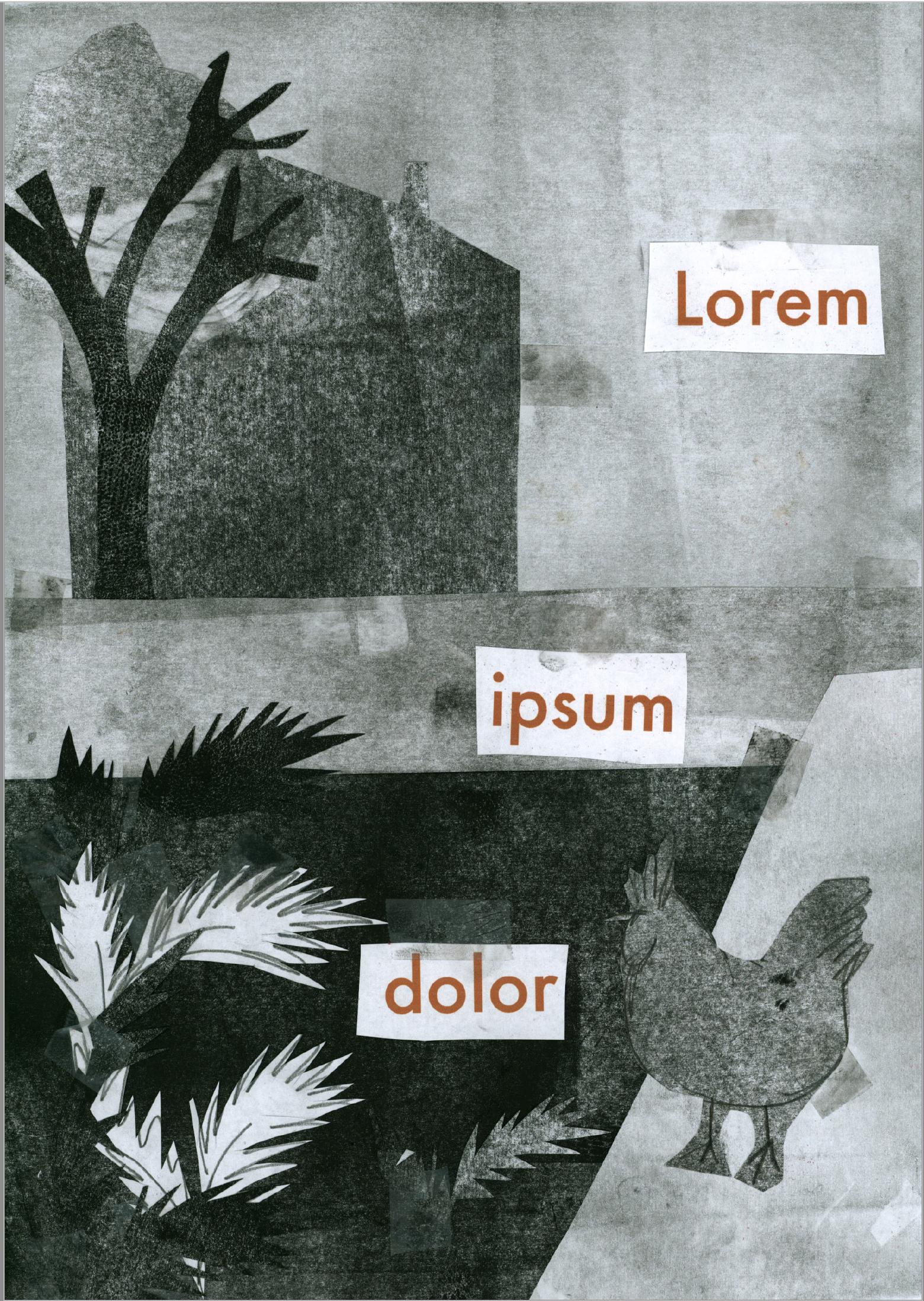
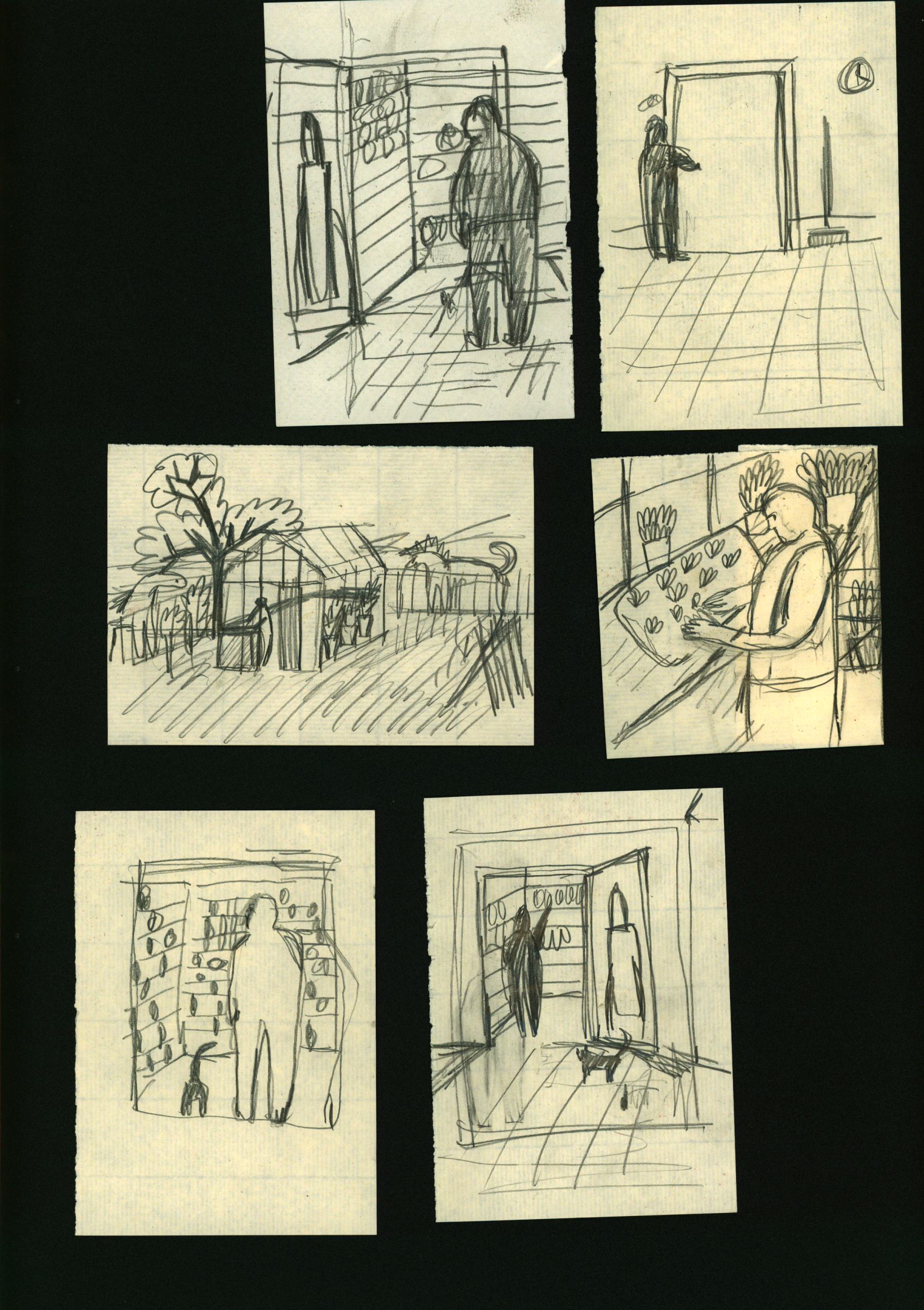
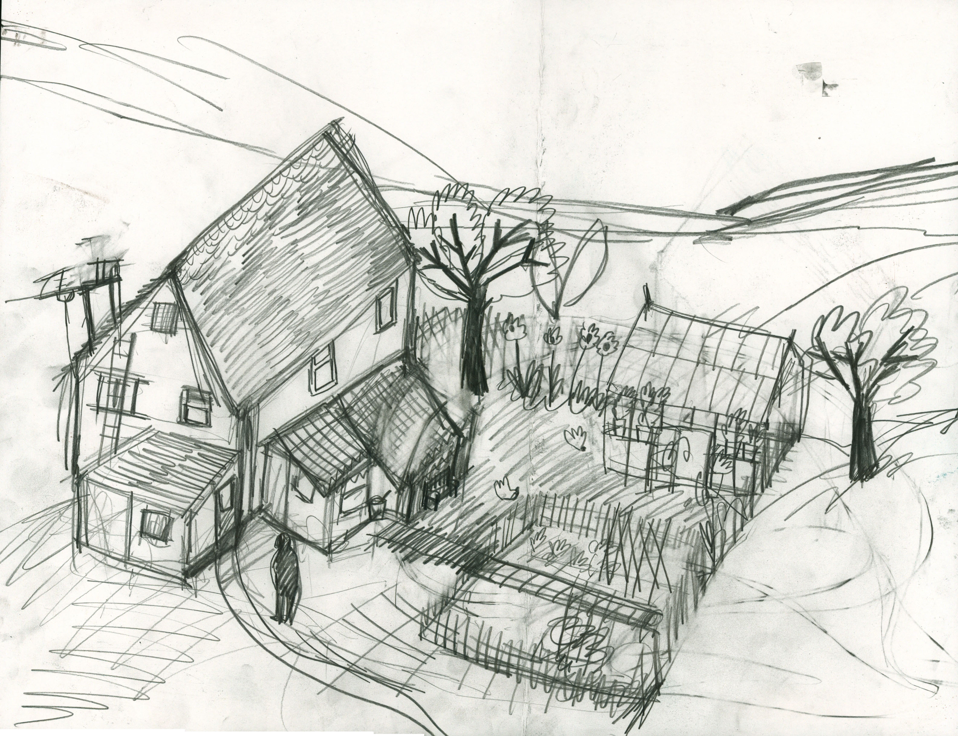
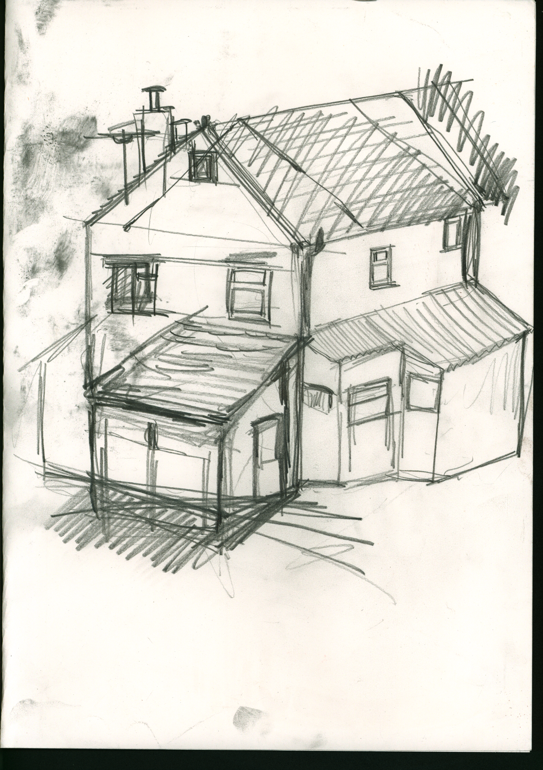
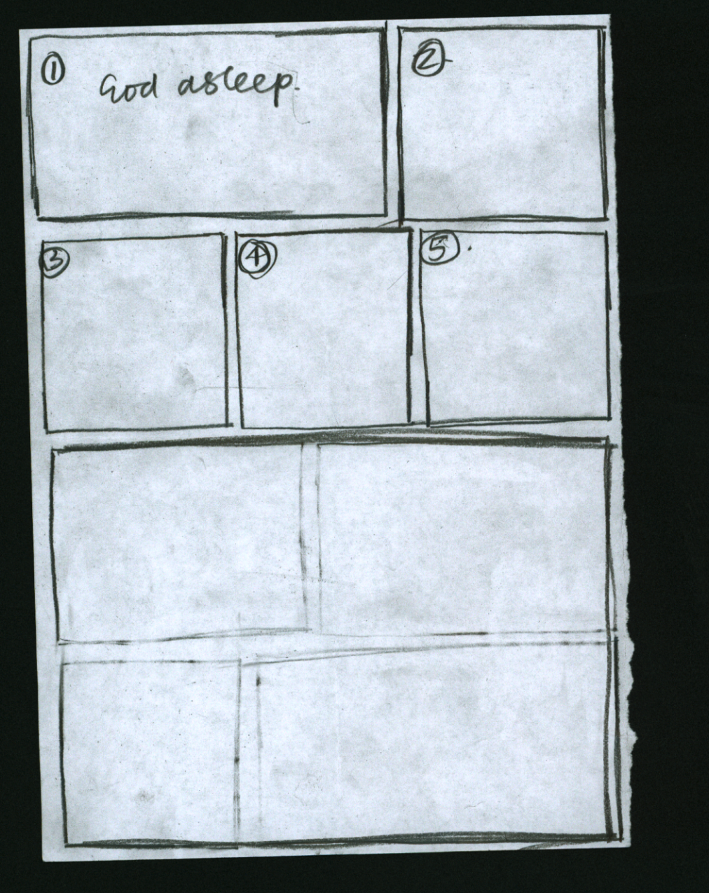
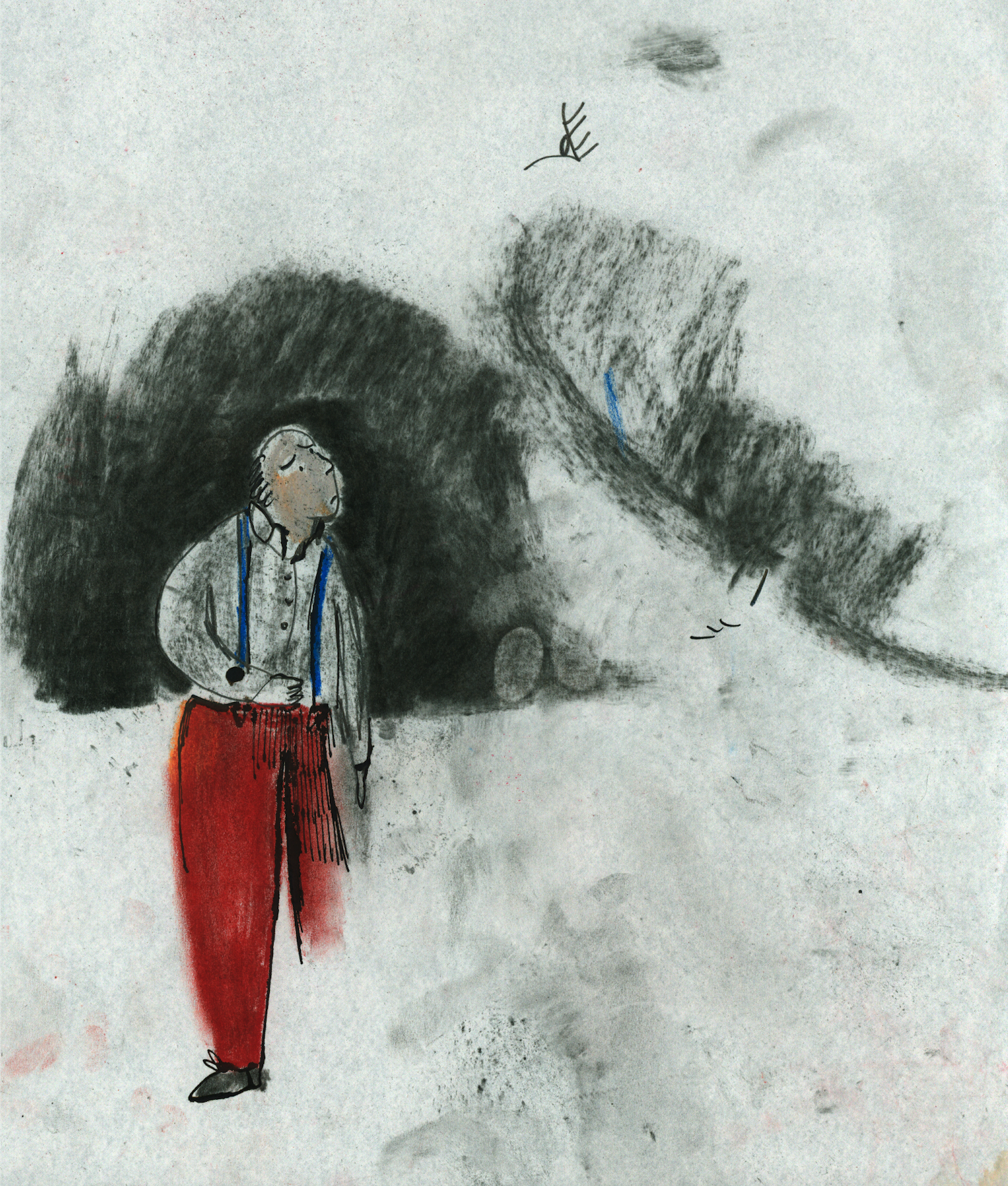
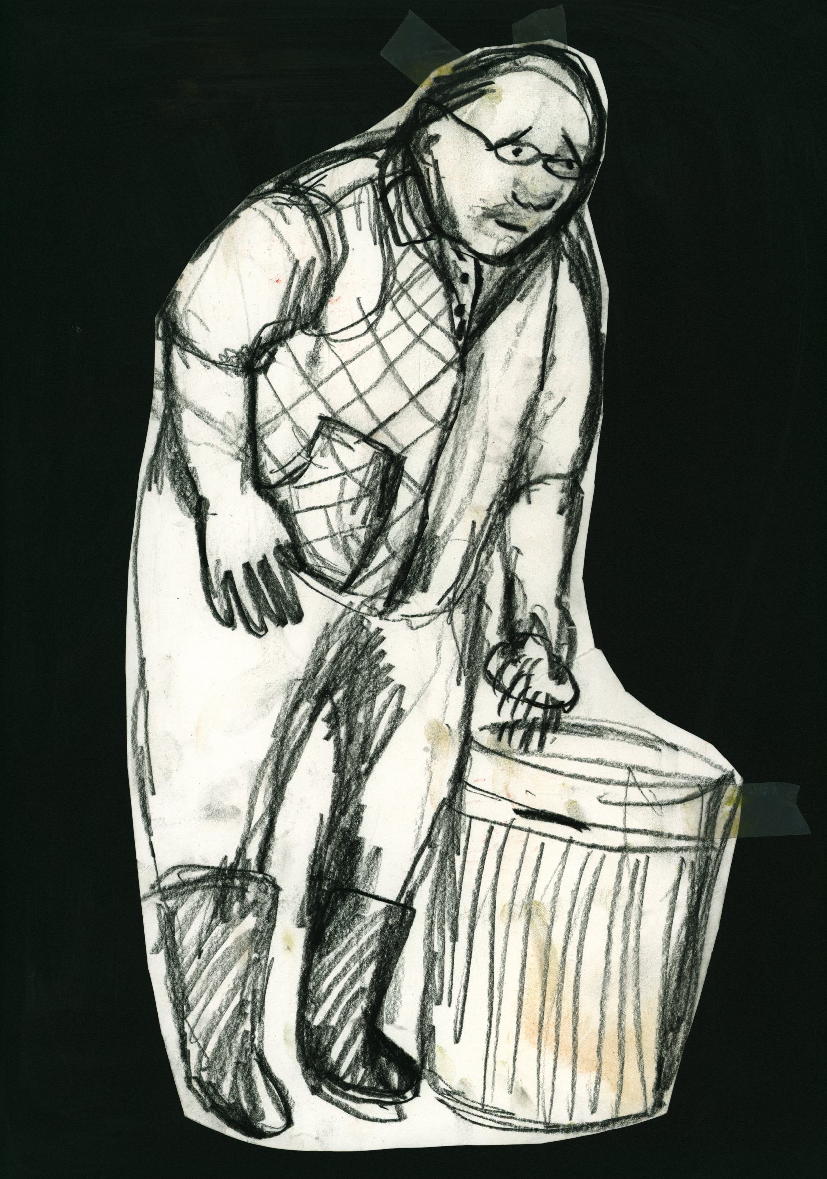
God’s House
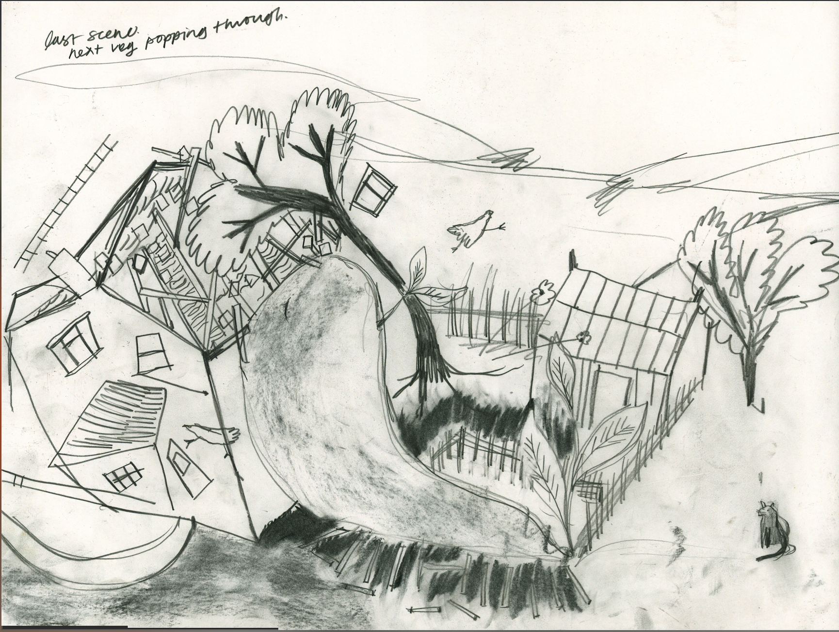

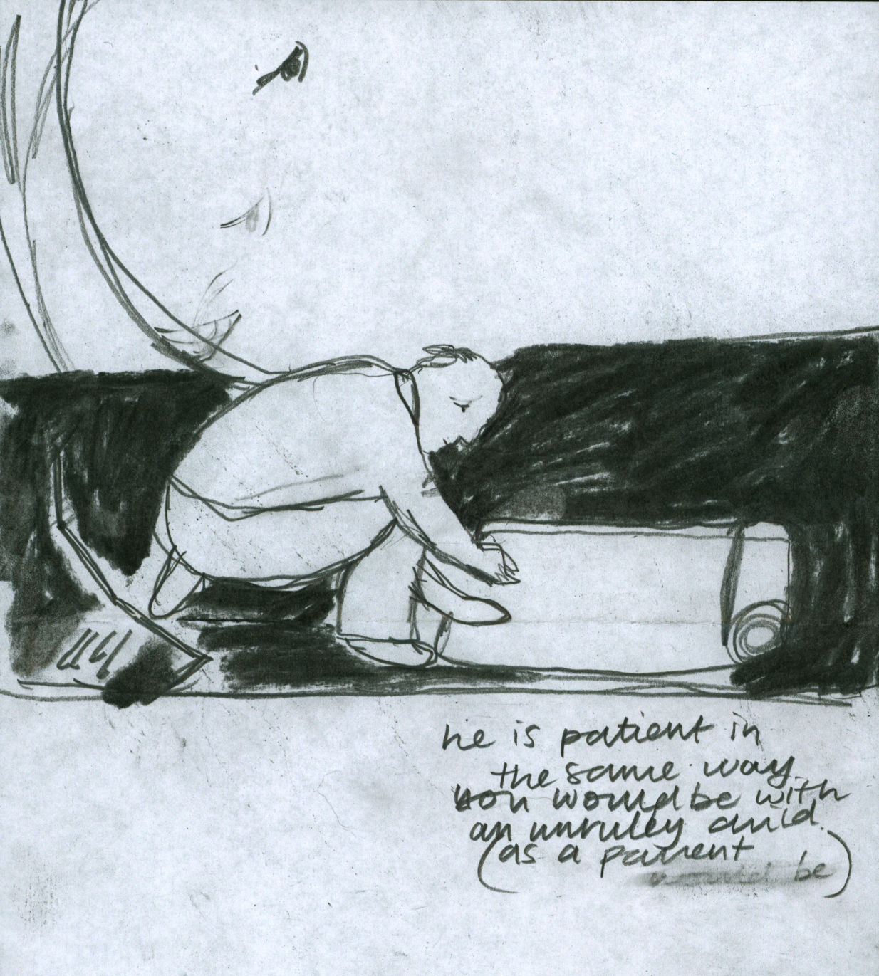
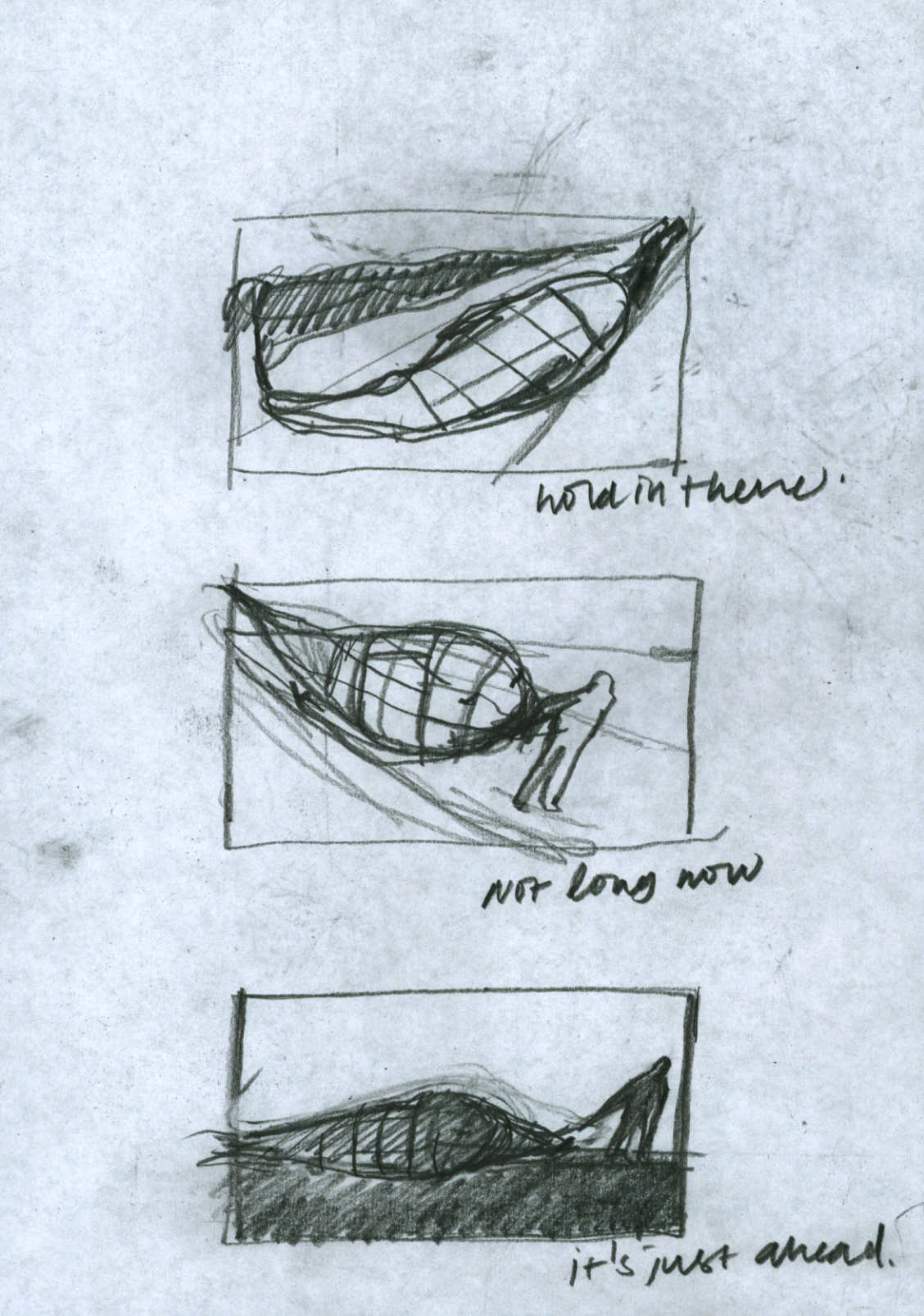
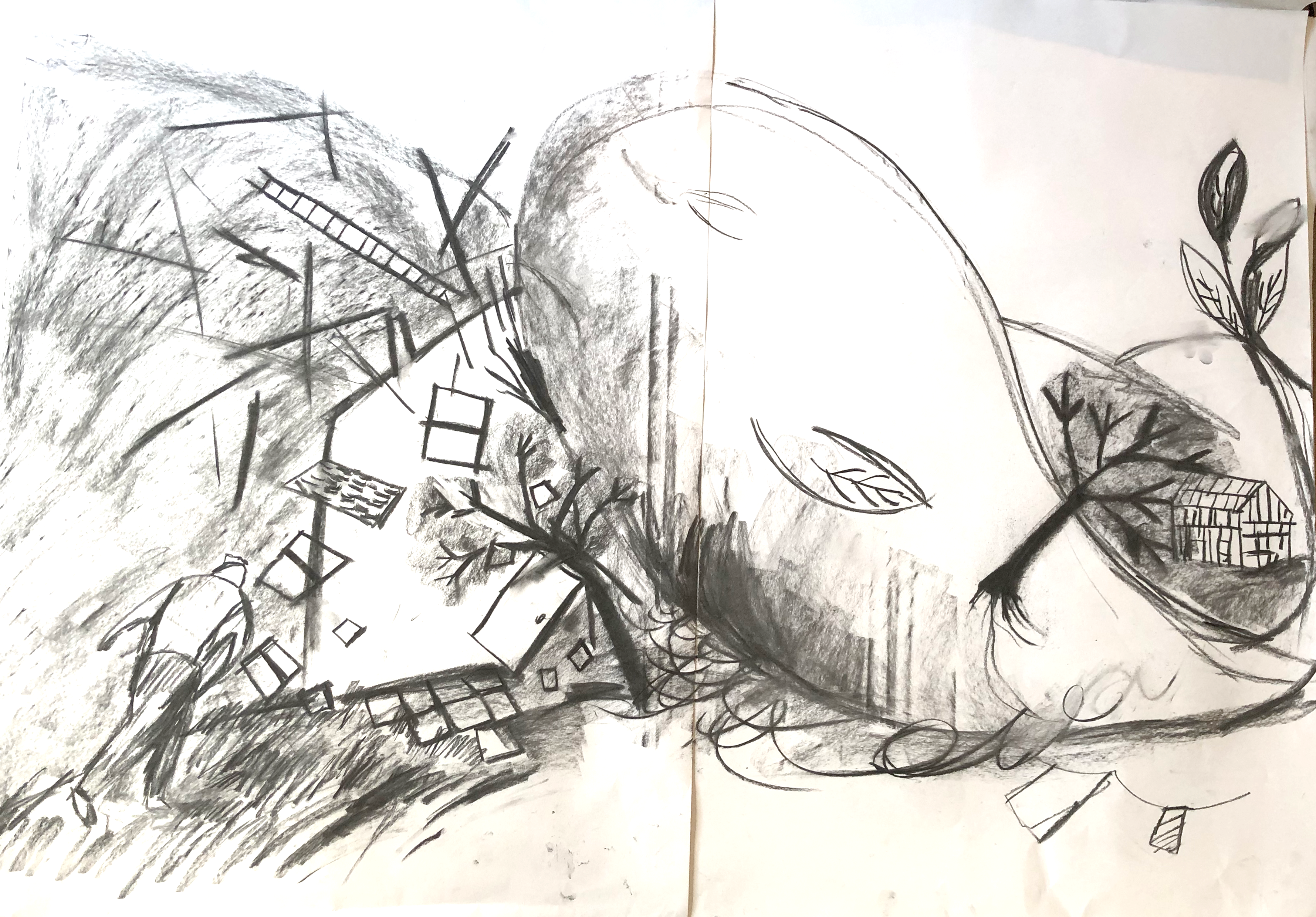
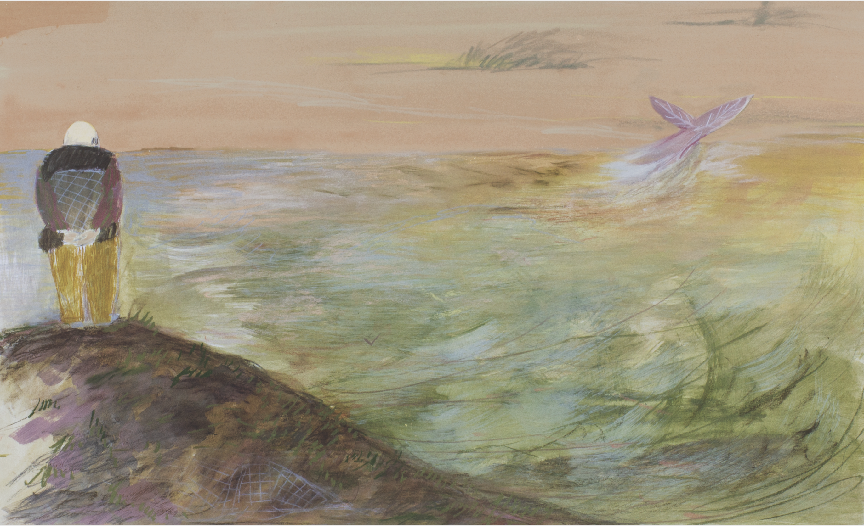
Scared chicken sequence

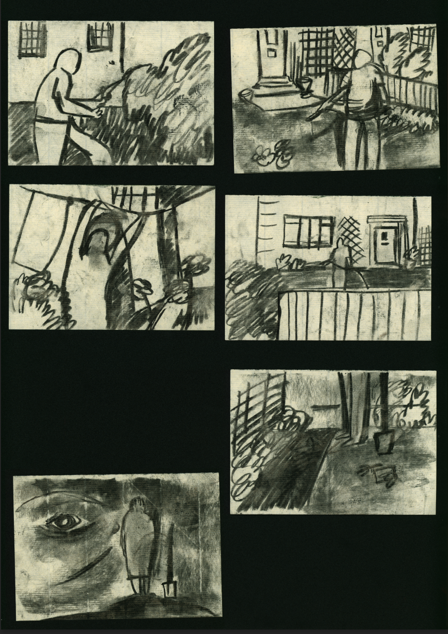
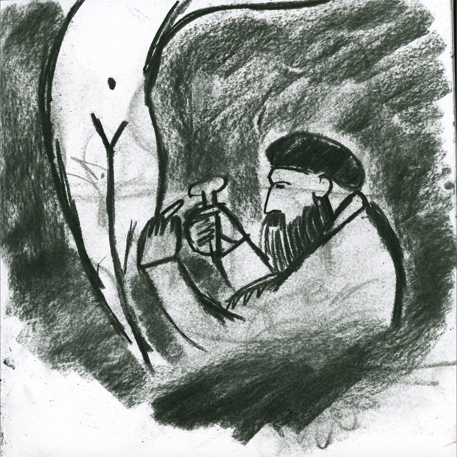
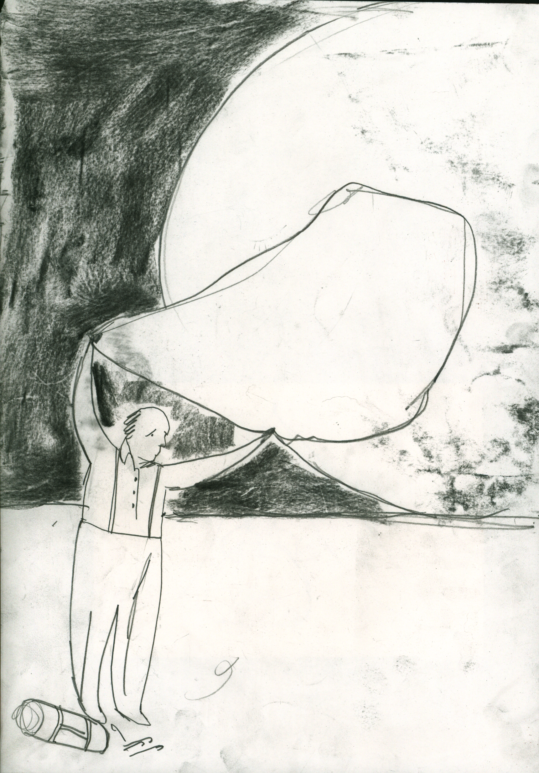
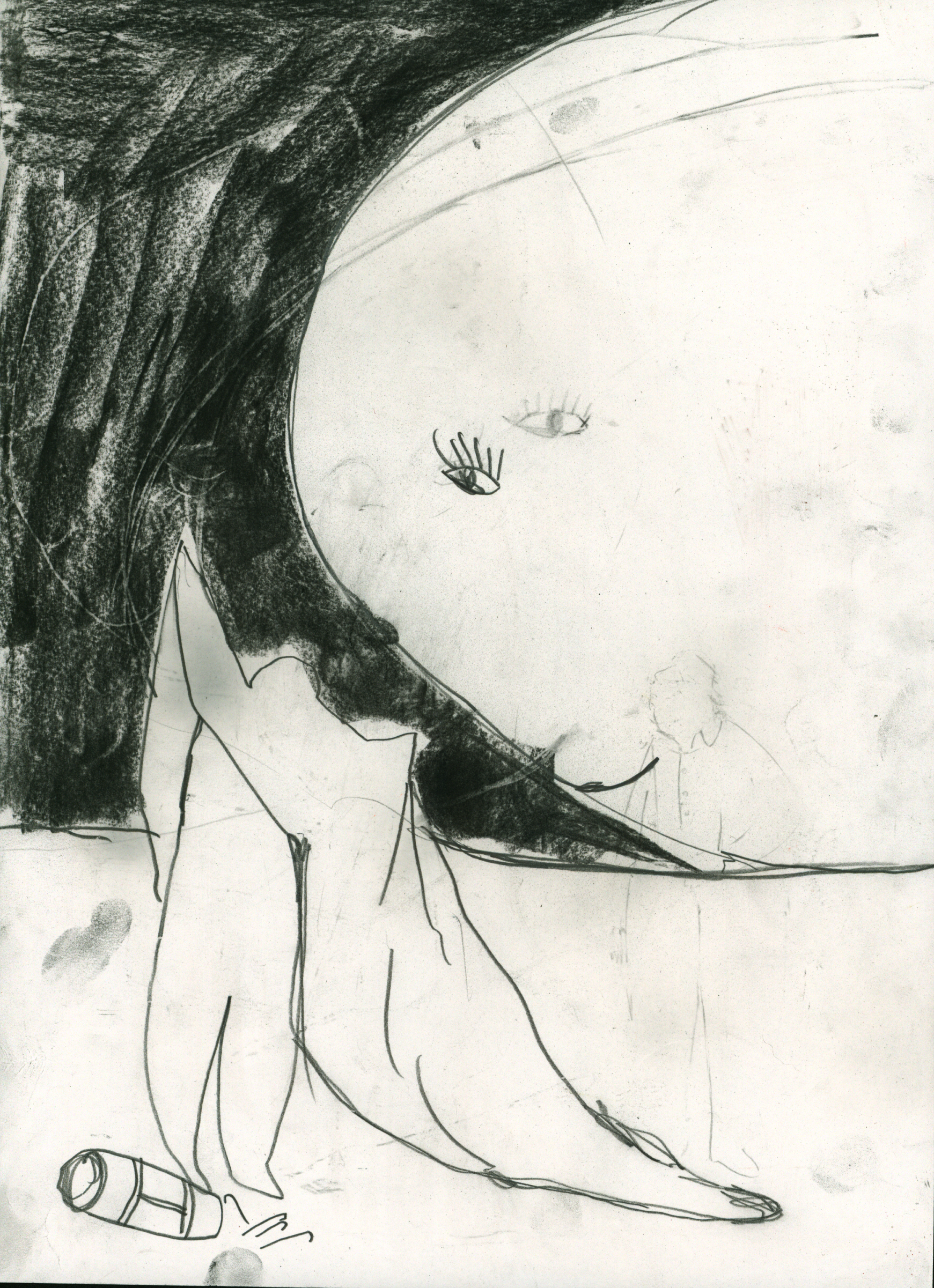
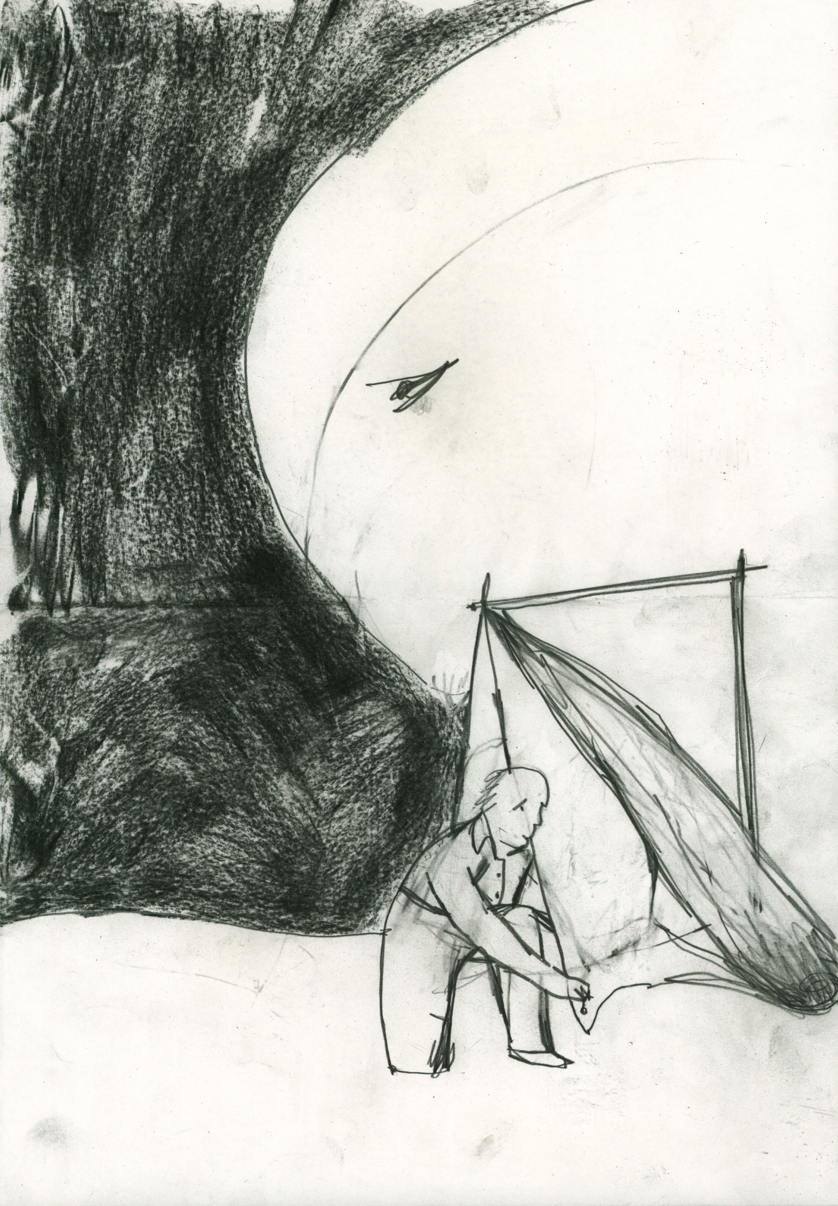
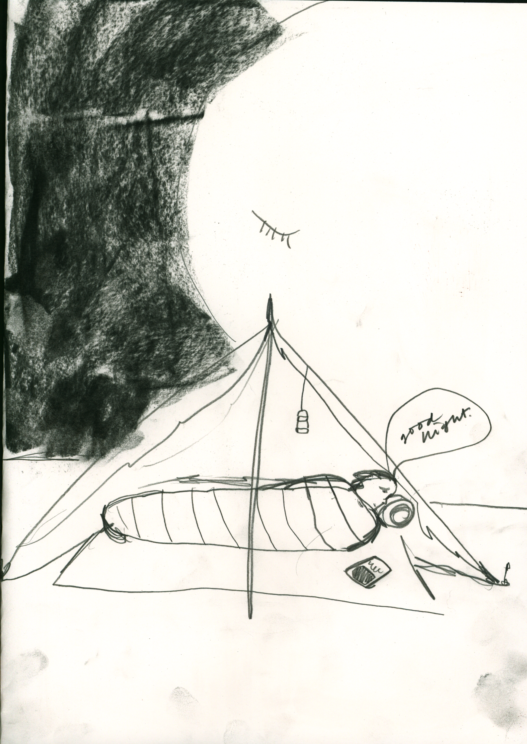
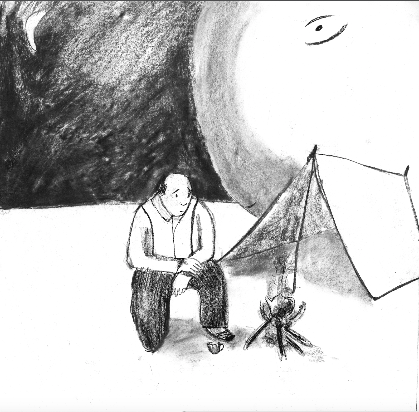
God camping out


9th February
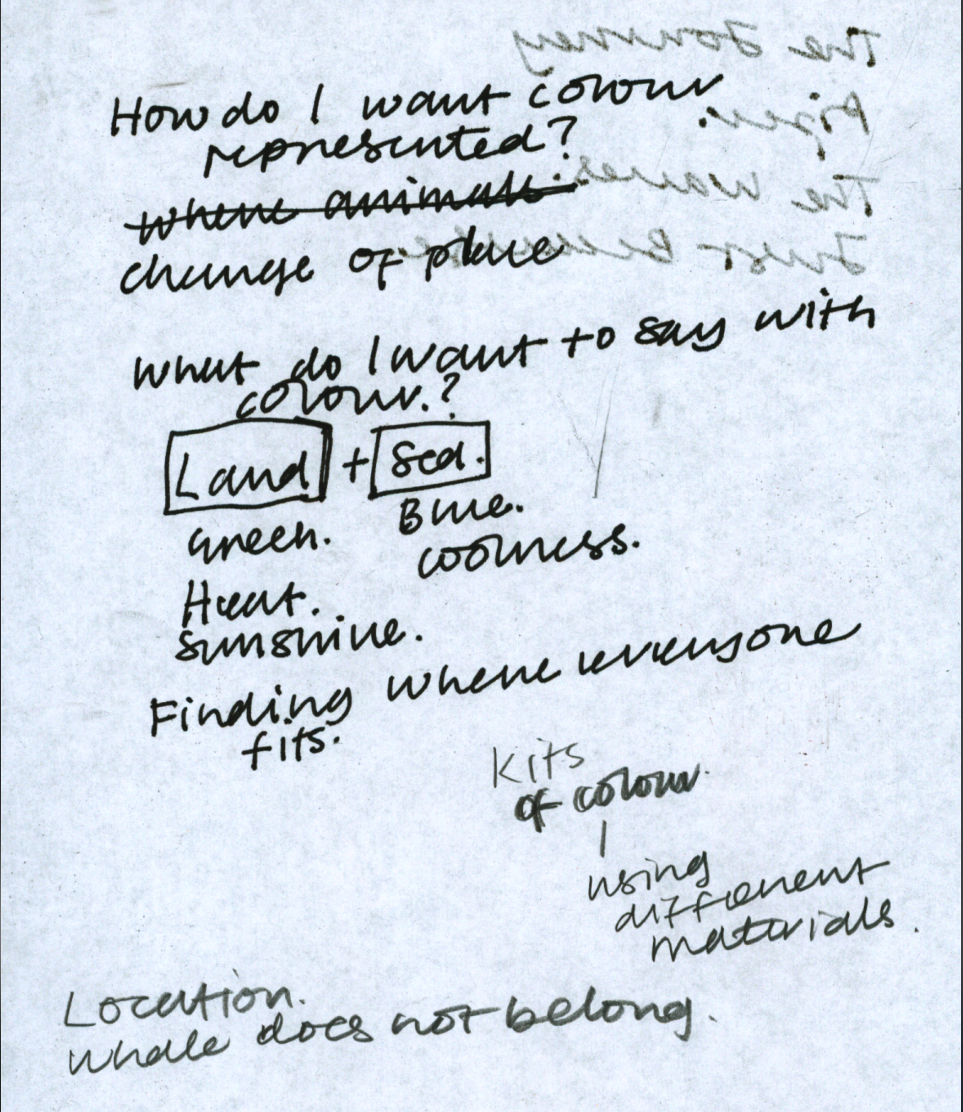


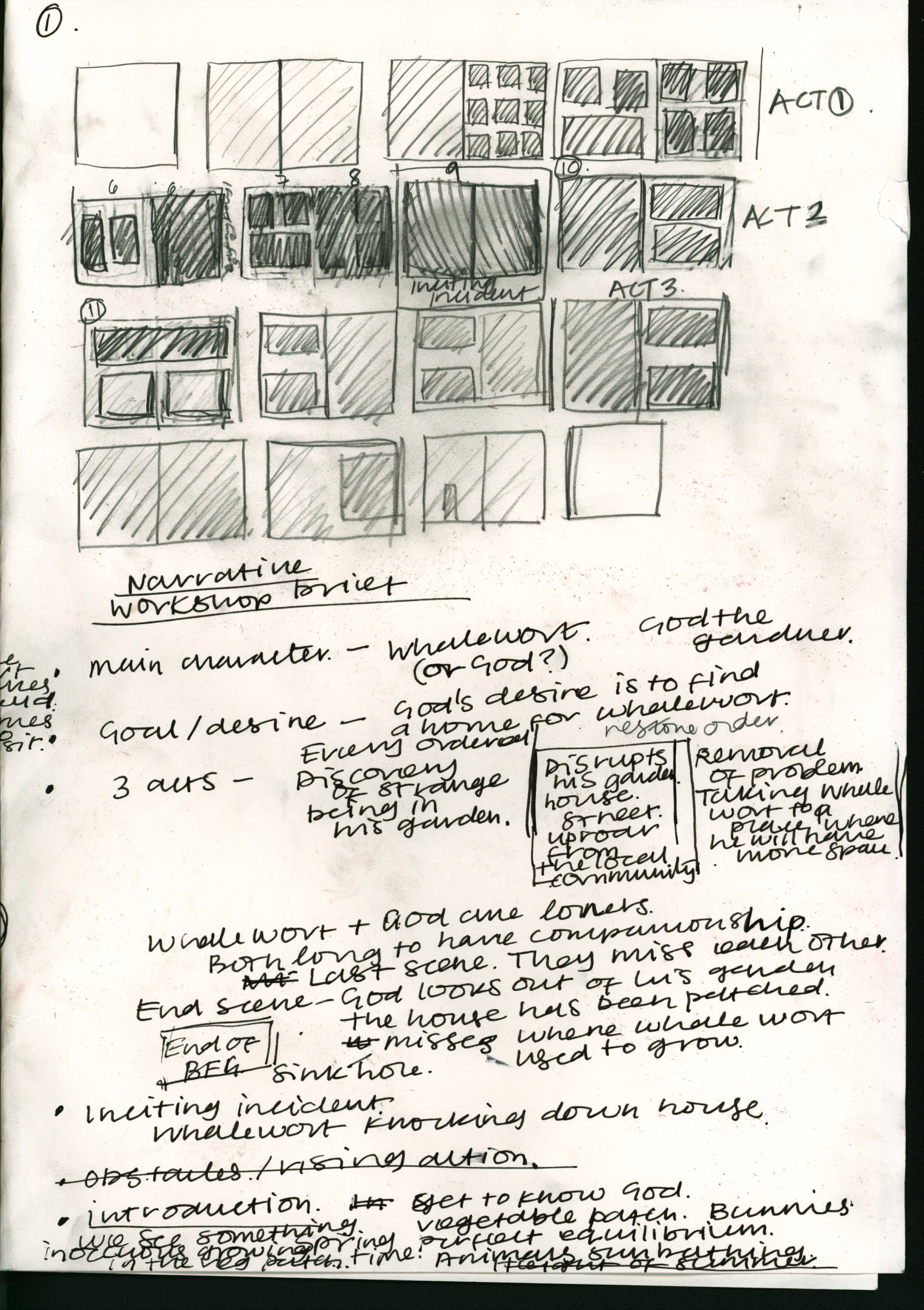
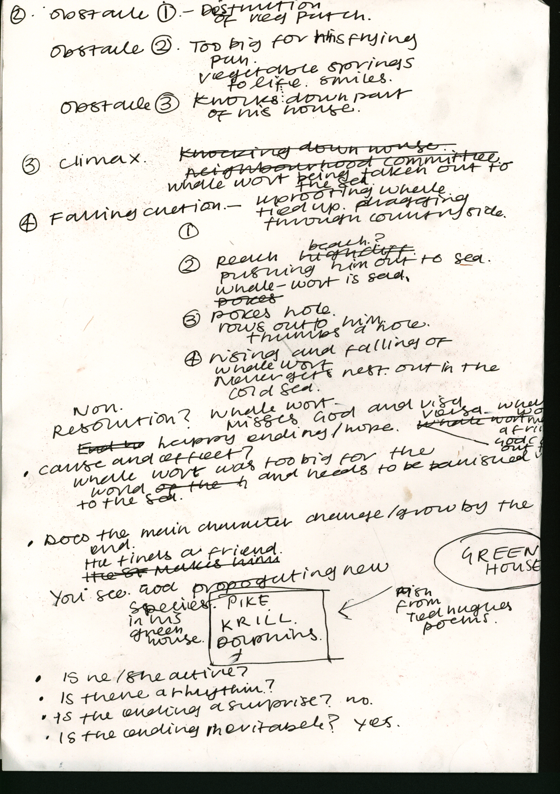
What is the story about?
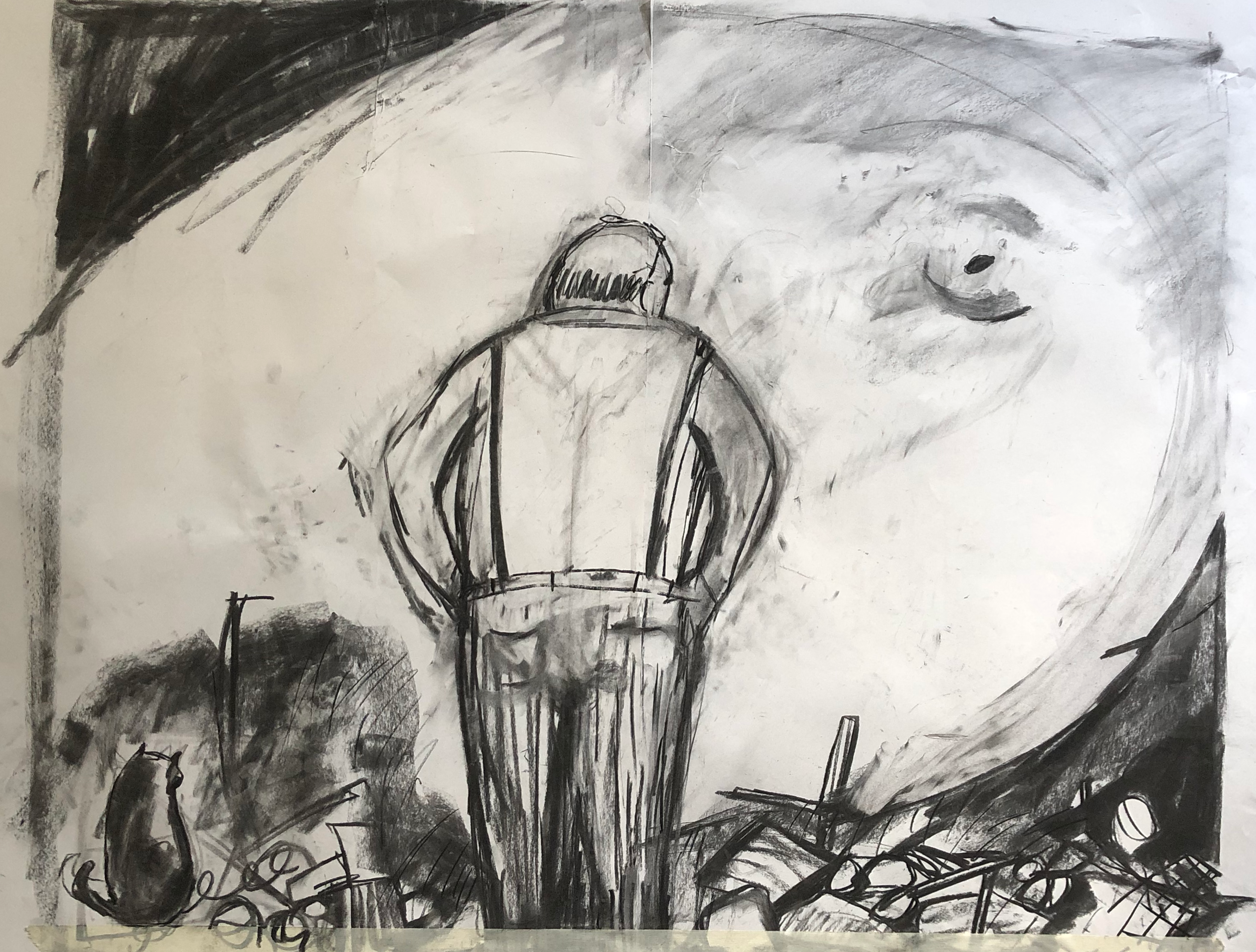
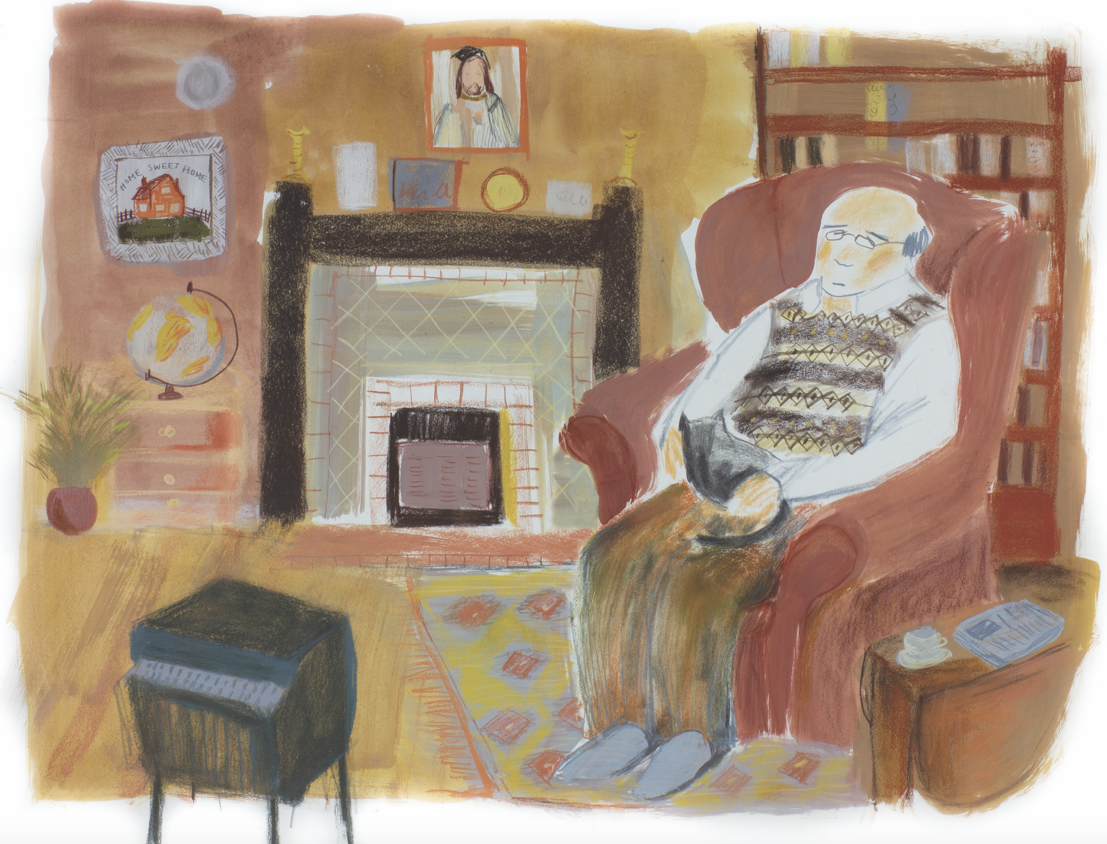
The story is about a week in the life of God.
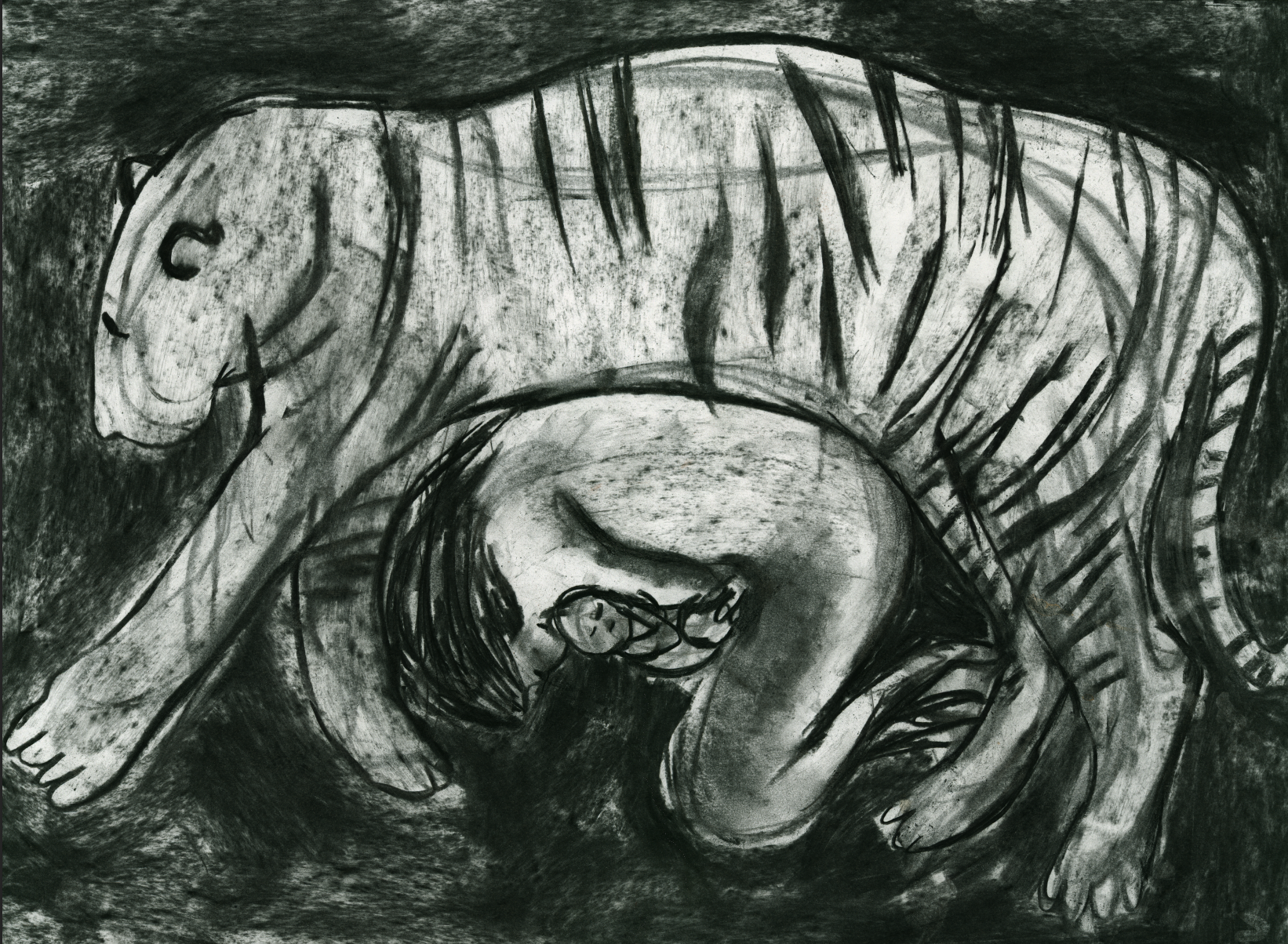
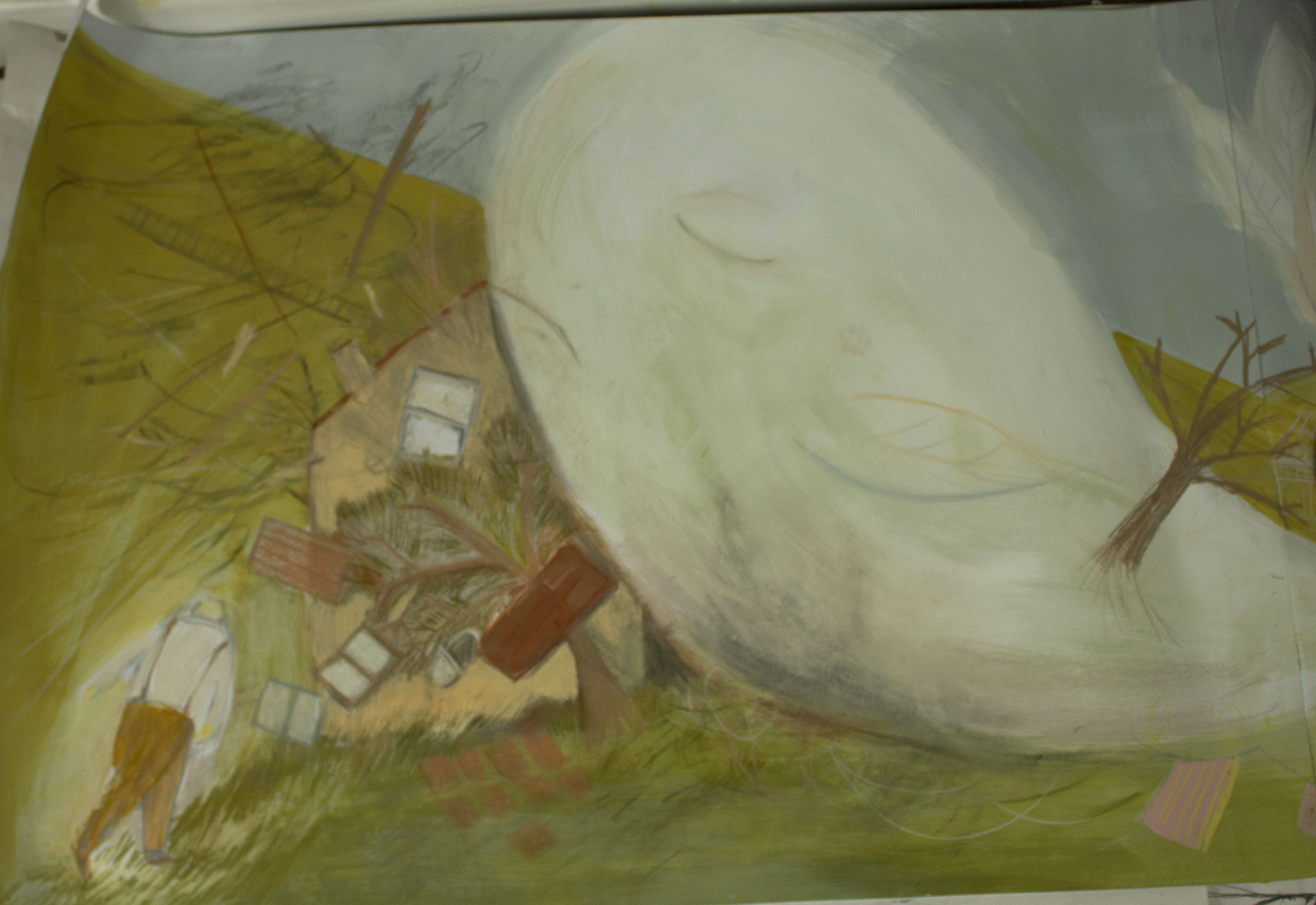
This is the first book in a sequel. I say that because I don’t want the whale to dominate. He is just one of many problems God encounter.
It shows an episode of God’s daily routine and one of his everyday challenges. The challenge in this book happens to be what he should do with a whale that has mistakenly grown in his garden.
I want it to the follow the format of a farce. God is an everyday character who is thrown into situations which are improbable and ridiculous. The whale is the issue in this book.
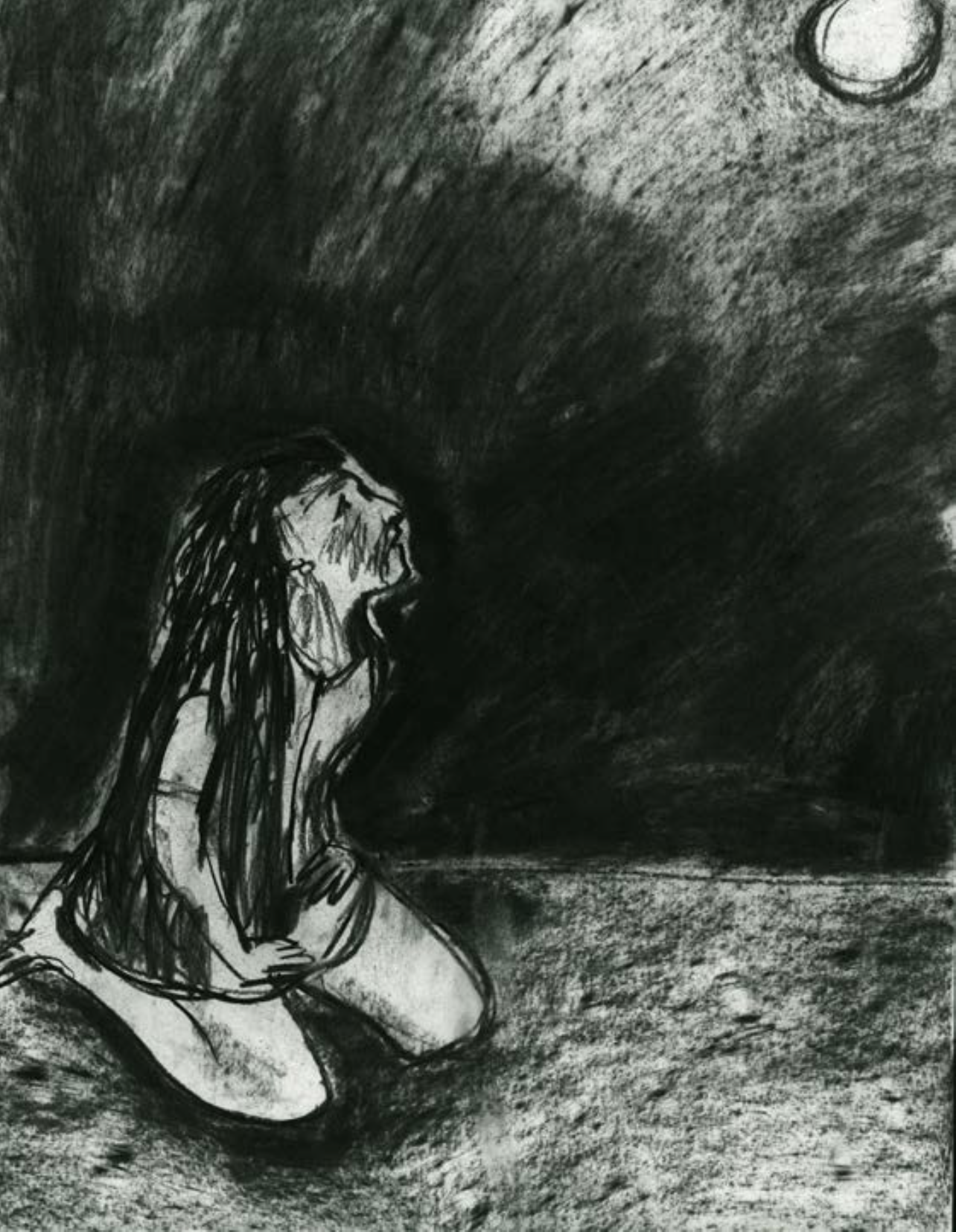
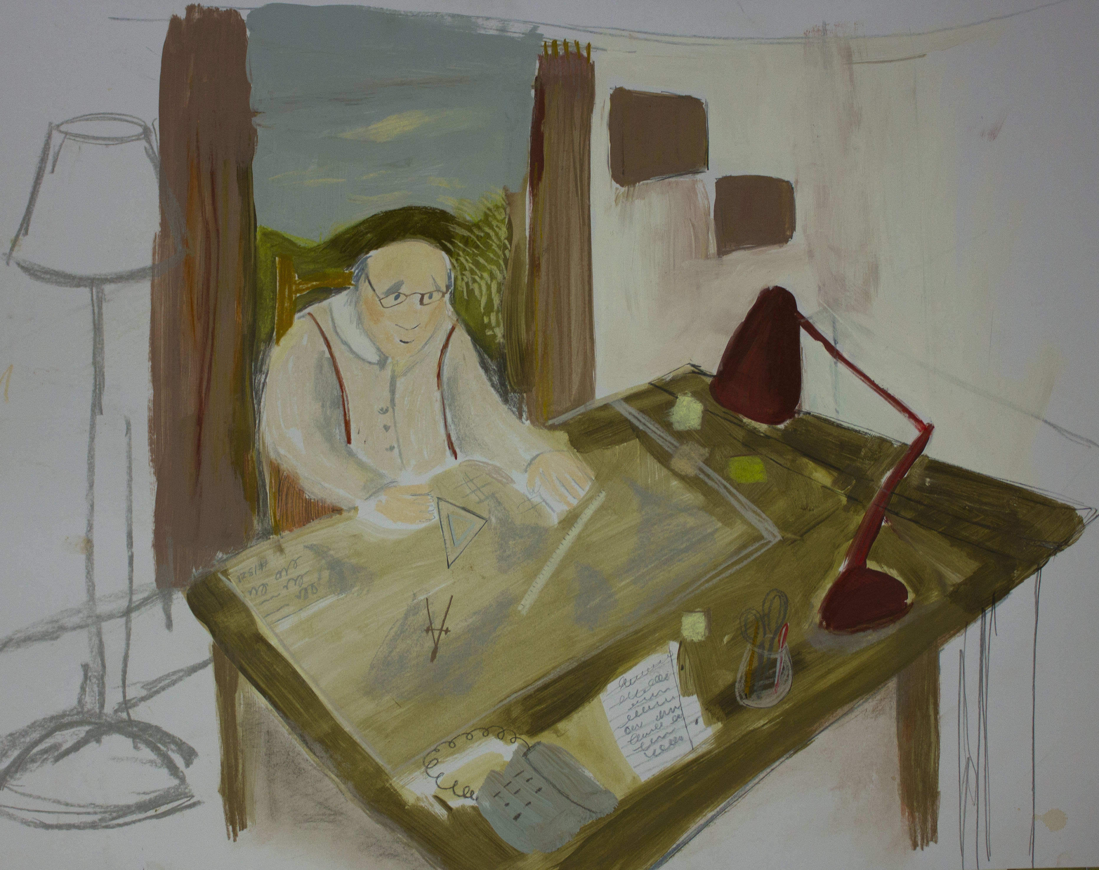
I would like the character of God to be slightly put upon by the new experiences which prevent God from retiring from work. All God wants is peace and quiet.
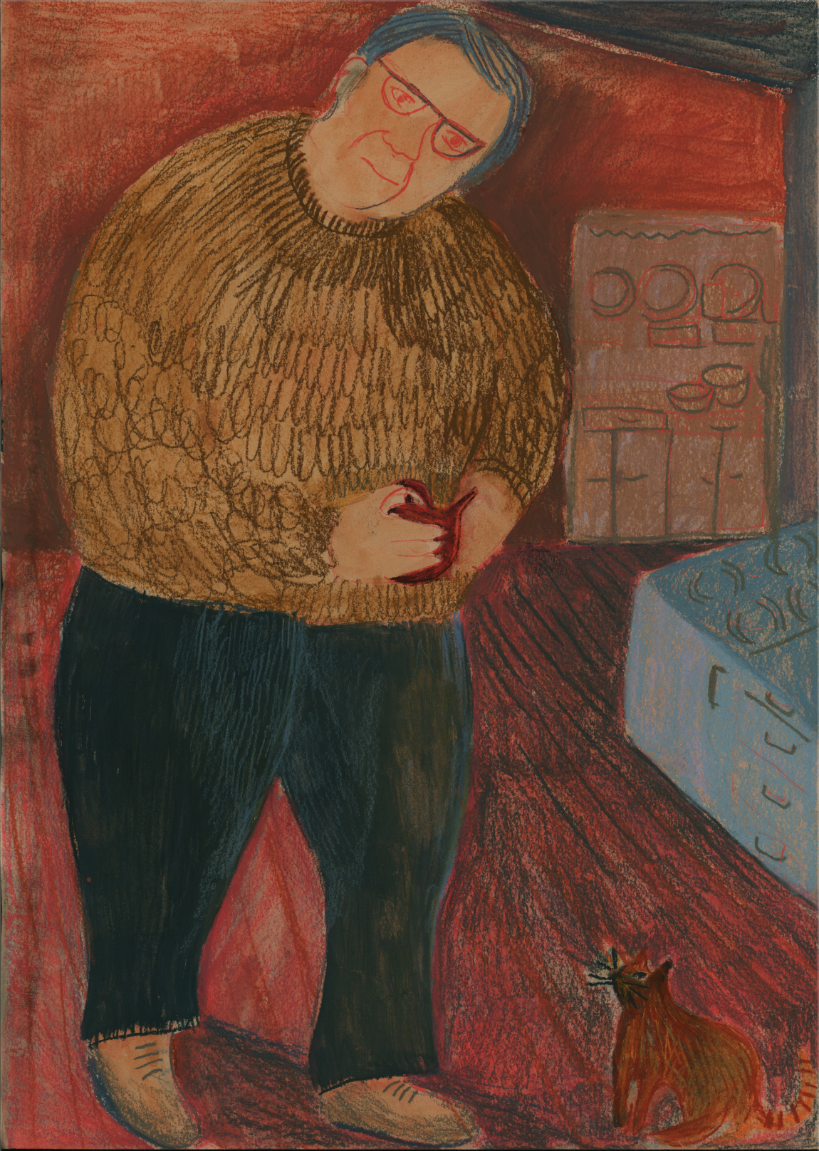
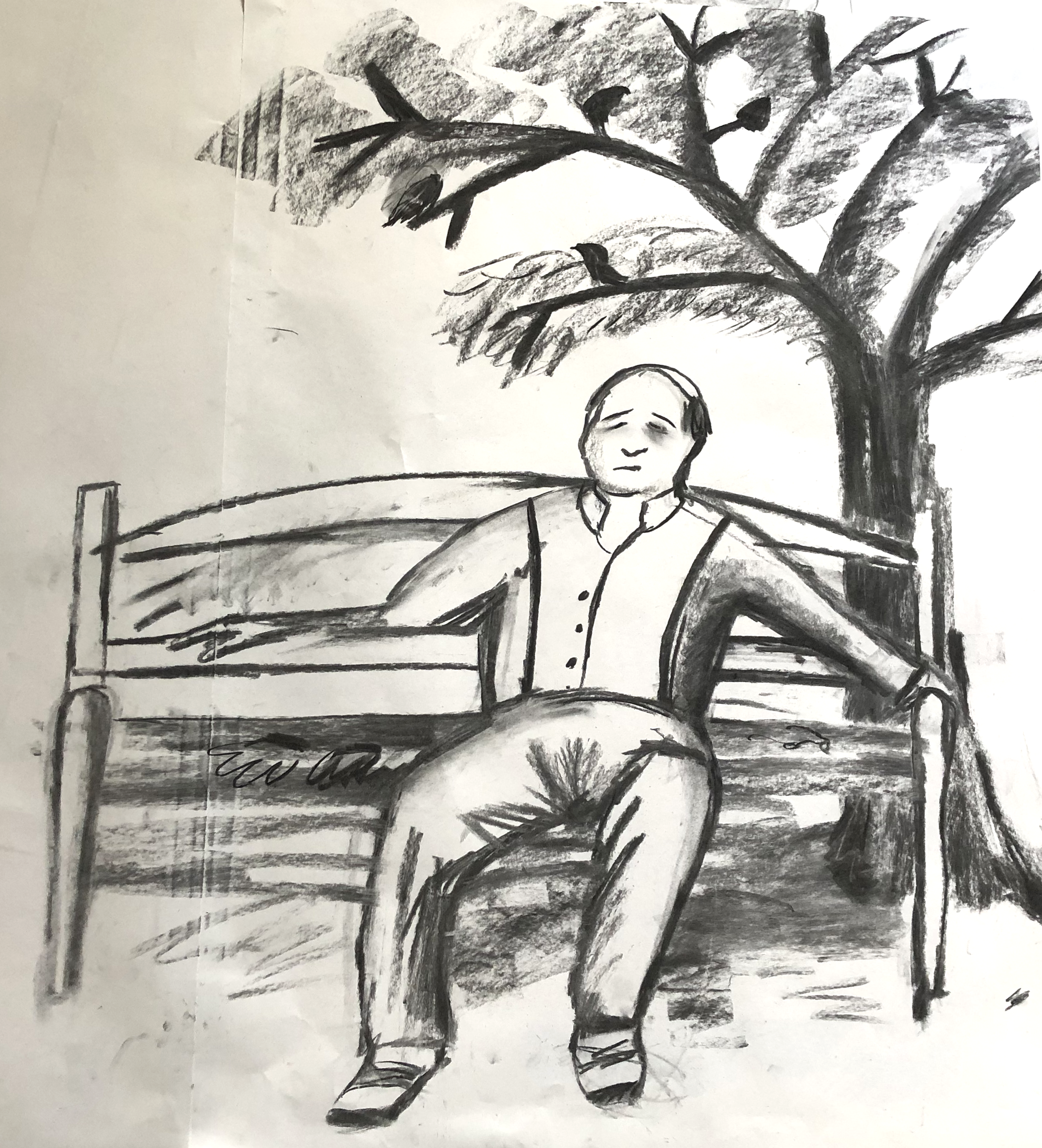
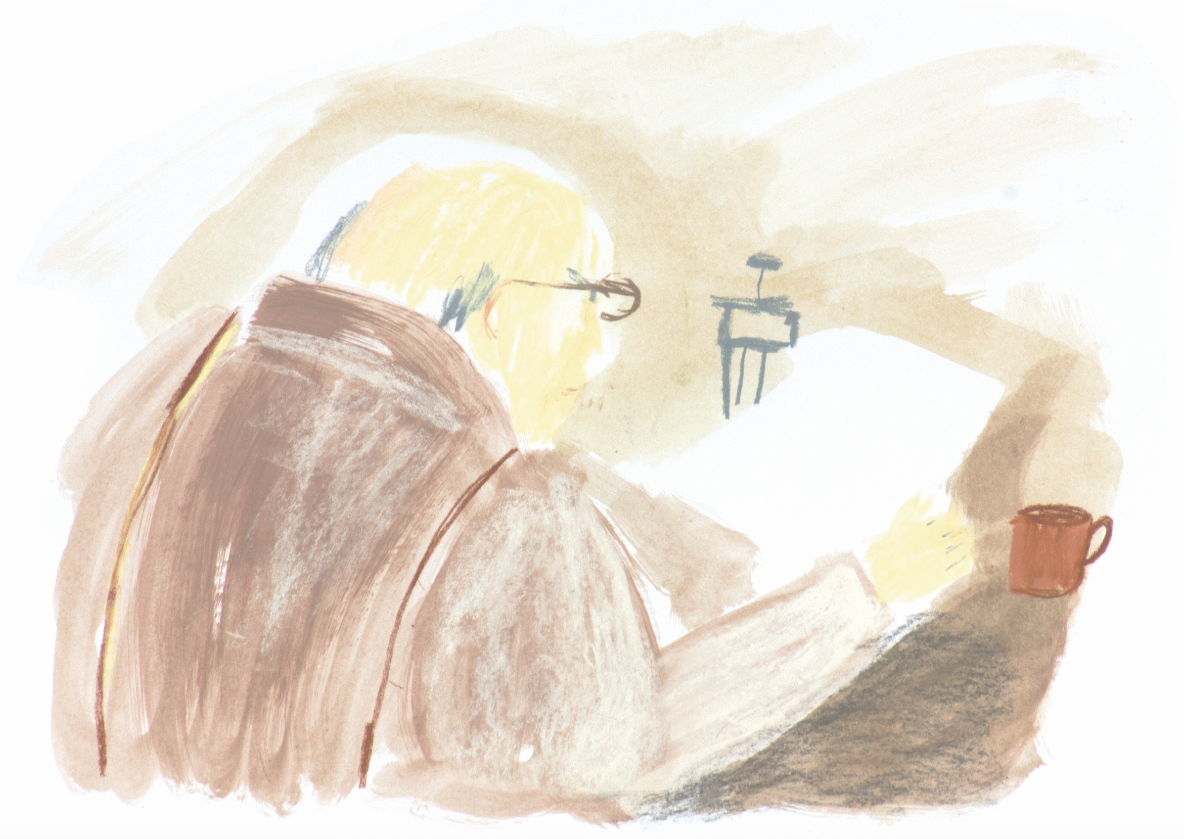
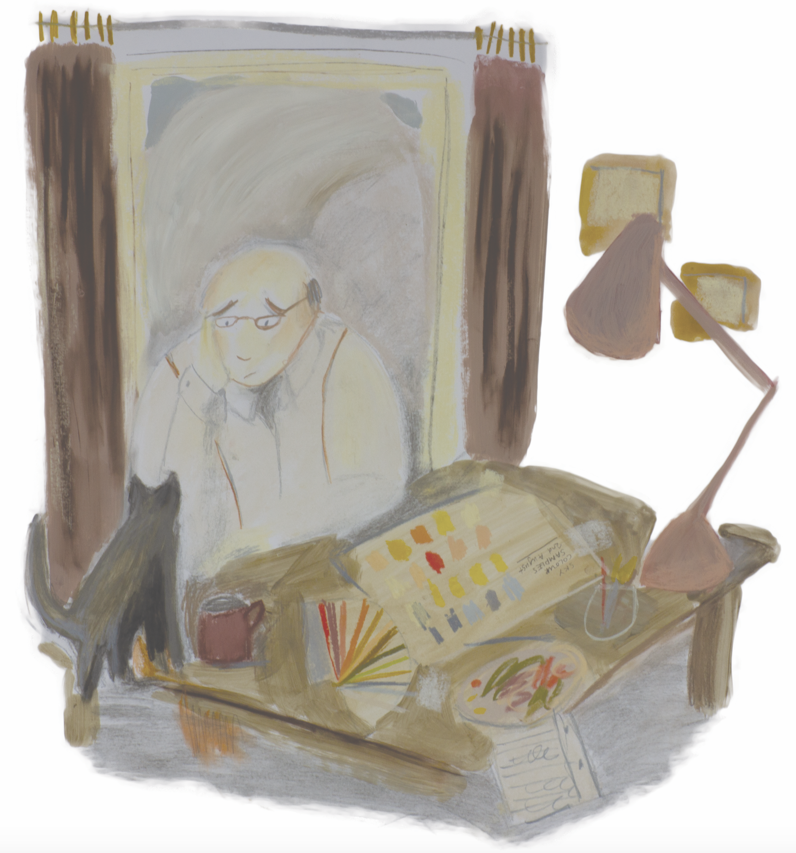
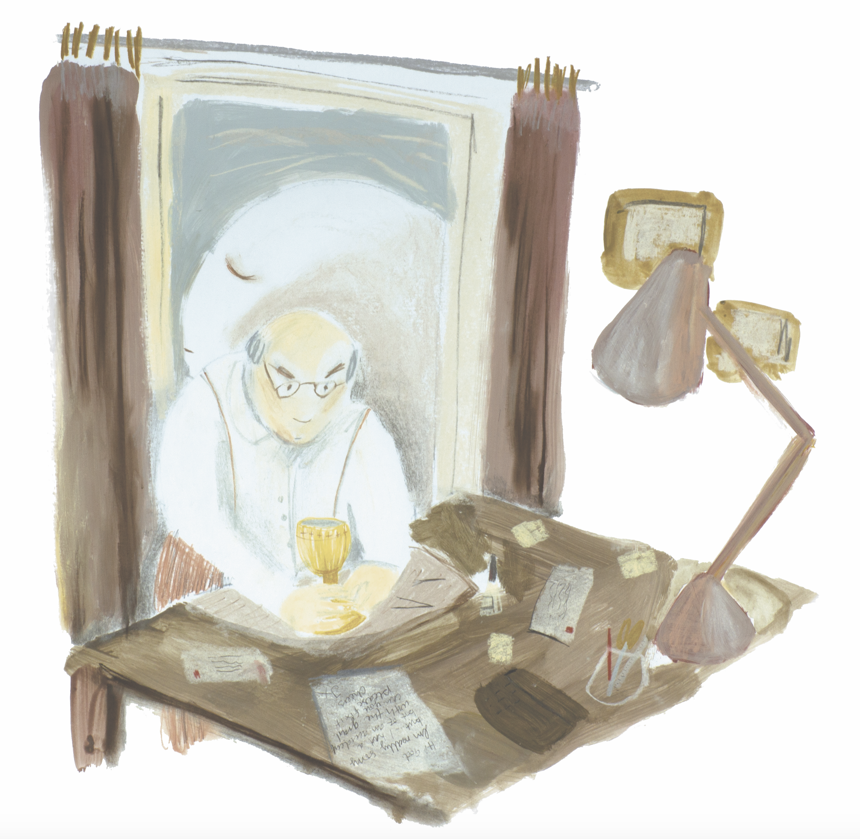
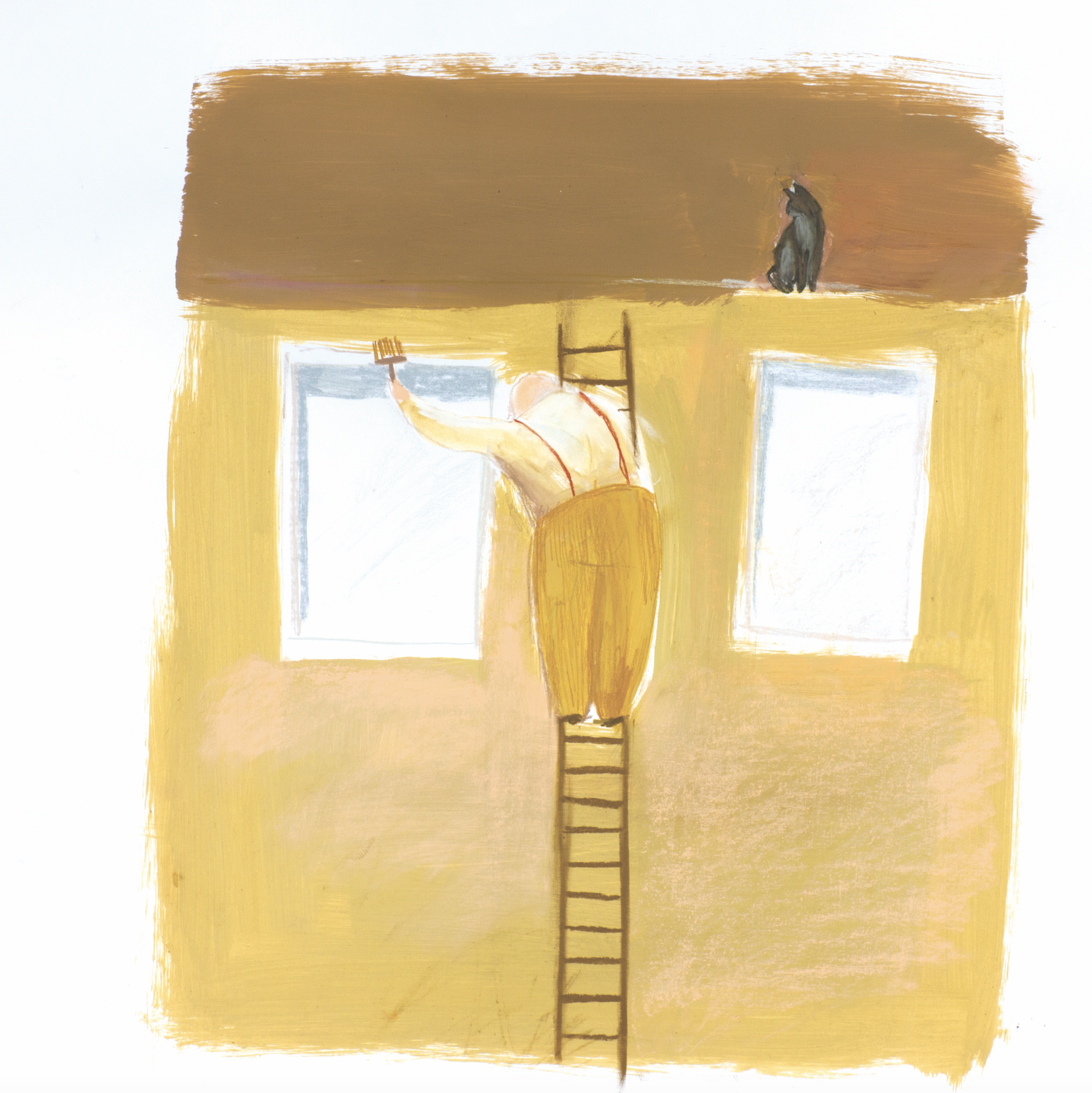
The two central characters are God and his cat. God is a less animated version of Basil Fawlty. He is just wanting to mind his own business but feels like everyone is out to get him. Another good analogy in Wallace and Gromit.
Notes from February 18th
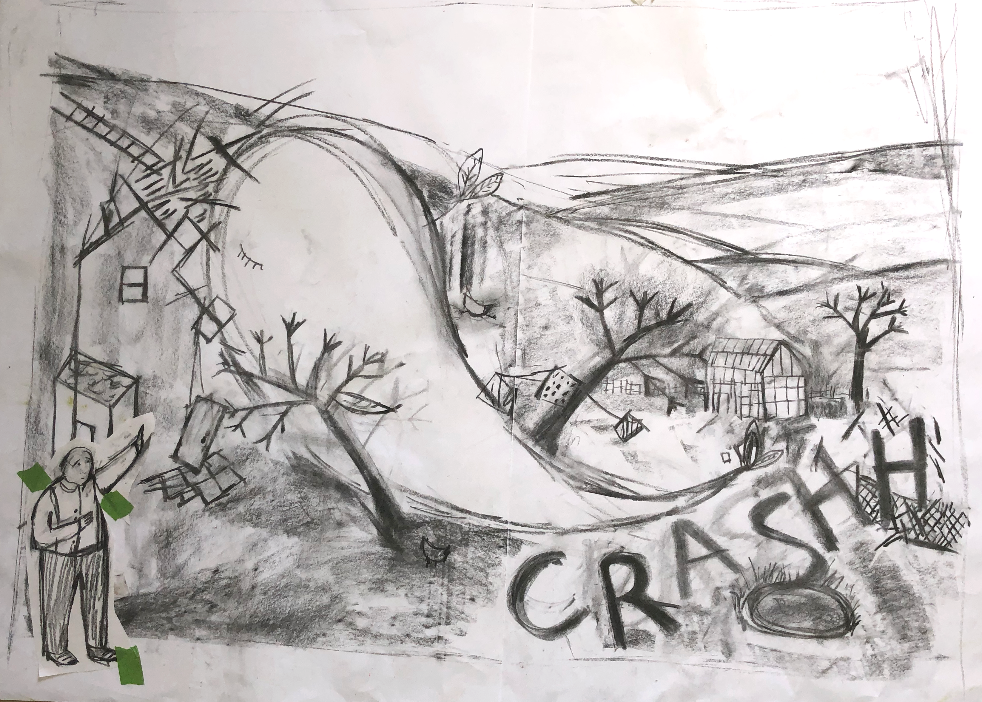
- Focus on artwork. Remember that is different from final artwork.
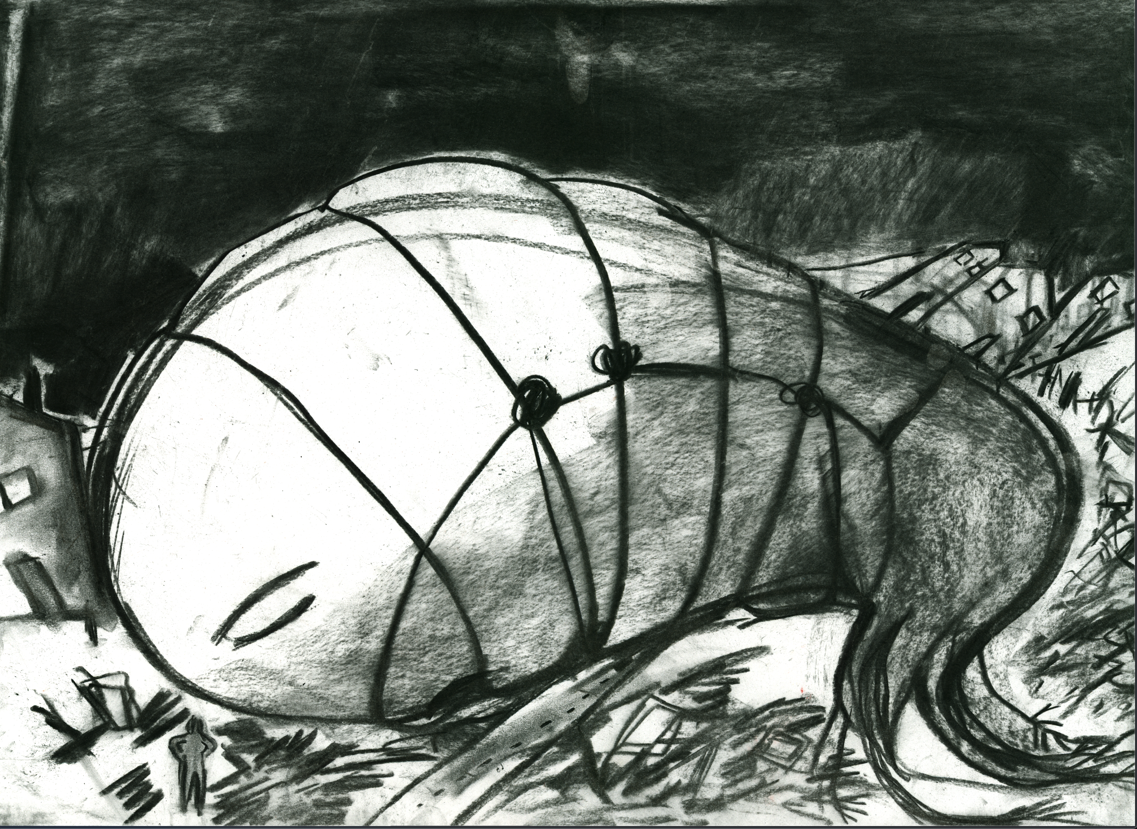
- Possibly collage the whale.
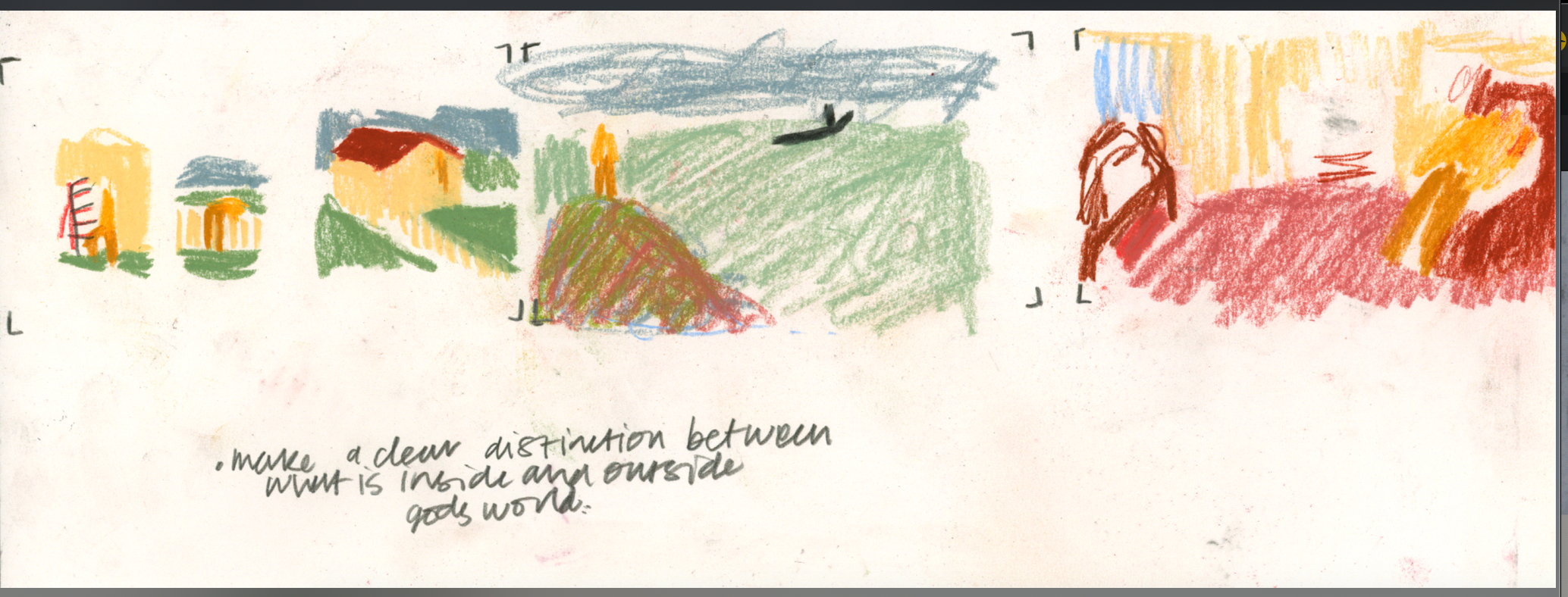
-Hint at the whales growth in the desk pictures. Change angle of the perspective.
- Show a saddness of the whale’s departure. Show God’s humanity more.
-Make sure the story look understandable.
Notes from February 18th
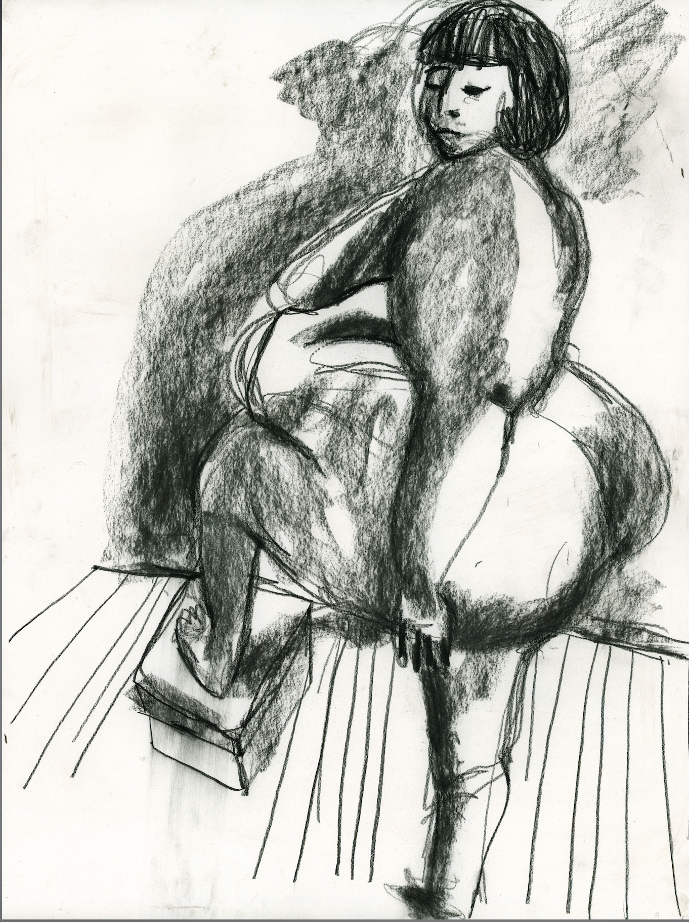
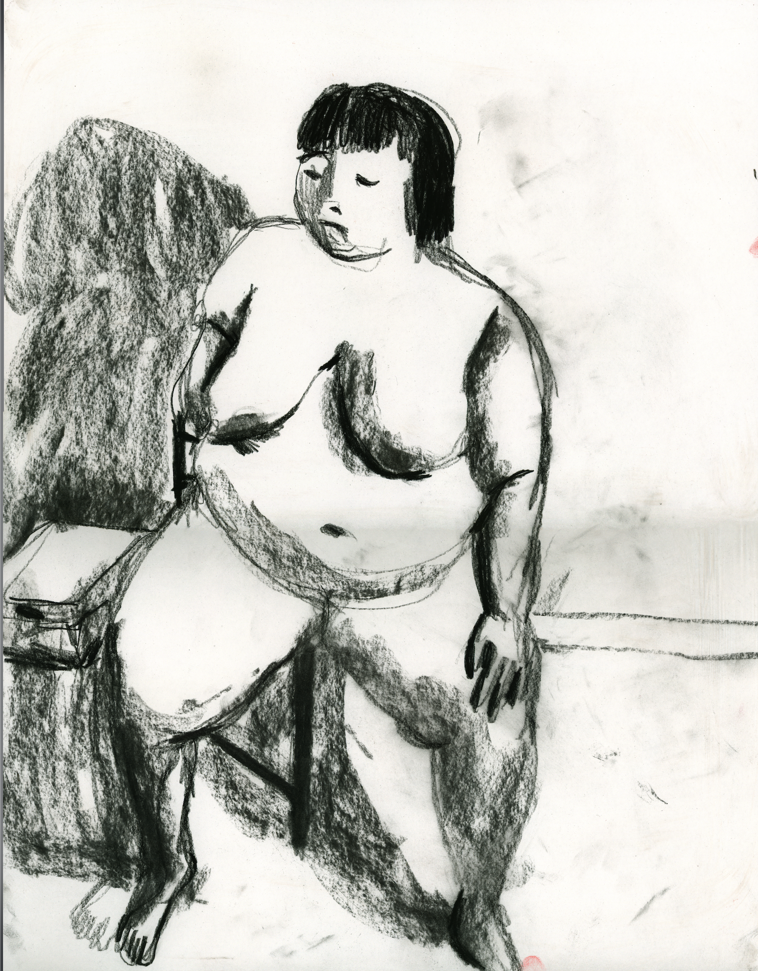


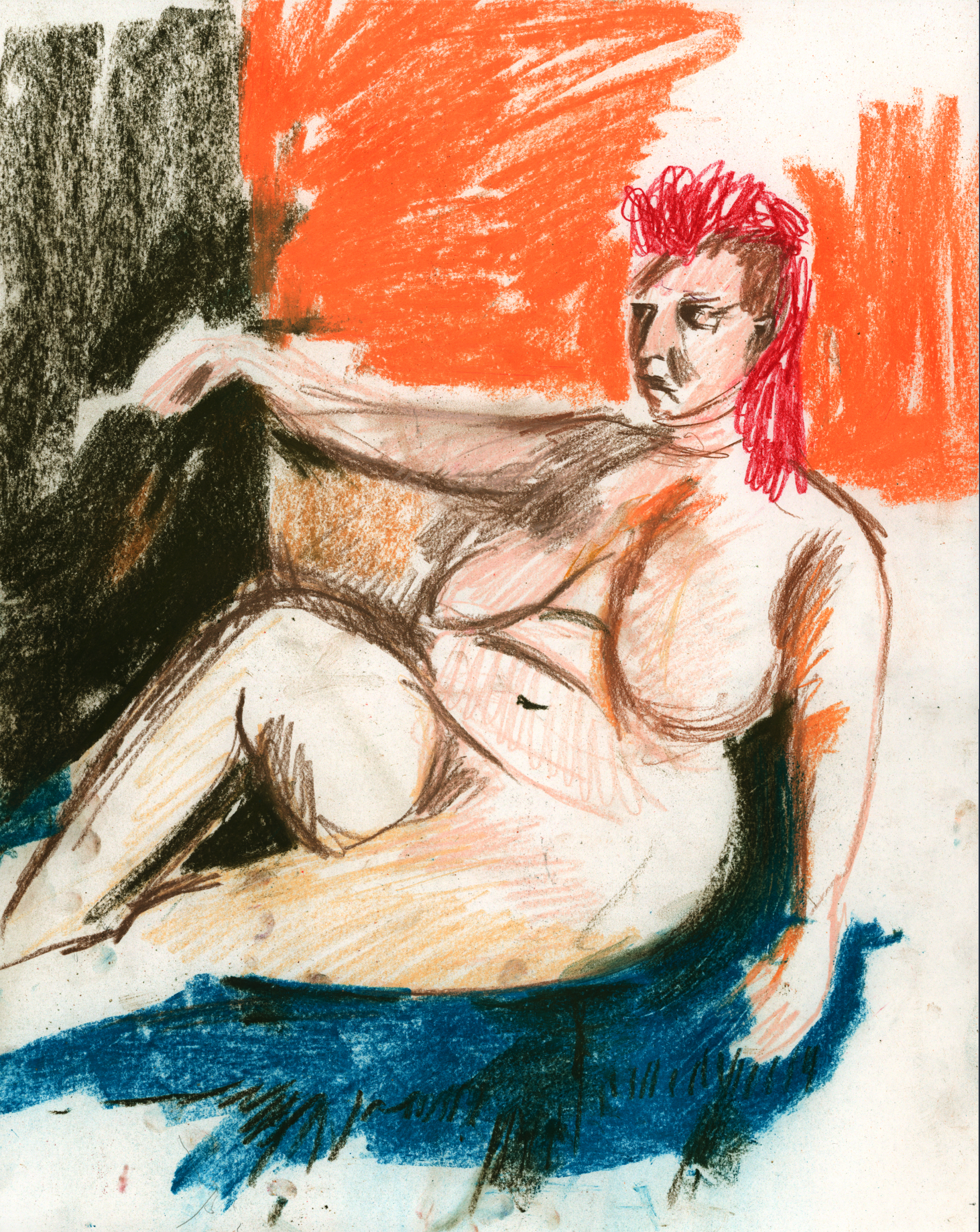
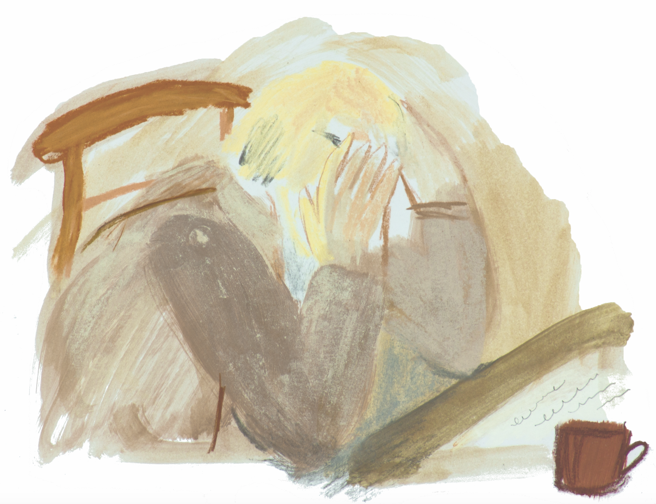
First coloured studies I was pleased with. Created just before the end of review. Pam wasn’t convinced! Too much energy in mark making. Clumsy colour palette


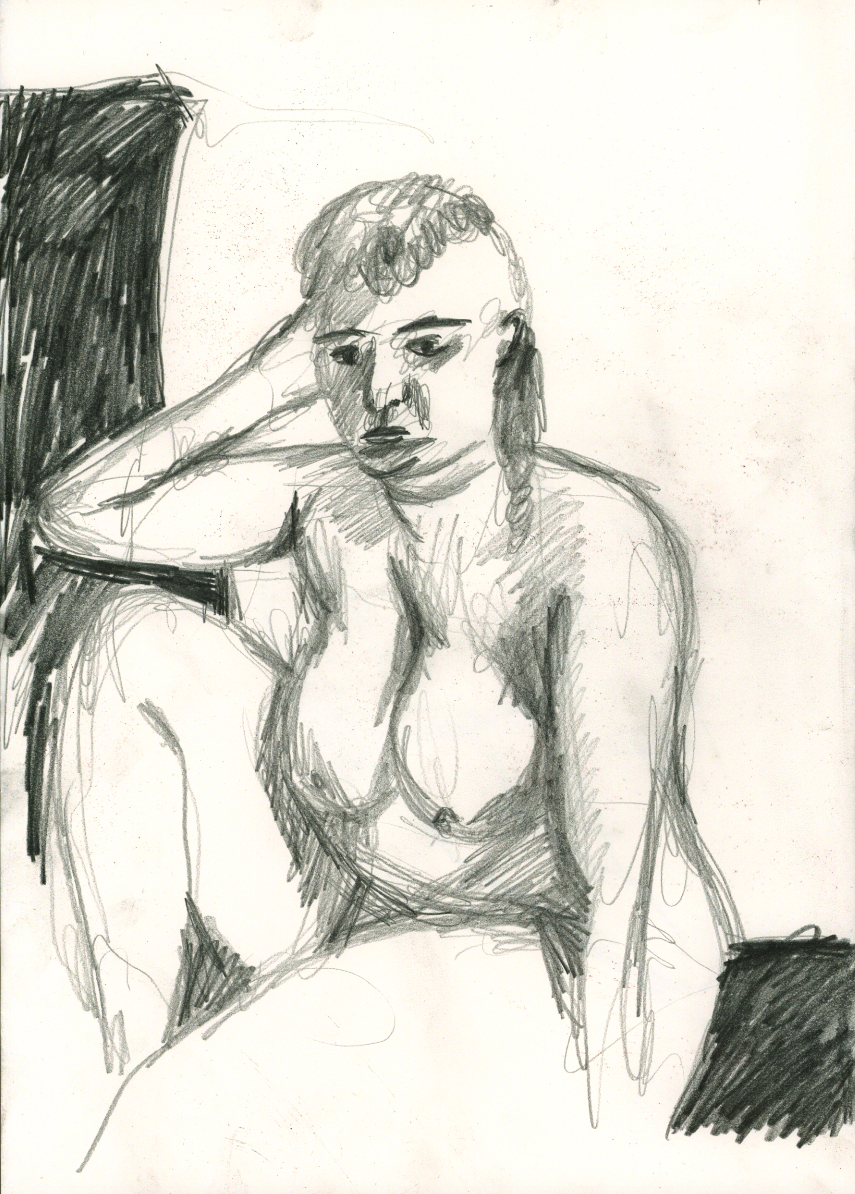
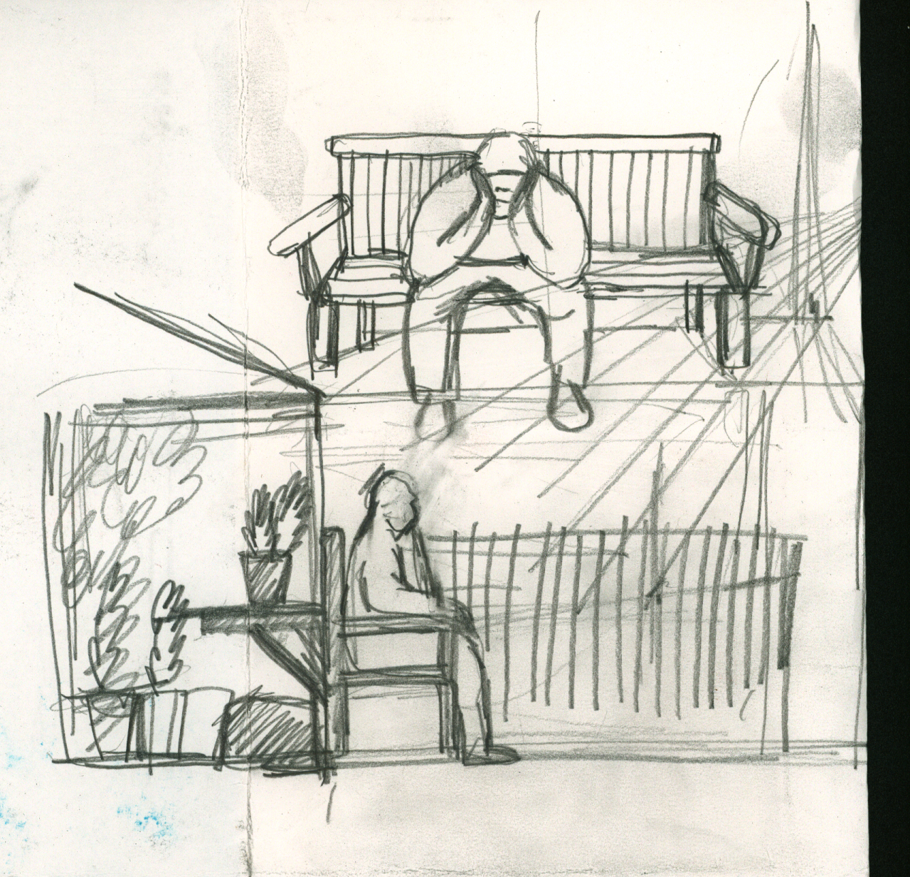
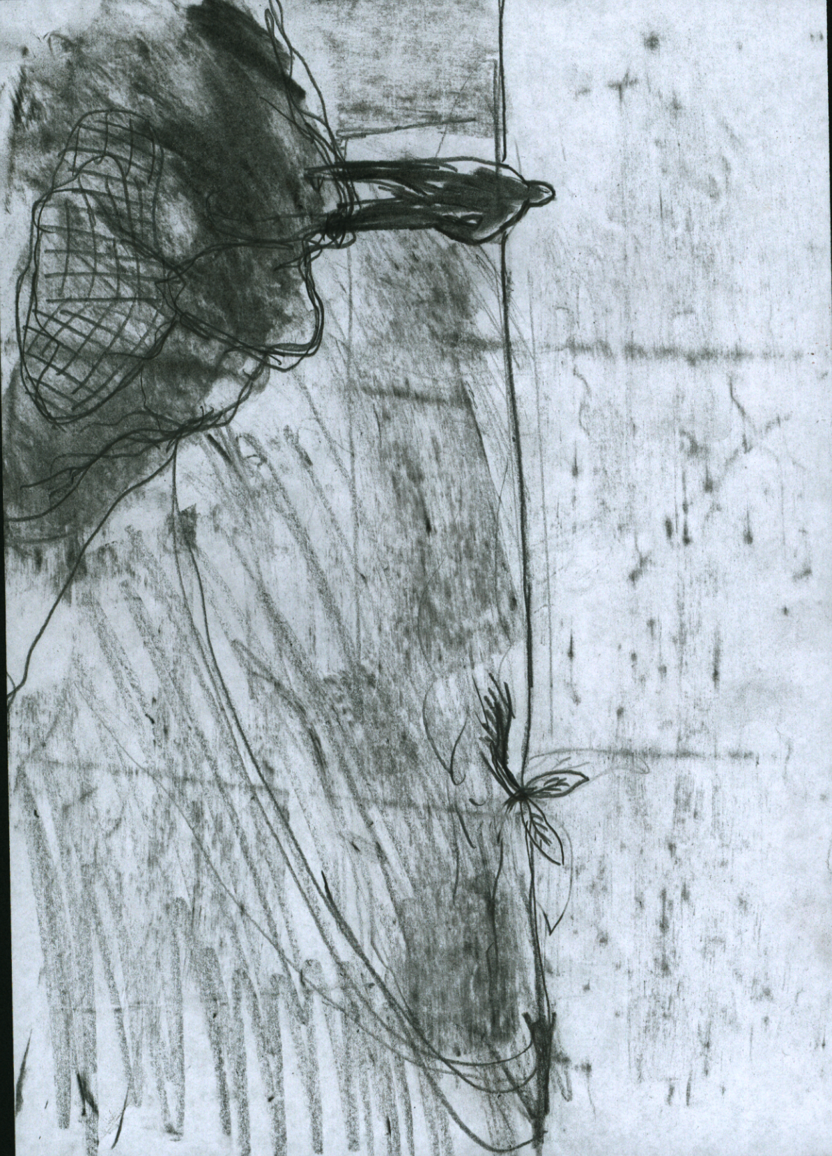
The most useful discovery made at this point was the usefulness of drawing big. Started working at A1 - A0 size. This is a horrible drawing below, but the approach is useful, I started using the drawings as proper working drawings. Chopping stuff about and experimenting with the best layouts.

I ended the module in a delightful mess. Straight onto the essay and the scribbles were put to bed. During the easter break I started again.


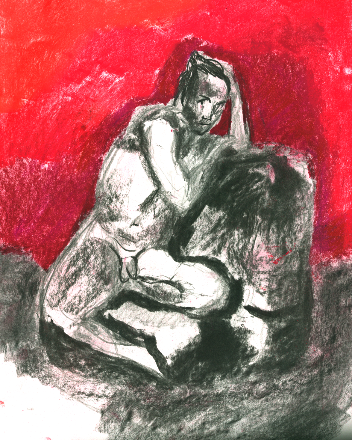
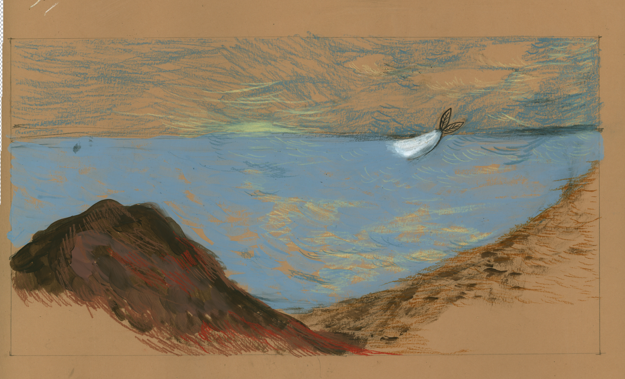
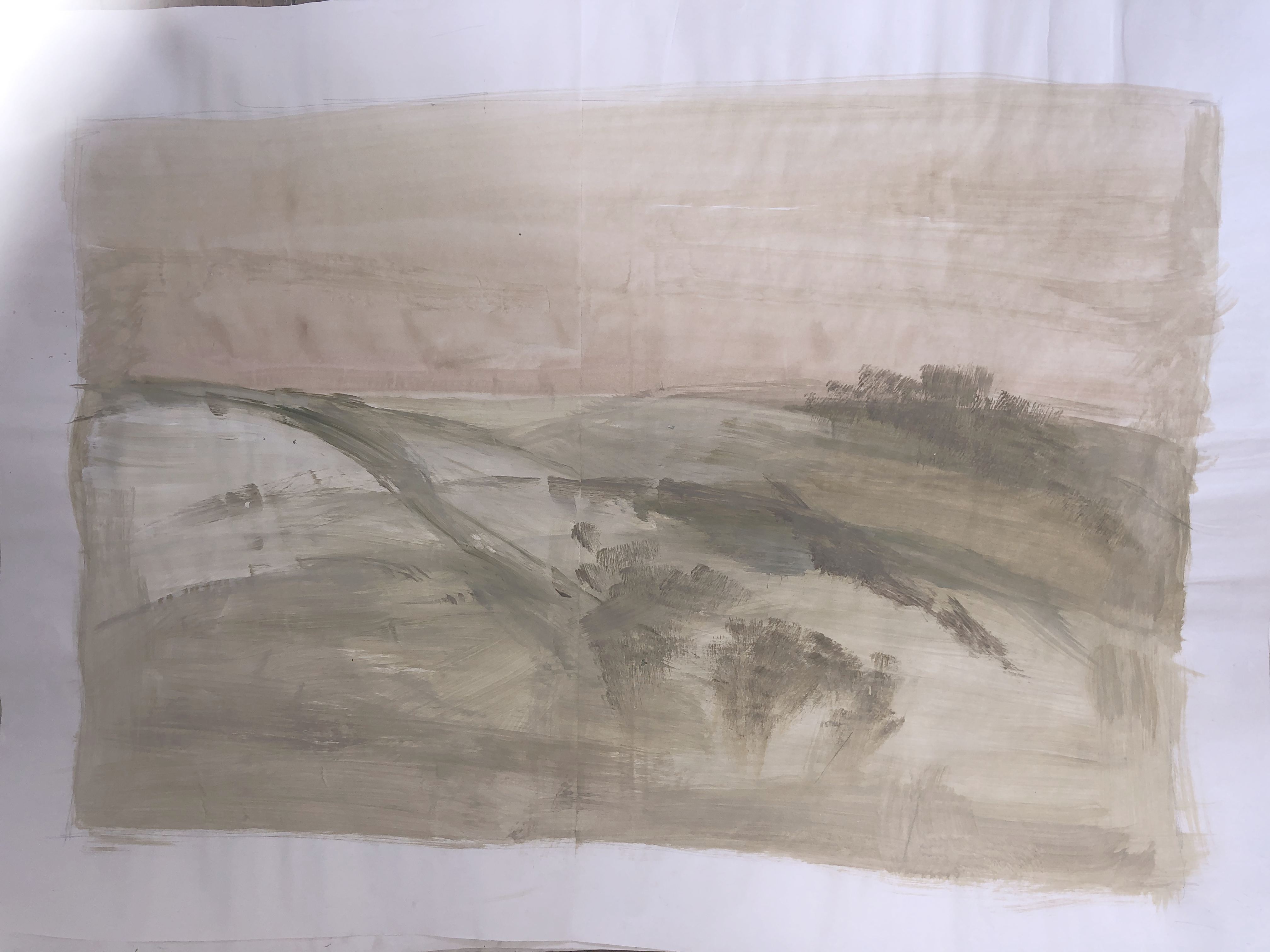
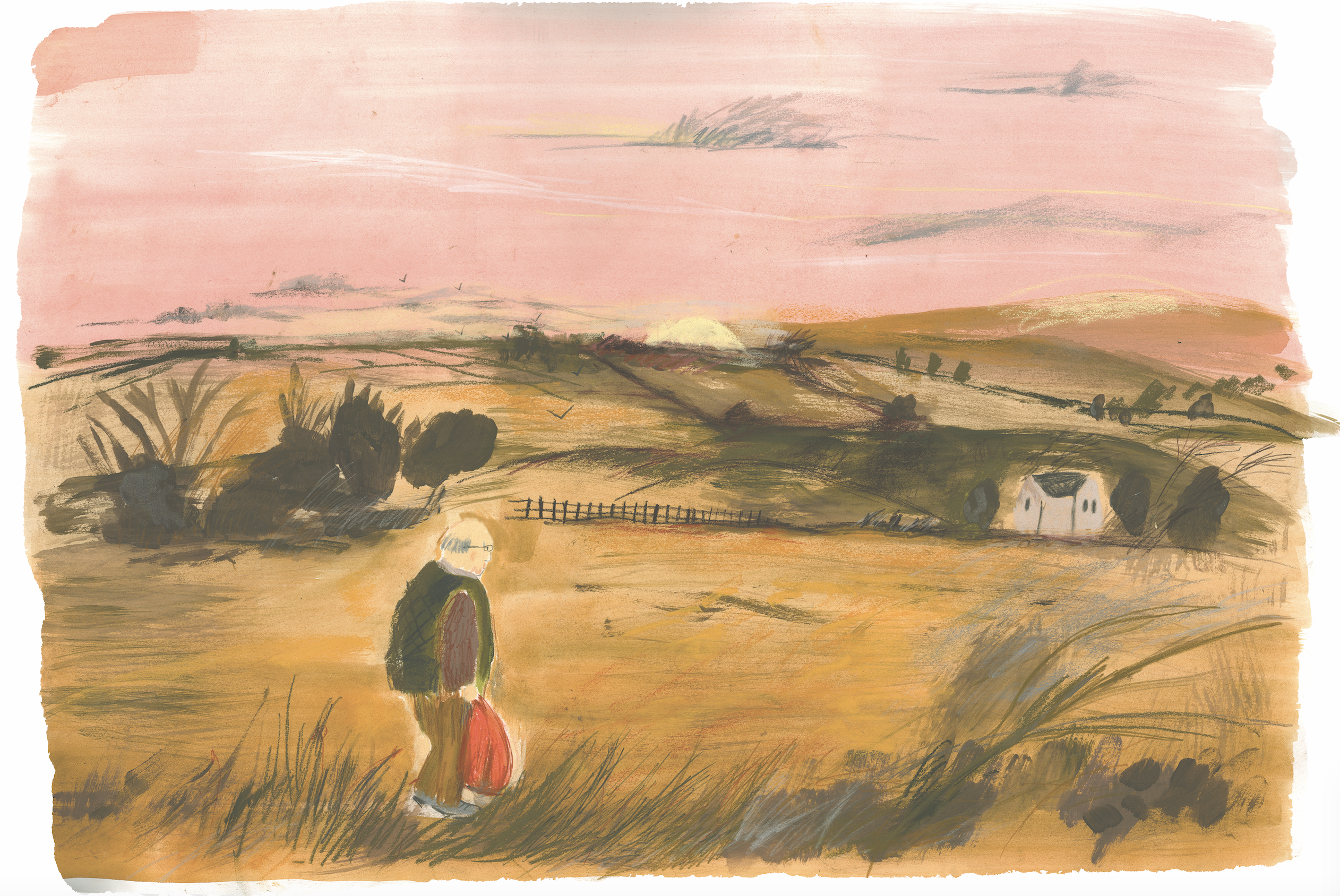
I started to do paintings on big pieces of paper. Working with sample pots of emulsion, a decorators brush and drawn chalk on top.

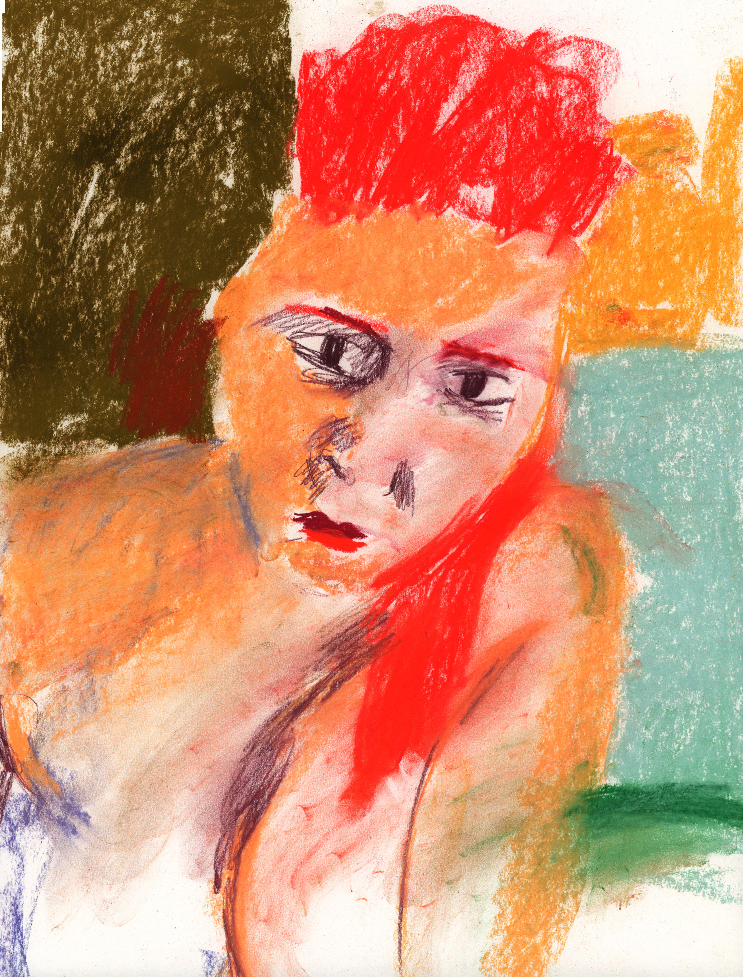
I was happy with this attempt. It kept the looseness of the chalk line but gave the drawings a solidity. Next problem was the paper. I had some lovely Somerset paper but it was too expensive to paint on at the scale I wanted. This is still my favourite drawing, but I compromised it by painting on thin cartridge. ![]()
I tried wallpaper lining. It’s cheap and the right size, but it soaked up the paint too much ![]()
I carried on making roughs of each frame. Repeating frames until I was happy with the layout. Something I shyed away from before now.


I ended up speaking to my local printer and he recommended buying a pack of 3000 gsm paper which had a smooth finish. The paper worked perfectly. Once I had sorted out the paper, the scale I wanted to draw and the colour palette, everything else flowed much more easily. I also was strict about the coloured chalks I used. Having less options really helped me focus on the enjoyable bit of drawing and painting!


The next issue was printing the dummy. I made up my first book, but some of the pages weren’t lining up and some of the colour calibration was off. I reworked the photoshop files and persisted with trying to line up the indesign files.
Previous dummy - See link below.
http://online.flipbuilder.com/unta/dfww/